
Your logo is the face of your business, the first handshake with your audience, the visual embodiment of your brand’s story, values, and promise. Those tiny little symbols are more than a splash of colour or fancy font. They carry the weight of your entire brand on their shoulders.
A well-designed logo can whisper, shout, or serenade its message to an audience, making it an indispensable tool in your branding toolkit. But how do you design one that catches the eye, captures the essence of your brand, and stands out from your competition?
We’ll explore exactly that in this guide on the do’s and don’ts of logo design – straight from the brains of our branding experts at LINK Creative – and discover the art and science behind creating the perfect logo.
Let’s go!
The anatomy of a great logo.
Ever wonder why some logos stick in your mind while others are easily forgotten? The answer is simple: they’ve used the winning formula for creating something special that piques your interest and keeps it.
While every logo is unique – just like the business it belongs to – the best have a few things in common. It takes a slew of thoughtful decisions to create a symbol that resonates and endures. And the best go beyond aesthetics to capture your brand’s soul in visual form.
1. They’re simple.
The most iconic logos don’t scream for attention. Even if your brand is bold by nature, there’s a way to communicate that without overcomplicating it. Simple logos are easily recognised and memorable. Complicating things can confuse your audience and dilute your brand’s message. So it’s best to strip away any unnecessary elements.
2. They’re authentic.
A logo that doesn’t resonate with your brand’s values and target audience can send mixed signals. It needs to echo your business ethos. So think deeply about your brand’s core values and how you want to be perceived. For example, a tech company might opt for sleek, modern lines, while a child-care centre might choose a playful, colourful design.
3. They’re timeless.
Trends come and go. You want your logo to last. So it should be more Audrey Hepburn than parachute pants, if you catch our drift. A timeless logo ensures your brand remains relevant and doesn’t feel outdated in a few years. We recommend looking into logos that have stood the test of time to identify common characteristics they share.
4. They’re versatile.
Your logo should be the chameleon of the branding world. Whether it’s gracing a massive billboard or sitting pretty on a business card, it should look chef’s kiss perfect. If folks are squinting or tilting their heads trying to decipher it, it’s time for a redesign. Your logo should be clear and distinguishable in various sizes, mediums, and settings. So make sure the design is scalable, and if you have text in it, make sure it’s legible. If your audience can’t read your brand’s name or slogan, they won’t remember you.
And make sure to test its appearance in various sizes and on different backgrounds before you lock in the final design.
5. They’re fluid.
Ever watched a ballet? Every move, every leap, every twirl is in harmony. Your logo should have that same rhythm. Each element should play well with the others. A harmonious logo feels balanced and is pleasing to the eye. So make sure each element of your logo is complementary the others. This might mean balancing a bold image with a delicate font or ensuring the colours don’t clash.
6. They have meaning.
Some of the best logos have an hidden message. One that you have to a look a bit harder to see. A subtle hint or playful element can make your logo more intriguing and memorable. It doesn’t have to be overt. The power of our unconscious mind in interpreting symbolism can’t be overstated. Think of ways to incorporate a double meaning or clever design twist. For example, the FedEx logo has a hidden arrow between the ‘E’ and ‘x’, symbolizing forward movement and efficiency.
7. They’ve got font weight and spacing down pat.
These aren’t just fancy terms to impress your friends with. They’re the salt and pepper of logo design. A dash of bold here, a sprinkle of space there, and voila! You’ve got yourself a logo that not only looks good but feels right. Proper font weight and spacing ensure your logo’s text is balanced and easy to read. Play with different weights to see which complements your logo’s imagery. And adjust kerning (spacing between characters) to find that sweet spot where any letters aren’t too squished or spaced out.
Now you’ve got the gist, let’s look at an example.
Let’s dissect one of the most iconic and recognisable logos in the world. Apple is the epitome of successful, effective logo design. You see it, you get it, you remember it.
Let’s dive into why.
Simplicity: Apple’s logo is a basic apple silhouette with a bite taken out. No fancy details, no extra frills. This simplicity makes it instantly recognisable, even from a distance.
Authentic: Apples have historically symbolised knowledge, wisdom, and learning. Apple’s products, from the very beginning, have been about using knowledge to push boundaries and redefine standards. The logo captures this ethos perfectly, in an unexpected way.
Timeless: While Apple’s logo has undergone refinements over the years, its core design has remained consistent. They steered clear of design fads, to stay relevant through the ages.
Versatile: Apple’s logo looks as stunning on the back of an iPhone as it does on a billboard or laptop. Its simplicity ensures that it’s scalable and versatile. Whether it’s a monochromatic design on products or a colourful rendition in older ads, it never loses its identity.
Fluid: The curves of the apple and the bite taken out of it flow seamlessly, while the leaf on top mimics the shape of the bite. There’s a natural harmony in its design that keeps it feeling balanced and pleasing to the eye.
Meaningful: Their logo does many things at once. First, it reinforces their business name without having to say it explicitly. Second, it’s rife with potential hidden meanings. The bite could be a play on the word “byte” (a nod to the tech industry and computing). But it also calls tales of knowledge and discovery to mind. Think about the story of Isaac Newton and the falling apple, or the biblical story of Adam and Eve eating the forbidden fruit they plucked from the tree of knowledge. Talk about layers!
Font weight and spacing: While the main Apple logo doesn’t use text, the fonts they do use in their branding are always clear, legible, and complementary to the logo’s design.
How to put it into action: The do’s and don’ts of logo design.
✕ Don’t…
- Overcomplicate it.
If your logo needs a manual to decipher it, you’ve gone too far. - Go overboard with colours.
Your logo isn’t a canvas for every hue. Choose wisely. - Use ‘trendy‘ fonts.
Today’s ‘cool’ font is tomorrow’s Comic Sans. Tread carefully. - Plagiarise.
Inspiration is necessary. Copying isn’t. Don’t be that guy. - Be too literal.
The world doesn’t need another bakery with a loaf of bread as its logo. Think outside the box. - Ignore scalability.
If you shrink your logo and it looks like a blob, or it becomes illegible, it’s back to the drawing board. - Fill up all the negative space.
Negative space isn’t emptiness, it’s opportunity. Use it wisely.
✓ Do…
- Research thoroughly.
Understand your industry, audience, and brand ethos. Knowledge is the secret to effective design. - Brainstorm before decision making.
Free-flowing creativity can lead to unexpected and innovative designs. - Prioritise clarity (please!).
If it’s too left of field, it’ll miss the mark. Find the sweet spot between literal and unexpected. - Test. Test. Test.
Does it look spectacular on all devices and printed materials? Check it. Then check it again. - Get feedback.
Getting a range of opinions provides invaluable insights you won’t discover alone. - Be intentional about colours.
Choose hues that evoke a desired emotion, represent your brand, and work harmoniously together. - Embrace white space.
Your logo is a taster, not the full course. Avoid the temptation of jamming too much into it. - Think long-term.
Design with the future in mind. Will it still be relevant in 5, 10, or even 20 years? - Keep your balance.
Keep the weight of elements, colours, and typography balanced. - Think critically and don’t rush.
Take your time. Think it through. Chances are your first pass is not your best option.
Don’t forget to consider what you might have missed. It’s easy to get caught up in the fun of designing. But there are often considerations that slip through the cracks. Have you thought about whether your logo may have negative connotations in different cultures? Have you unintentionally created an offensive shape with your letter spacing? Does your chosen colour combination look too similar to something else? These things are easy to miss, but catching them early will save you countless headaches down the track.
Remember, there’s more to branding than just a logo.
It’d be nice for our to-do lists if branding was a one and done. We could throw together a logo and call it a day. But that’s not the truth of it. Your logo is just the tip of the branding iceberg.
Beneath it lies a vast world of strategy, shaping how your brand speaks, behaves, and connects with your audience. In branding, a well-defined strategy is the only place to start. It makes sure every aspect – from tone of voice, to website design, to advertisements, customer interactions, and your logo – aligns with your brand’s values and goals.
So, while a great logo can grab attention, it’s the synergy of all these elements, grounded in a solid strategy, that truly builds lasting relationships with customers.
Curious about what it takes to build a powerhouse brand?
Take a look behind the scenes at some of our recent branding projects.
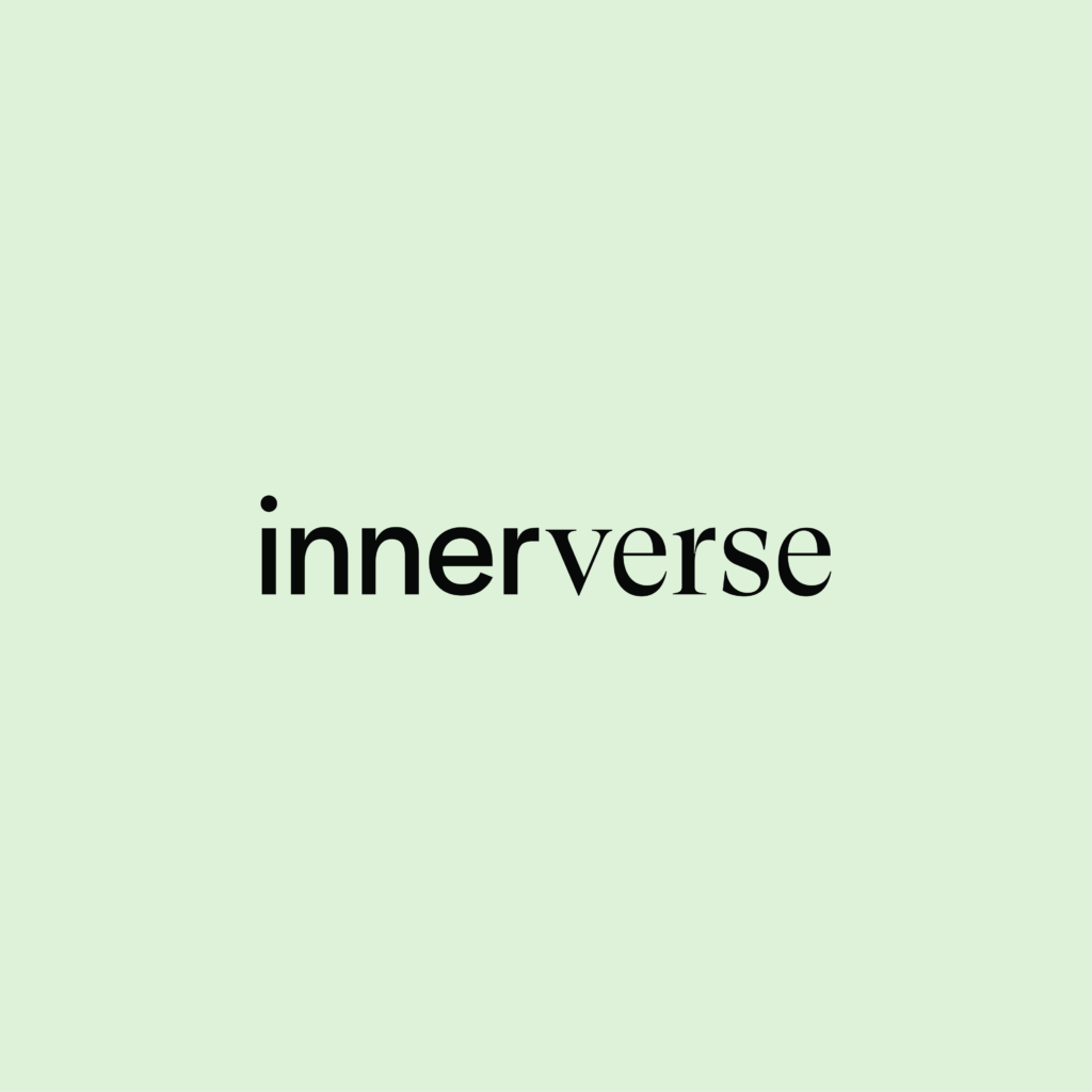
Innerverse: At the intersection of science and empathy.
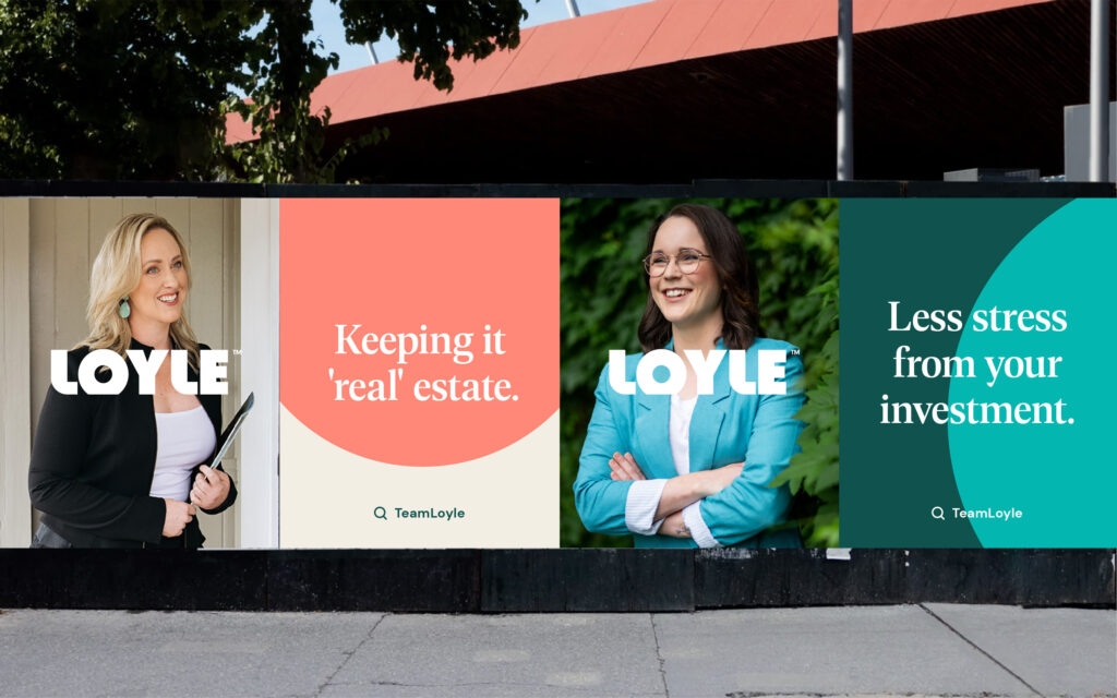
Loyle: Putting the real back in real estate.
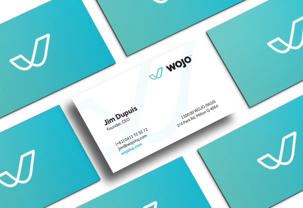
Wojo: Standing out in a sea of the same.
If you’d like to chat about taking your brand to the next level, we’re here to help.
Book a free, no-obligation chat with our Creative Lead to see if we’re the right team to help you design a smashing logo and build a brand that skyrockets you into your next phase of growth.