Innerverse is all about diving deep into the psyche with compassionate therapy. On their mission to uncover the root cause of mental health symptoms, they needed a brand that reflected their ability to decode complex psychology while keeping it real with their clients.
How we helped
Brand strategy Brand design Naming Copywriting Web design
Our mission?
Balance a genius level of info with an approachable style that gently says, “You’ve got this”. Think evidence-based therapy wrapped a snug blanket of warmth, wisdom, and optimism.
a word from our client
Lorem ipsum.
Pamika Brischke
INNERVERSE
Brand strategy
Illuminating the core.
We needed the brand to convey deep psychological insights while remaining accessible to a diverse audience. That meant striking the delicate balance between informative content and approachability, ensuring that clients felt understood, supported, and empowered to seek the transformative healing they deserve.
the approach
Innerverse’s dedication to identifying the root cause of their clients’ symptoms had to shine through every element, mirroring the brand’s empathetic core. From visuals to messaging, the new brand needed to prepare customers to make productive changes alongside a real person, with unreal tools and knowledge.
Messaging
The intersection of science and empathy.
Innerverse is progressive, forging a new path at the cutting edge of therapy. But never to the point of discomfort. So we crafted messaging that owns their high intelligence while maintaining a down-to-earth attitude. By mixing compassion with a straightforward tone, they chat with their audience like old friends – no shocking surprises or sugar coating required.
Lorem ipsum.
Pamika Brischke
Innerverse
a word from our client
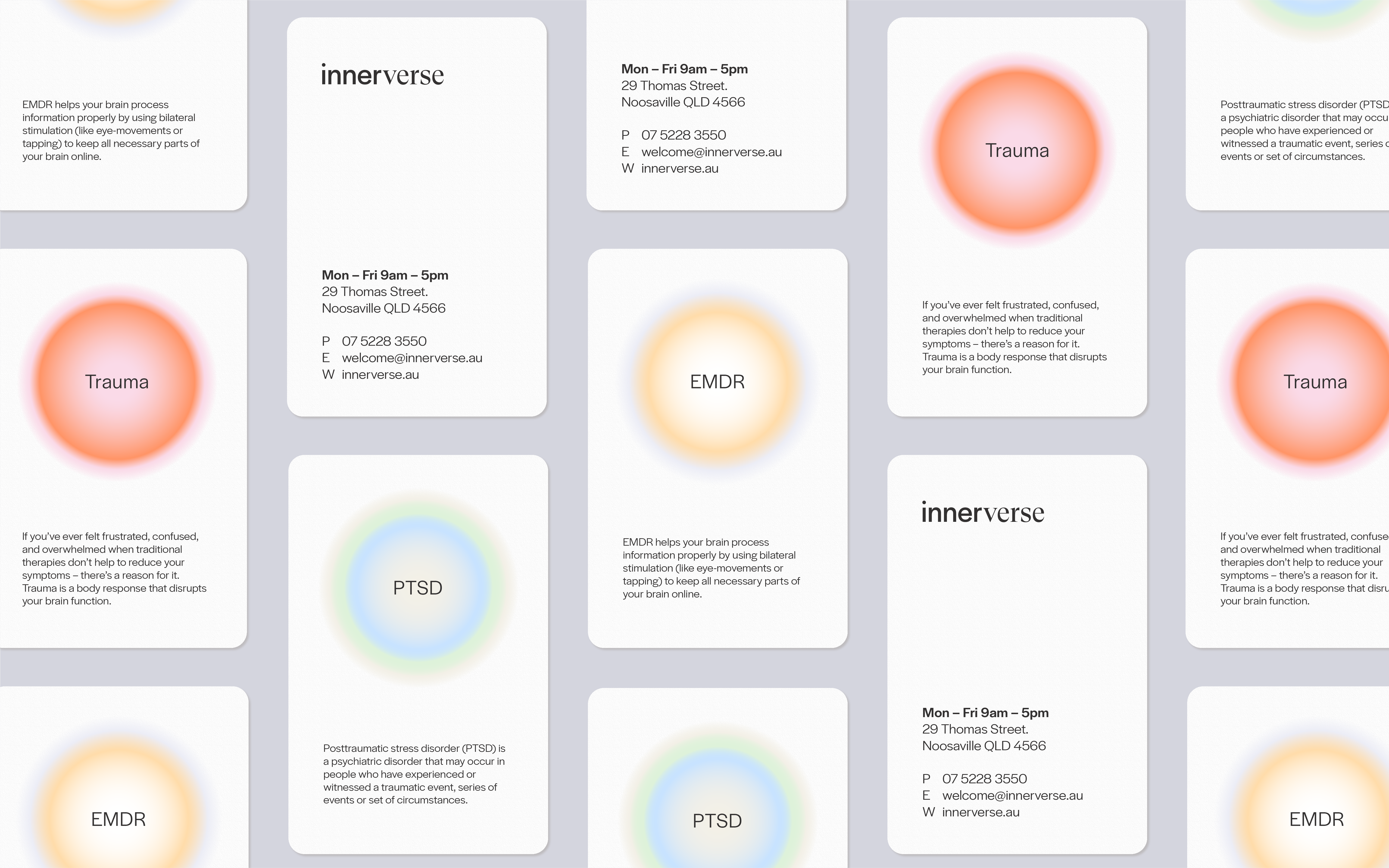
The new logo
A weighted journey.
By combining both sans-serif and serif typefaces at different weights, the logo visually embodies the path towards wholeness and signifies the progress made along the journey of healing from trauma.
The new brand name
Reflecting inside, out.
During our research, we found a fascinating connection between the "Cosmic Web" – the intangible threads that bind the universe - and our brain's neural pathways. That got us thinking: within each of us, lies our own inner universe. And therapy is the tool we use to navigate it. So how did we transform this concept into a name with impact? We invented a word of our own: Innerverse.
Their new brand sings the song of modern professionalism and genuine warmth, with a scientific edge.
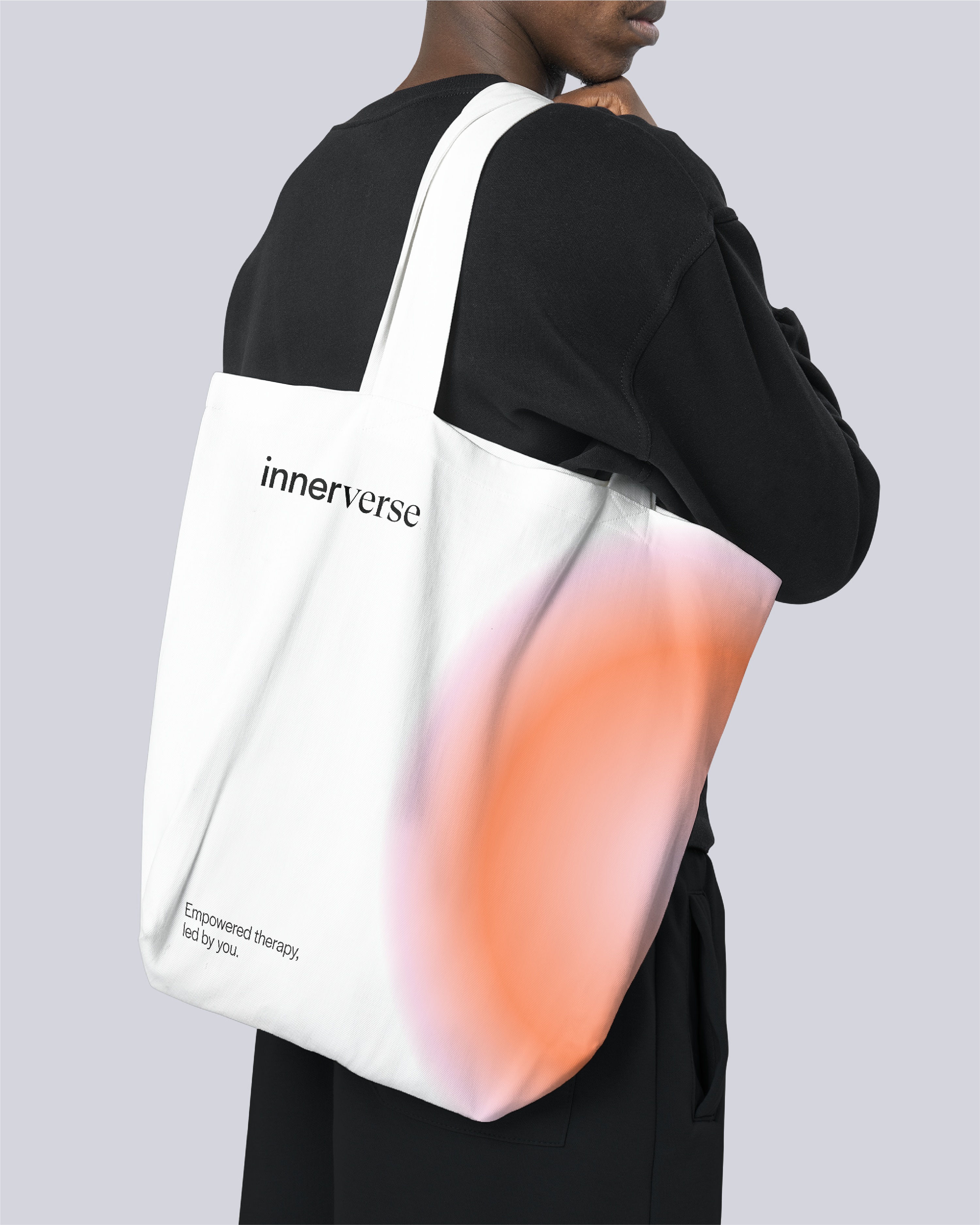
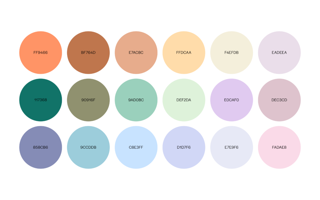
Colours.
The range of colour combinations reflects the diversity of emotions to create a powerful and resonant identity that sparks curiosity, without sacrificing comfort.
Typography.
Readability is a key focus in trauma-informed design. So Halyard Display’s beautifully robust weight, hand-picked classic elements, and lively spirit were perfect for a uniform visual identity with a familiar yet unique personality.
Graphic elements.
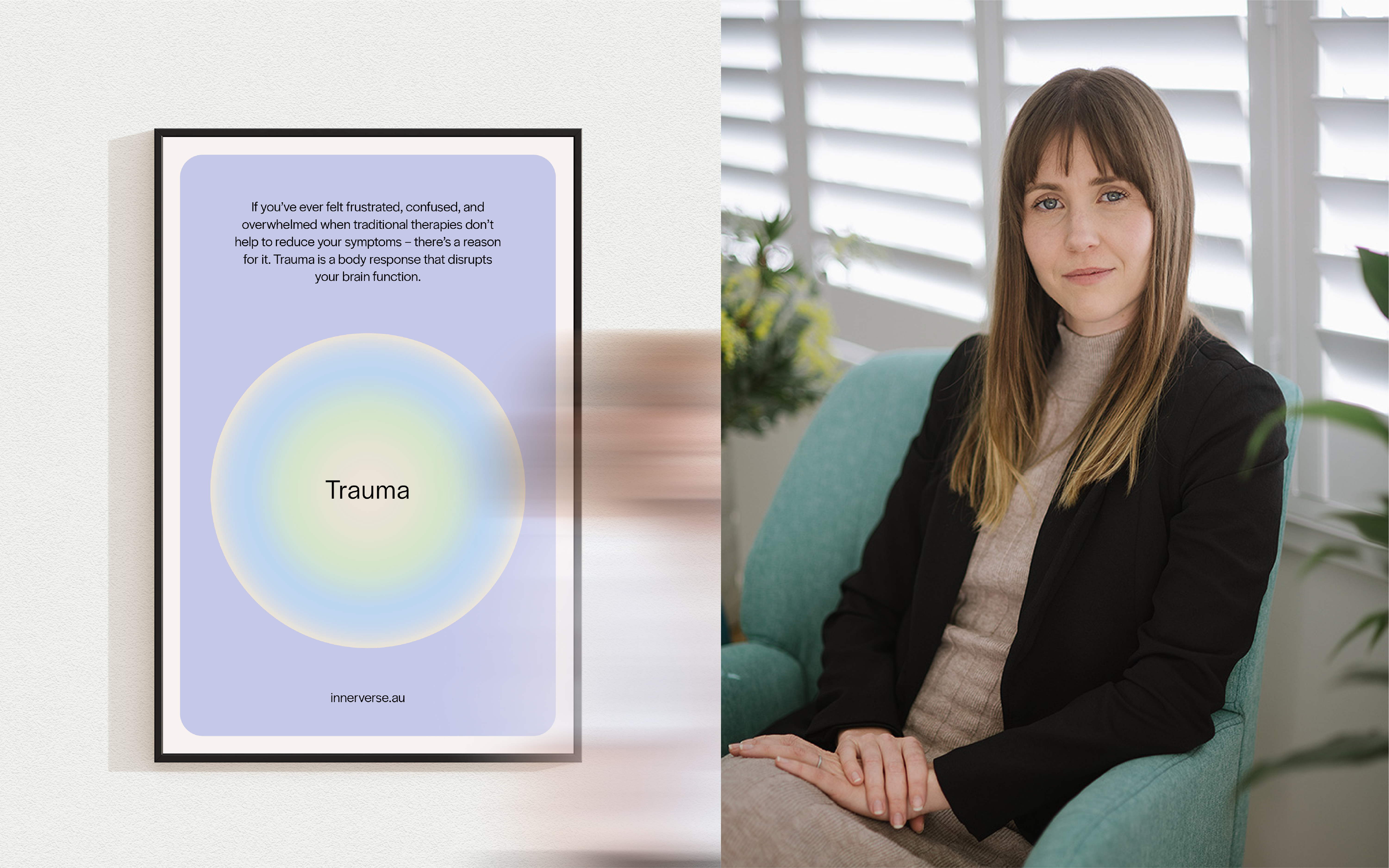
To convey the complexity of the human mind, emotions, thoughts, and sensations are represented by radial colour gradients that form dynamic and intriguing orbs of light.
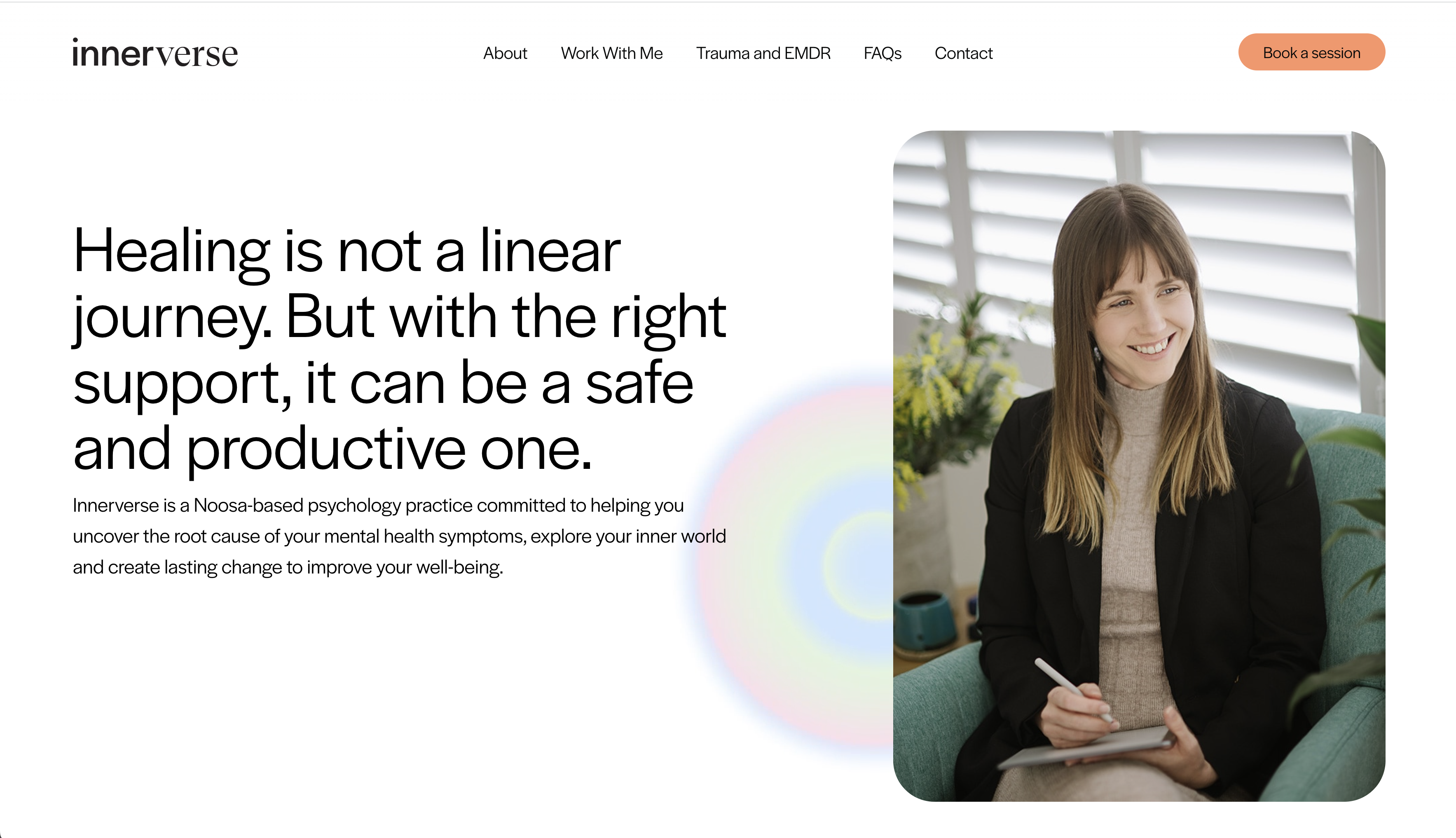
Photography.
Warm. Inviting. Optimistic. Client-focused.
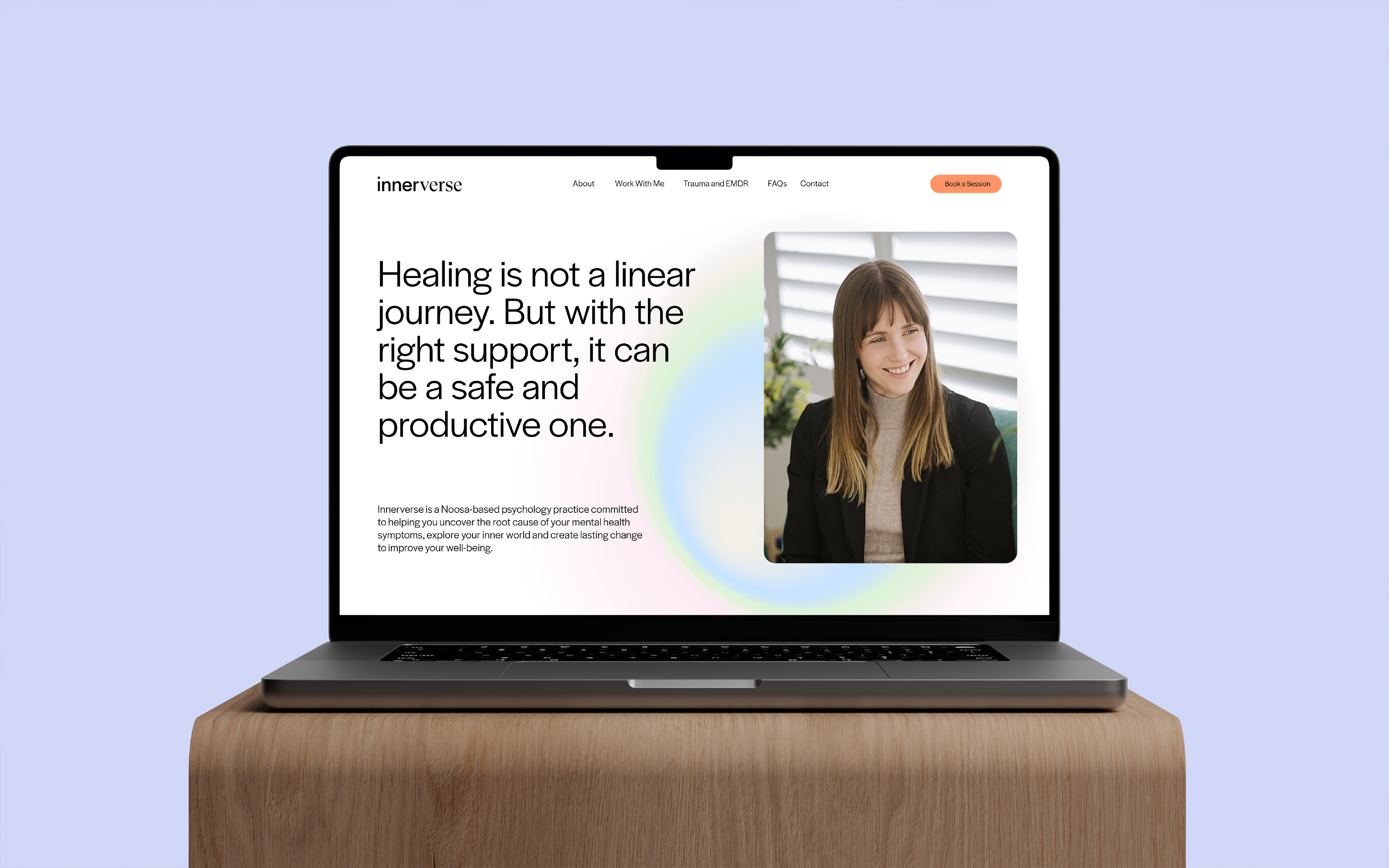
For the photoshoot, we prioritised the use of talent to show the face behind Innerverse in action. Setting clear expectations is a core value for Innerverse, so we used imagery to give potential clients a feel for what they’ll experience during therapy. Our Creative Lead was hands-on during the photography process, providing art direction on the new office interior and wardrobe choices to evoke a modern, comfortable, and optimistic aesthetic.
Trauma-informed design was essential to ensure the new website provided an easy-to-navigate, simple experience that was sensitive to the emotional needs of those seeking help. Through a careful website structuring process, a strong focus on readability, and meticulous reduction of visual clutter, we created a thoughtfully designed and strategically worded website to convey energy, empathy, and expertise.
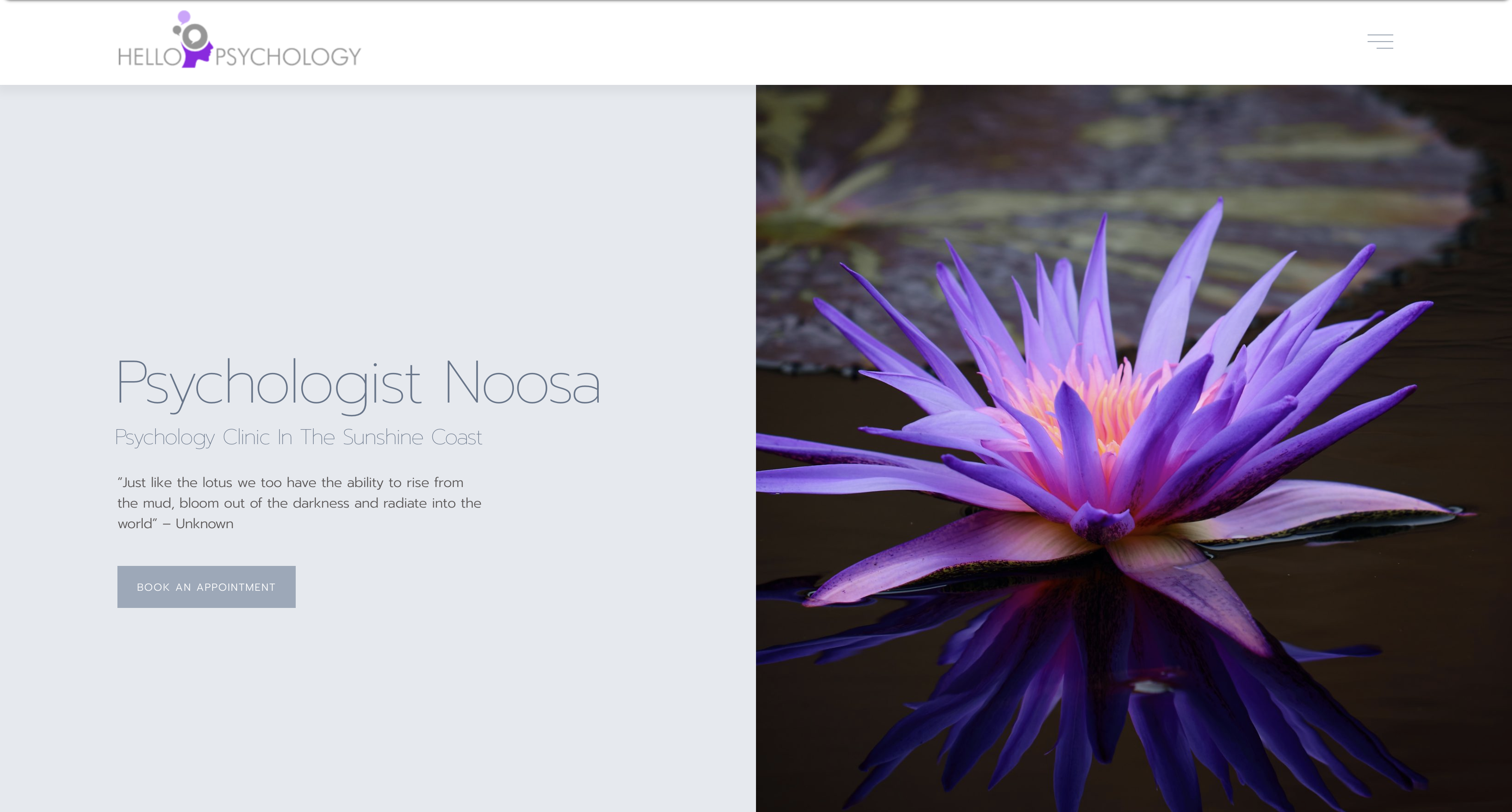
Before
After
Closing statement.
Lorem ipsum dolor sit amet, consectetur adipiscing elit, sed do eiusmod tempor incididunt ut labore et dolore magna aliqua. Ut enim ad minim veniam, quis nostrud exercitation ullamco laboris nisi ut aliquip ex ea commodo consequat.
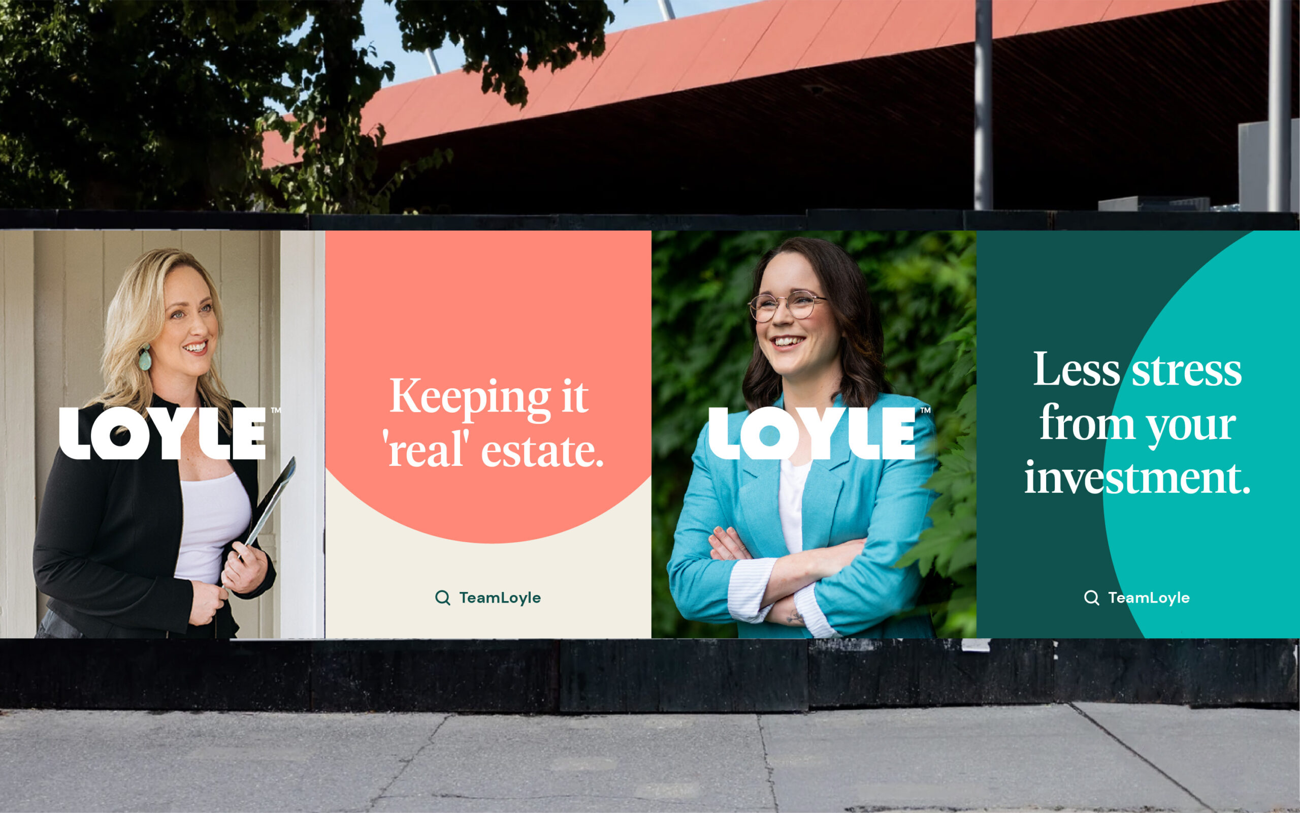
Next up?
Loyle and how to put the real back in real estate.


