Your brand identity is more than just a logo or a catchy tagline. It’s the core of what sets your business apart, defines how customers perceive you, and ultimately drives loyalty. But when you make drastic changes to your brand without considering the potential impact, the results can be catastrophic.
Let’s look at some high-profile branding missteps and what you can learn from them to avoid making the same mistake—especially when it comes to your website.
1. Tropicana’s Packaging Redesign (2009)
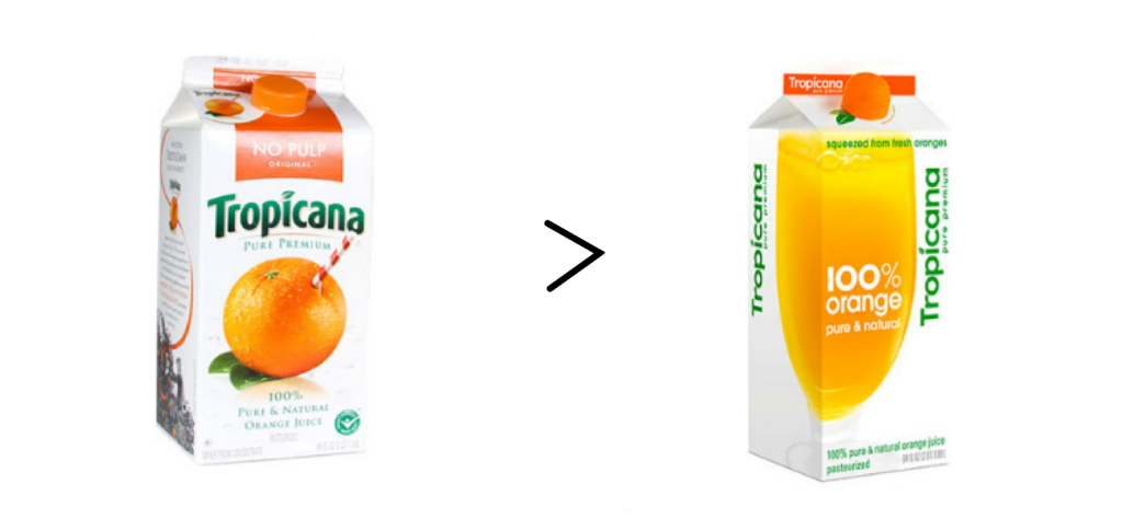
In 2009, Tropicana aimed to simplify its packaging, opting for a cleaner, more modern look. Gone was the familiar image of an orange with a straw in it, replaced by a glass of juice that was far less distinctive.
The Result? Consumers couldn’t recognize the product on the shelf. Sales dropped 20% within two months, costing the company around $30 million USD. Tropicana quickly reverted to its original design. The lesson? Simplifying your message and visuals is fine—but not at the expense of brand recognition.
2. Gap’s Logo Redesign (2010)

Gap decided to modernize its logo with a minimalist Helvetica font and a small blue square. They wanted a fresh, clean look that fit with the modern era. However, the new design failed to resonate with customers.
The Result? A flood of backlash within days. People felt the new logo was generic and lost the brand’s essence. Gap reverted to their old logo within a week. The mistake? Change needs to be gradual, well-communicated, and in line with what your audience expects from your brand.
3. Pepsi’s “Live for Now” Tagline (2012)

In 2012, Pepsi introduced the tagline “Live for Now” as a way to appeal to a younger audience. The phrase was meant to align with the fast-paced, social media-driven world. But there was one problem: it didn’t speak to Pepsi’s core brand or values.
The Result? The tagline felt shallow and disconnected from Pepsi’s history of being a fun, youth-driven alternative to Coca-Cola. Consumers didn’t respond, and Pepsi struggled to gain traction. Oversimplifying your message without keeping your brand identity intact can alienate your audience.
4. Burger King’s Satisfries (2013)
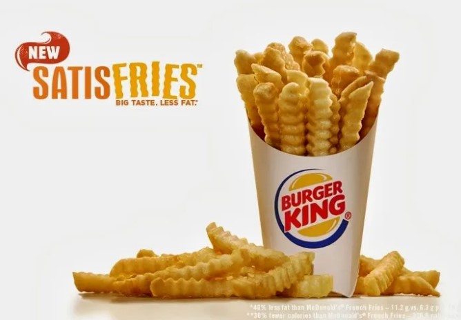
Burger King launched Satisfries as a healthier alternative to their regular fries. The idea was sound, but they failed to clearly communicate what made these fries special, and worse, they charged more for them.
The Result? Customers were confused and didn’t see the value in paying extra for something they couldn’t differentiate. Sales flopped, and the product was discontinued within a year. When simplifying or changing your offerings, clarity and customer education are key.
The Same Dangers Apply to Your Website
These branding missteps don’t just happen with logos, taglines, or packaging—they happen when businesses overhaul their websites, too. Changing your site without a plan can confuse or alienate your audience, especially if:
- Old Branding Disappears Overnight: If your customers are used to seeing specific colors, logos, or layouts, removing them too suddenly can cause confusion.
- Removing Old Pages Without Notice: Older pages or sections of your site may still be valuable to loyal customers or contain SEO rankings that are critical for traffic. If you pull them without a proper redirect strategy, you risk losing traffic, trust, and authority.
- Failing to Communicate Changes: A website redesign should always be paired with clear communication to your customers. Let them know what’s changing, why it’s changing, and how it benefits them.
Whether you’re tweaking your logo or giving your website a facelift, having a well-thought-out plan in place is critical to ensure you maintain customer trust and brand recognition.
When Brands Got It Right: Simplification Success Stories
While many companies have struggled with rebranding and oversimplification, some have nailed the art of streamlining their message—creating a clearer, stronger connection with their audience.
1. Old Spice’s “The Man Your Man Could Smell Like” (2010)
Old Spice was once seen as a product for older men, but that all changed with their now-famous campaign, “The Man Your Man Could Smell Like.” With a humorous and confident tone, Old Spice simplified its message to focus on how using their product would make men feel desirable. This simplicity, paired with the viral charm of the campaign’s character, transformed the brand’s image.
The Result? A once-fading brand became relevant again to a younger, more diverse audience, while also maintaining its core customer base. The key to Old Spice’s success? They streamlined their message without losing sight of their brand identity.
2. McDonald’s “I’m Lovin’ It” (2003)
In the early 2000s, McDonald’s needed a unifying message to strengthen its global presence. They introduced the simple, positive slogan “I’m Lovin’ It,” which focused on the joy and comfort of enjoying McDonald’s food. It was catchy, universal, and aligned with the brand’s promise of an enjoyable fast-food experience.
The Result? “I’m Lovin’ It” resonated across different cultures and age groups, becoming one of the most successful global campaigns in the brand’s history. By simplifying its message, McDonald’s managed to connect with consumers on a deeper emotional level while reinforcing its brand identity worldwide.
These examples show that simplification doesn’t mean stripping away the essence of your brand. When done thoughtfully, it can help you reach new audiences, re-energize your brand, and create lasting emotional connections.
Let LINK Creative Help You Navigate Change
At LINK Creative, we understand how important it is to get brand identity right. If you’re looking at rebranding, launching a new product, or redesigning your website, we can help you create a strategy that simplifies your message while keeping your brand identity strong. Call us today on 07 3899 8311 or use our online contact form and ensure your brand evolves the right way.