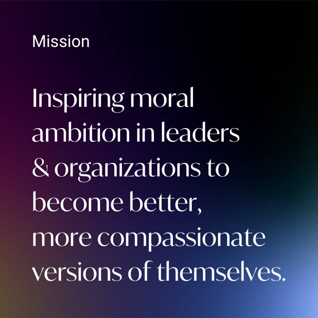
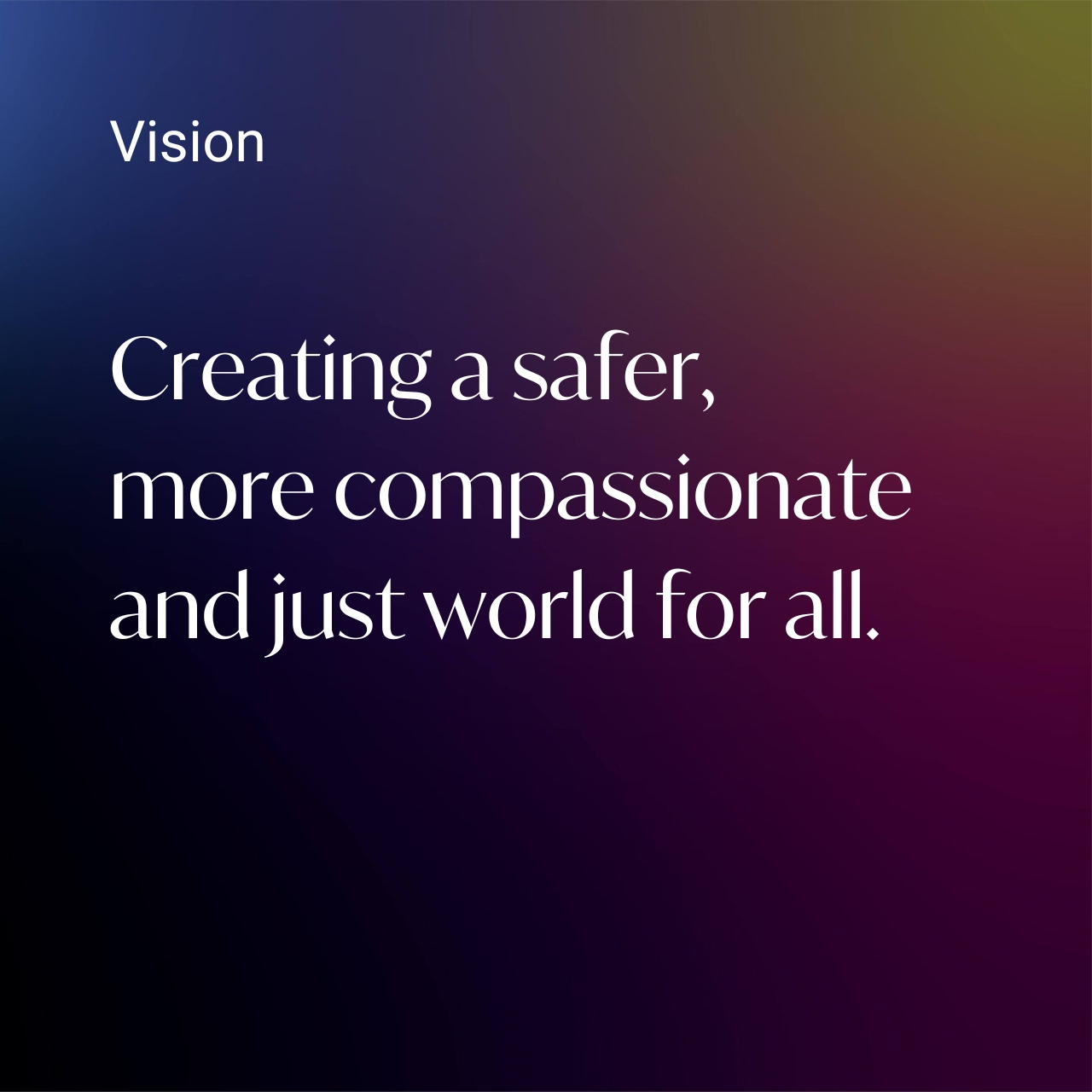
SIDNEY DEKKER

A visionary leader in organisational safety.

Ranked in the top 1% most influential scientists in the world, Sidney Dekker is a globally sought-after keynote speaker. He came to us with the reputation, expertise, and proven history of transforming global safety — but his visual brand identity didn’t match his monumental impact.

How we helped

Brand strategy
Brand design
Web design
Copywriting

Our mission?

Translate decades of pioneering research and global change into a brand that feels as groundbreaking as Sidney’s prolific body of work.

Brand strategy

Bold meets gentle.

Sidney is a force — strong, confident, and brimming with wisdom. His brand had to reflect his core belief: safety starts with compassion. So we blended his strength with compassionate touches to show the full spectrum of his multi-faceted personality — bold yet human, grounded yet transformative.

the approach

Sidney is a force — strong, confident, and brimming with wisdom. We balanced these elements with softer, compassionate touches to show the full spectrum of his multi-faceted personality — bold yet human, grounded yet transformative.

Messaging

Capturing the dynamism of a visionary leader.

A professor, keynote speaker, prolific author, pilot, and chaplain – Sidney is dynamic and packed with passion. Our challenge? Capture it all. Confident and composed (but never afraid to push the envelope), we balanced authority and warmth, for a tone that’s clear, compelling, and distinctly human.

The new logo

Two variations, one powerful brand.

The WoRDMARK

The wordmark blends modern and classic elements - distinct, but not traditional. Sidney's new logo reflects his wisdom and bold, progressive nature. The font is smooth and flowing, conveying wisdom and approachability, while its structure exudes trust and authority.

The ICON

We merged the letters S & D (an ode to his name and his core principle 'Safety Differently') with an abstract brain symbol to represent his intellect and ideas. The design also draws inspiration from a fingerprint (personal touch), a target (focus), and a maze (guiding people through complex problems). Small openings at the edges remove any sense of “closed thinking”, symbolising openness and endless possibilities.

Colours.

Dark backgrounds make his wisdom the star of the show. The sleek, professional, colour application keeps the focus on what he has to say, while contrast denotes clarity and prestige.

Typography.

Simple yet modern. Using a unique font like Ivymode to surprise and prime the audience for groundbreaking ideas. In combination with Roboto to ground the design, the fonts blend confidence, sophistication, and warmth, setting the tone for a brand that feels fresh and exciting.

Secondary element.

Inspired by stage lights – the gradient element also softens the overall look and reflects the compassion emanating from him and his work.

The new website

A true reflection. A digital stage. A warm invitation.

The website combines Sidney’s innovative ideas, compassionate leadership, and authoritative presence into one seamless experience. From the fresh design to the carefully crafted message, every element reflects his global influence and impressive body of work. More than a brand showcase, it’s a reflection of Sidney himself and an invitation for the world to join the safety revolution.

Before

After

Next up?

Innerverse: therapy at the intersection of science and empathy.

Let’s have a coffee.

Expert advice, a killer brew, and a plan for your world domination.

Let’s have a coffee.

Expert advice, a killer brew, and a plan for your world domination.

We send non-annoying emails.

5 articles. 2 min reads. All wrapped up in one fortnightly newsletter.

Mailing List

You got a question? 

Pop in your question, share your story, or say a quick hello and one of our friendly team will hit you back ASAP.  
Web Health Check
Checkboxes