PowerUp has been delivering fast, expert electrical solutions across South East Queensland for over 10 years. Trusted by some of the biggest names in the game (Tesla, Westfield etc.), their reliable and knowledgeable service sets them apart. But their brand wasn’t fully reflecting this. As they grew, they needed a brand that showcased their strengths to new clients and potential team members.
How we helped
Brand strategy Brand design Web design Copywriting
Our mission?
We modernised PowerUp’s brand with a fresh identity, website, and message that highlights their strengths and fuels their growth – inside and out.
Brand strategy
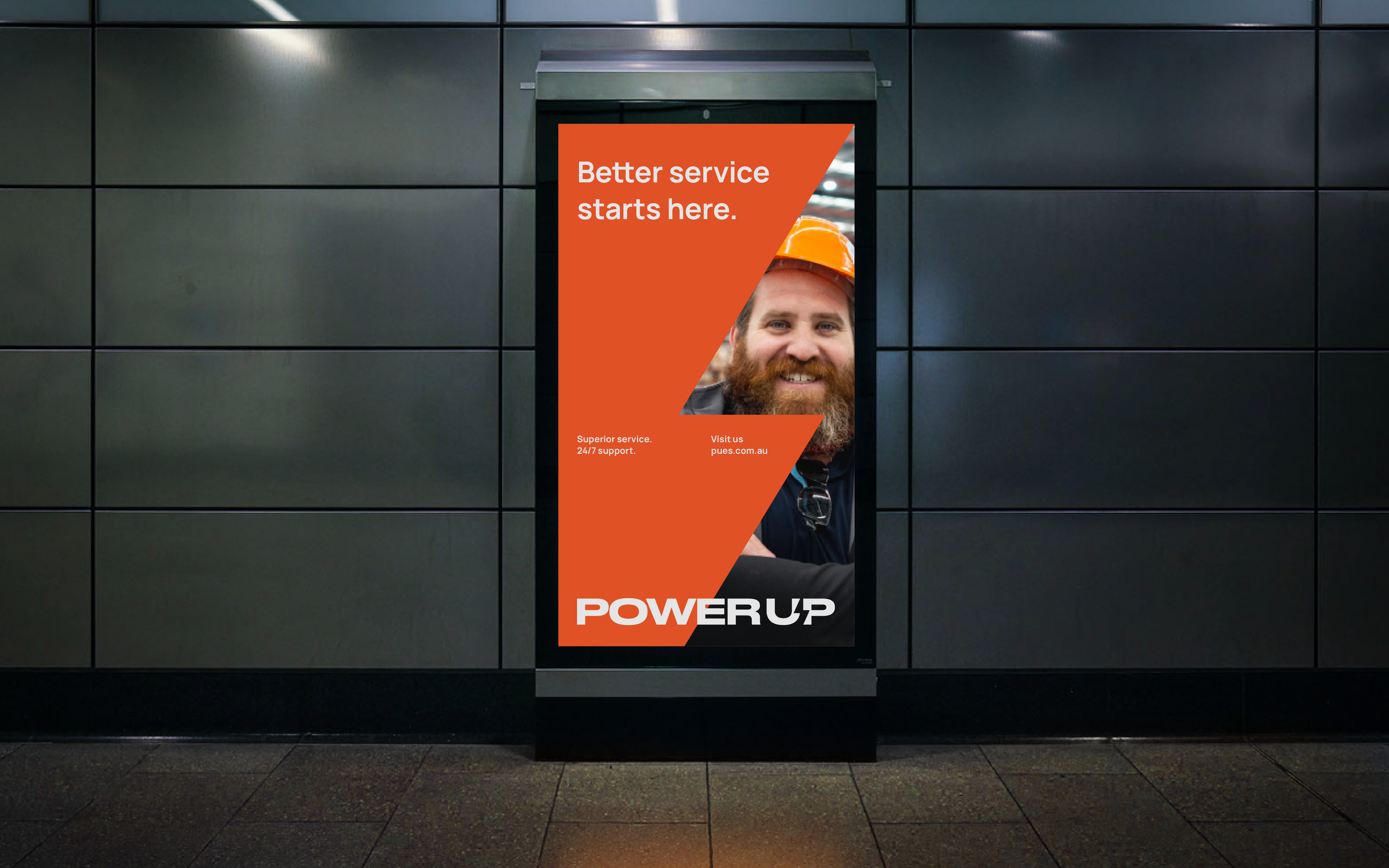
Reliable solutions. Superior service.
What happens when you mix the genuine care of a local sparky with the reliability of a large enterprise? You get PowerUp Electrical Solutions. Known as the go-to for a wide range of electrical needs, they needed a brand that showcased exactly why people love working with them.
the approach
We laid the foundation for PowerUp’s fresh, modern upgrade, adding an air of confidence that matches their skill. But their success comes from more than just their expertise. It comes from their people. So we brought what truly makes them great — their team of friendly experts — into the spotlight.
Messaging
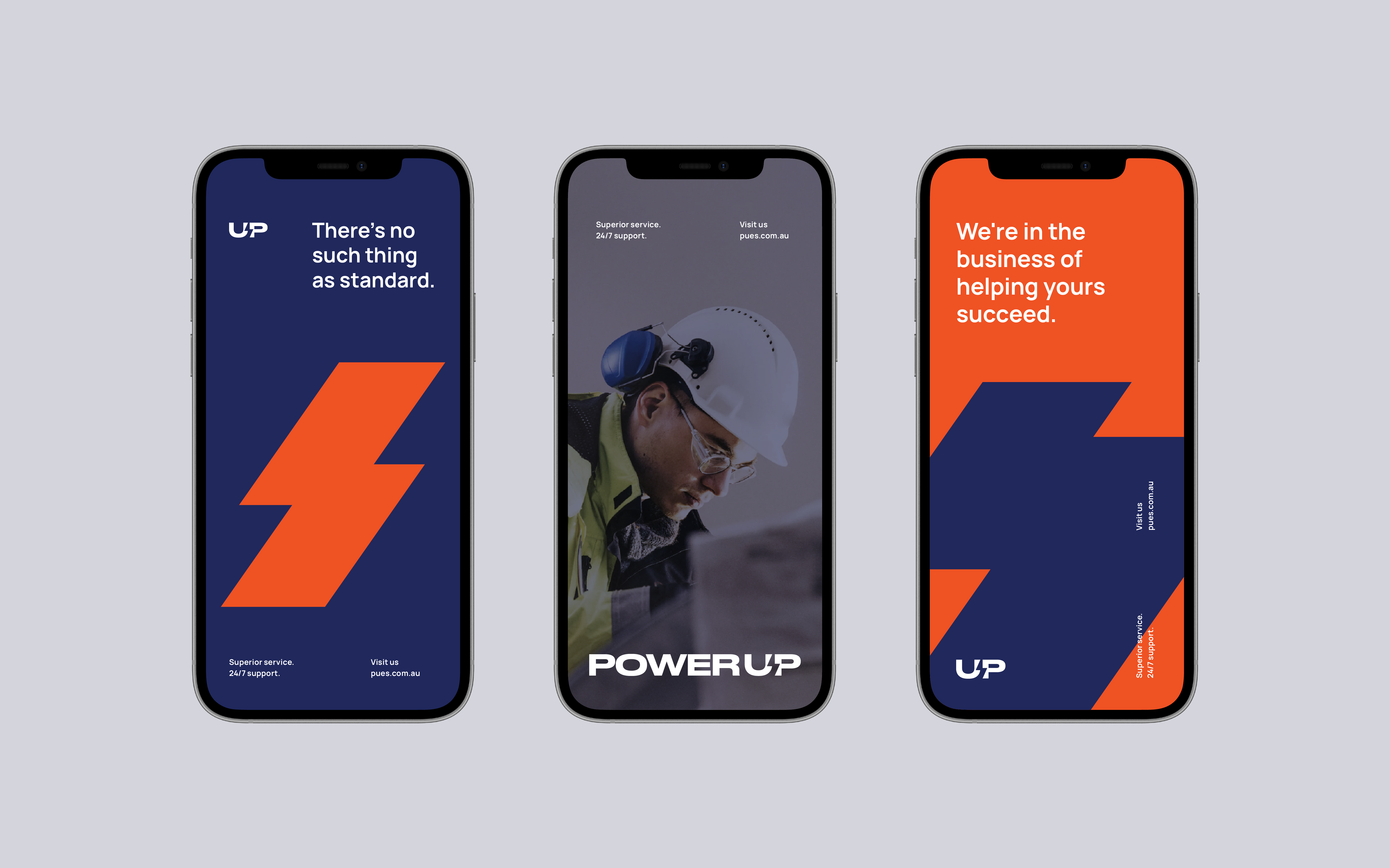
There's no such thing as standard.
PowerUp has perfected their systems, processes, and methods over years of hard work. Their brand message needed to toe the line of confidently owning their unmatched skill, while staying humble enough to connect with clients on their level.
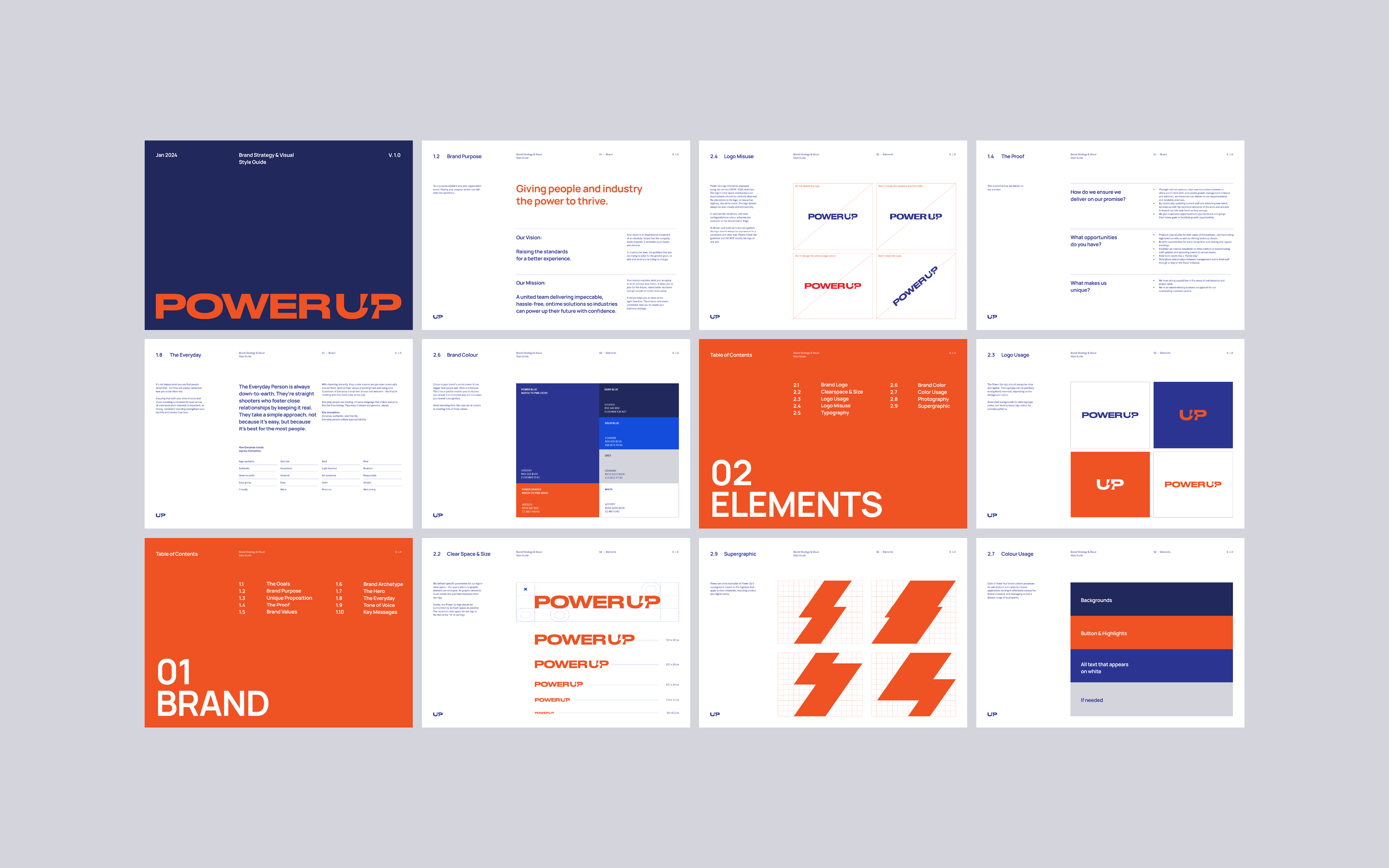
The new logo
Approachable authority.
PowerUp’s new wordmark features a sleek sans serif font with a lightning bolt cleverly crafted from negative space - symbolising their ability to deliver outstanding results, lightning fast.
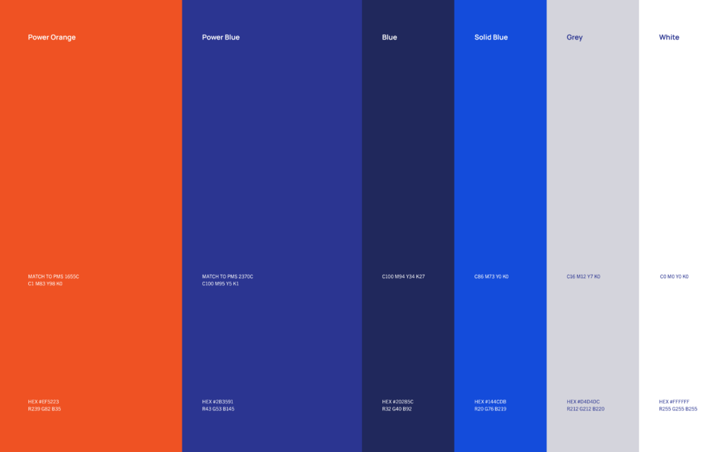
Colours.
We refined their colour palette, switching from bright blue and yellow to a deeper blue and vibrant orange. These bold colours focus attention on key elements, sparking visual interest across their brand identity.
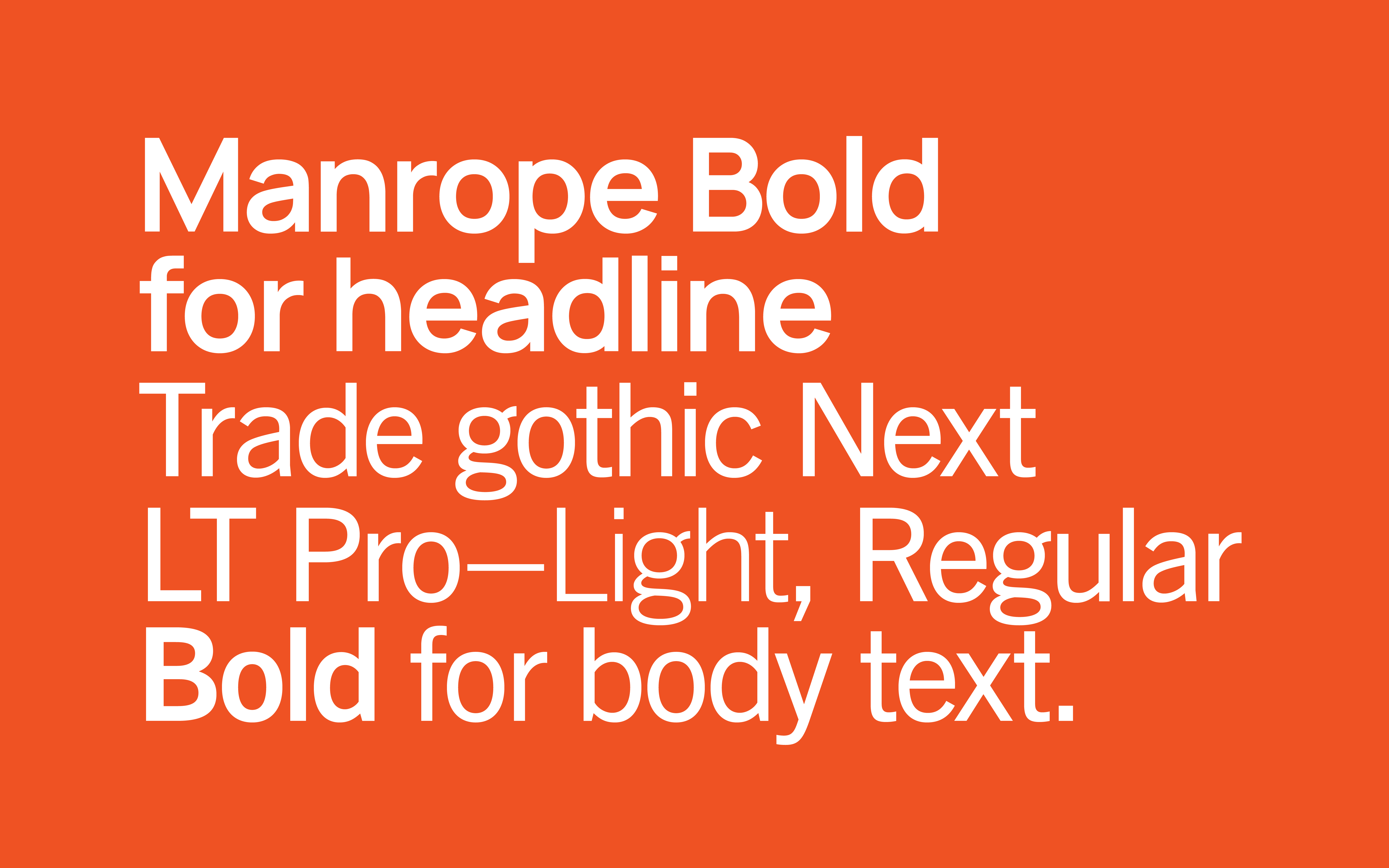
Typography.
The blend of Manrope’s bold yet friendly curves and Trade Gothic’s clean readability was perfect for a brand that’s both confident and approachable.
Graphic elements.
Bringing in the lightning shape from the logo, we created image overlays that add a dynamic energy to the visuals. Now, it accurately reflects the unique dynamism of the PowerUp team.
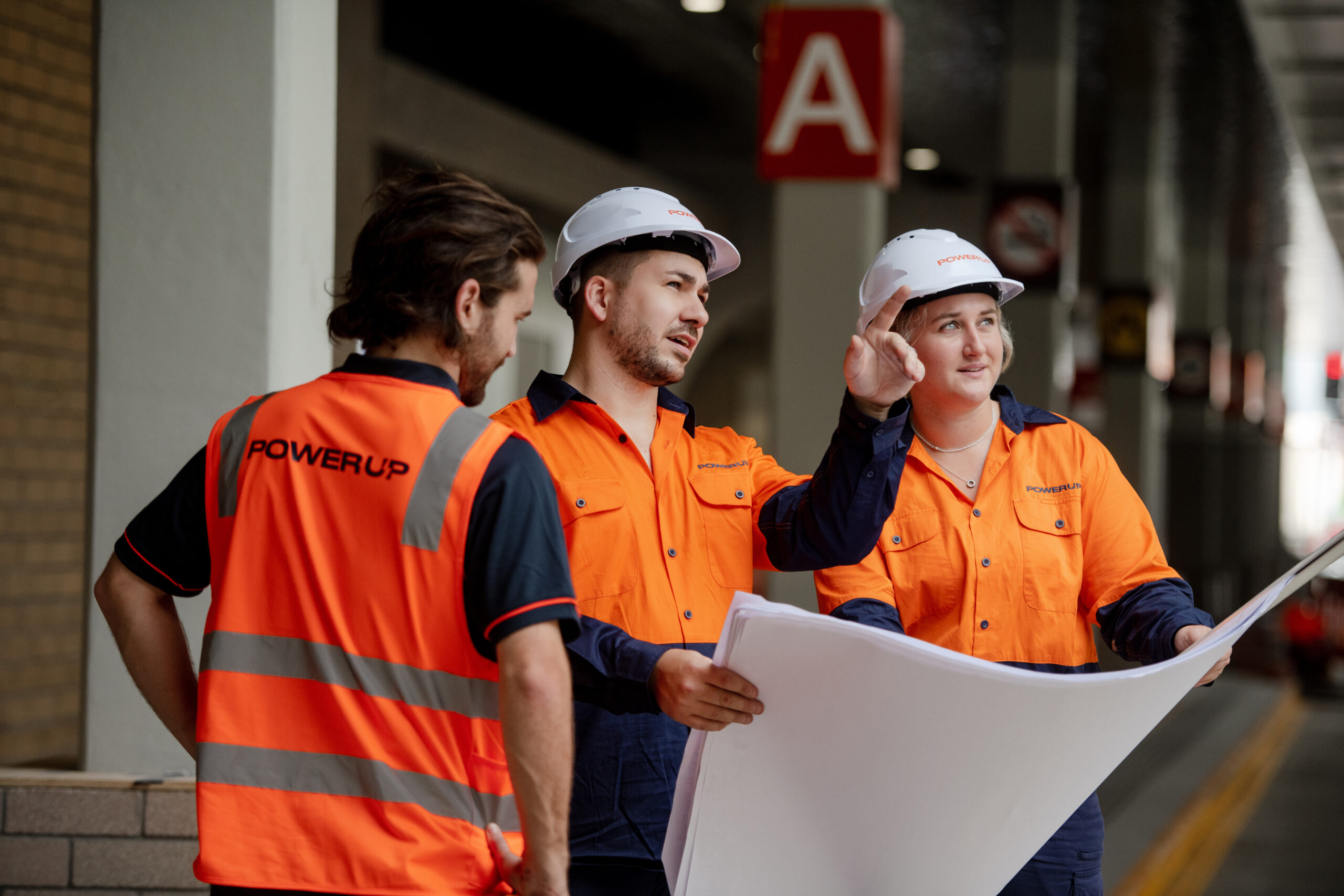
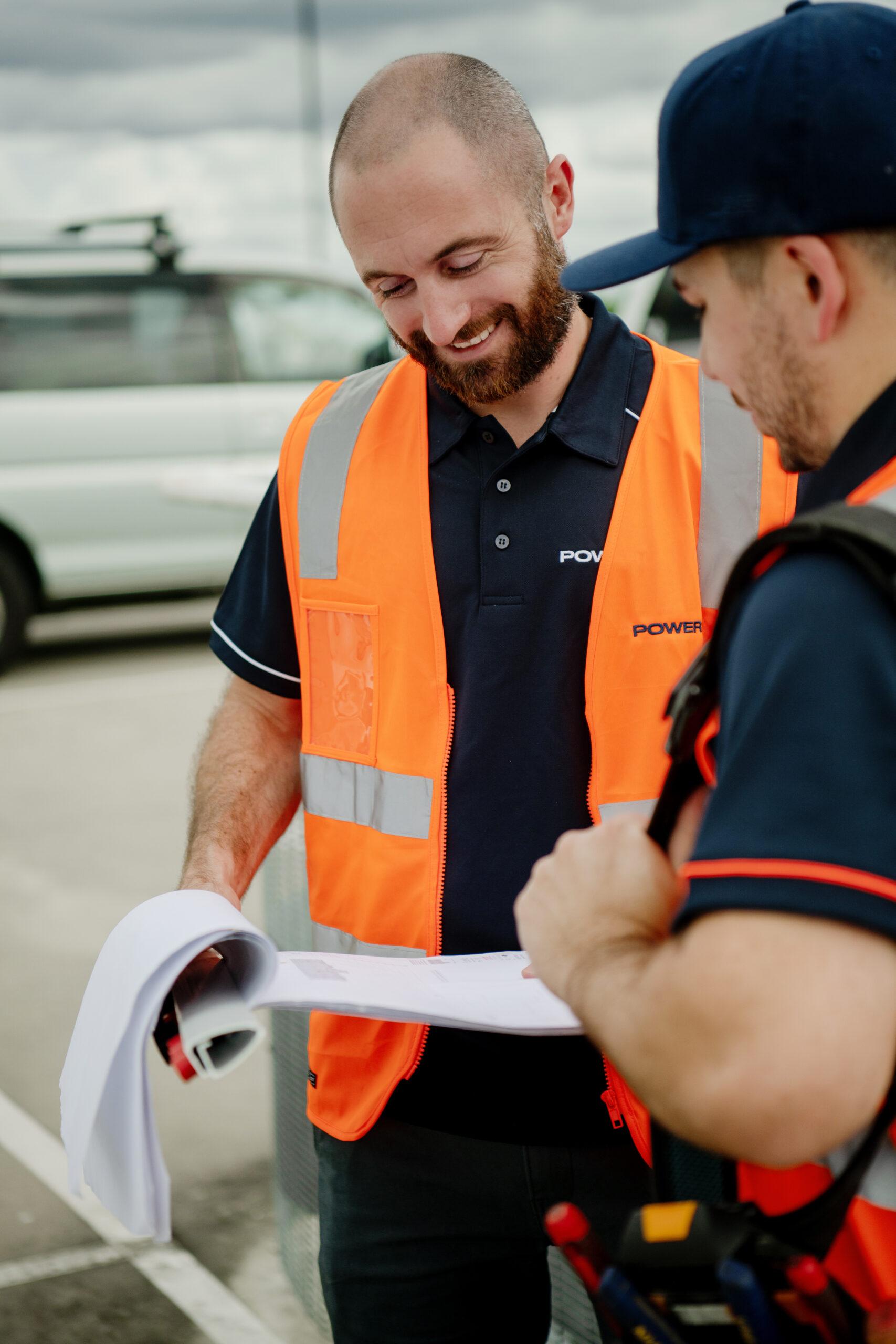
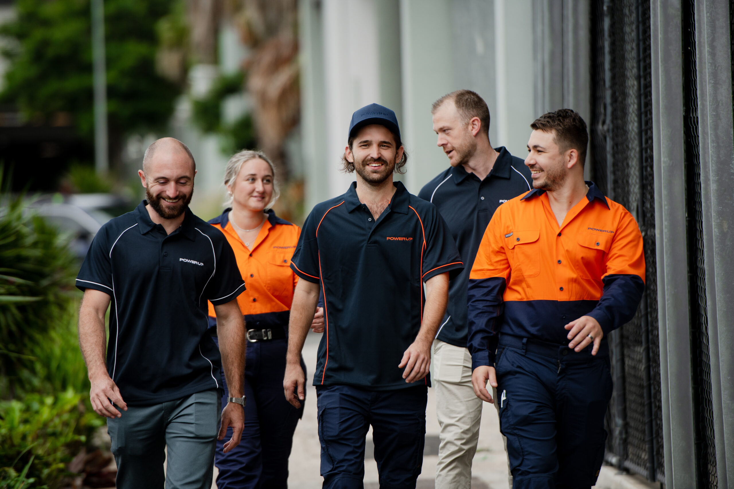
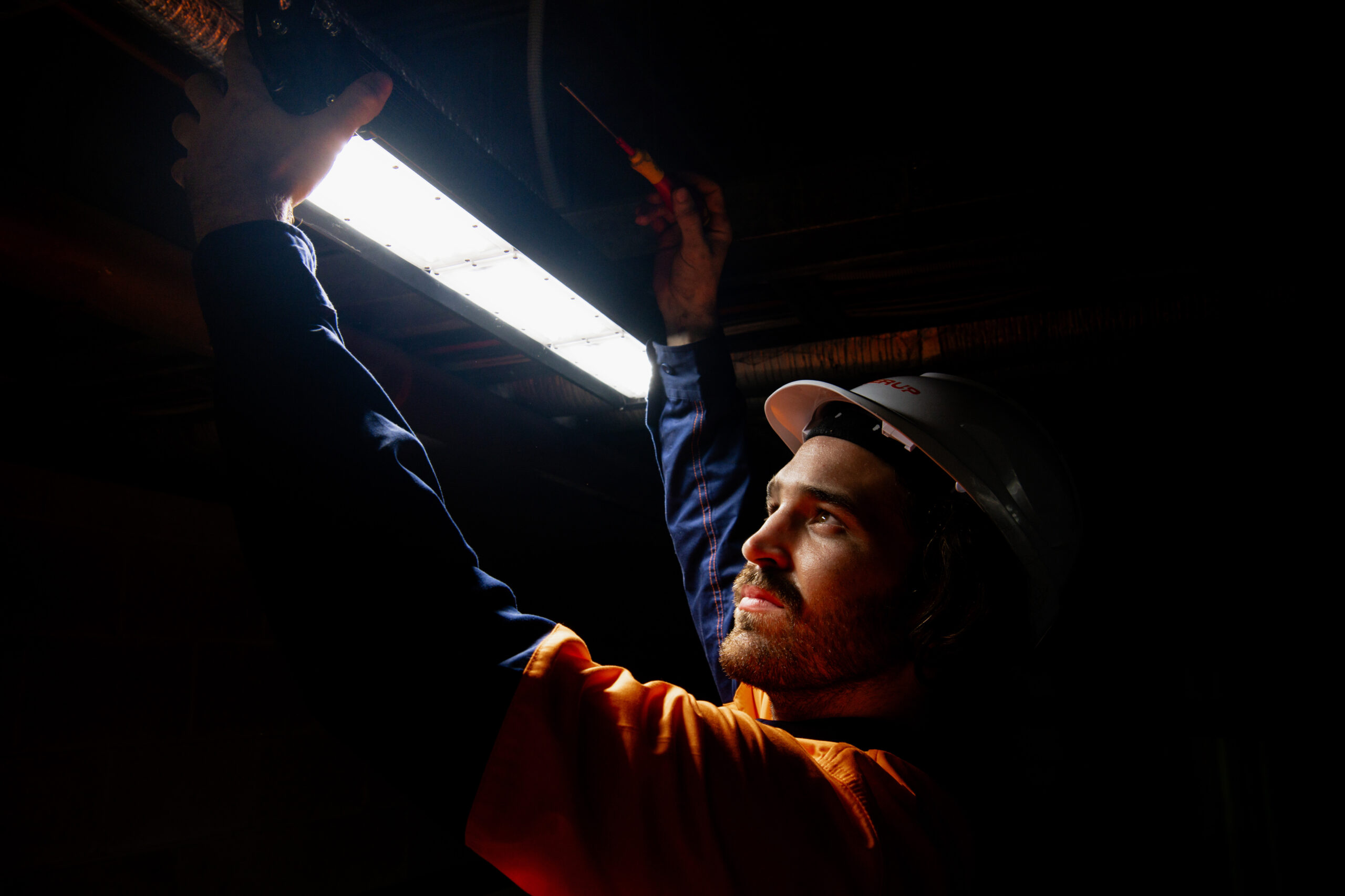
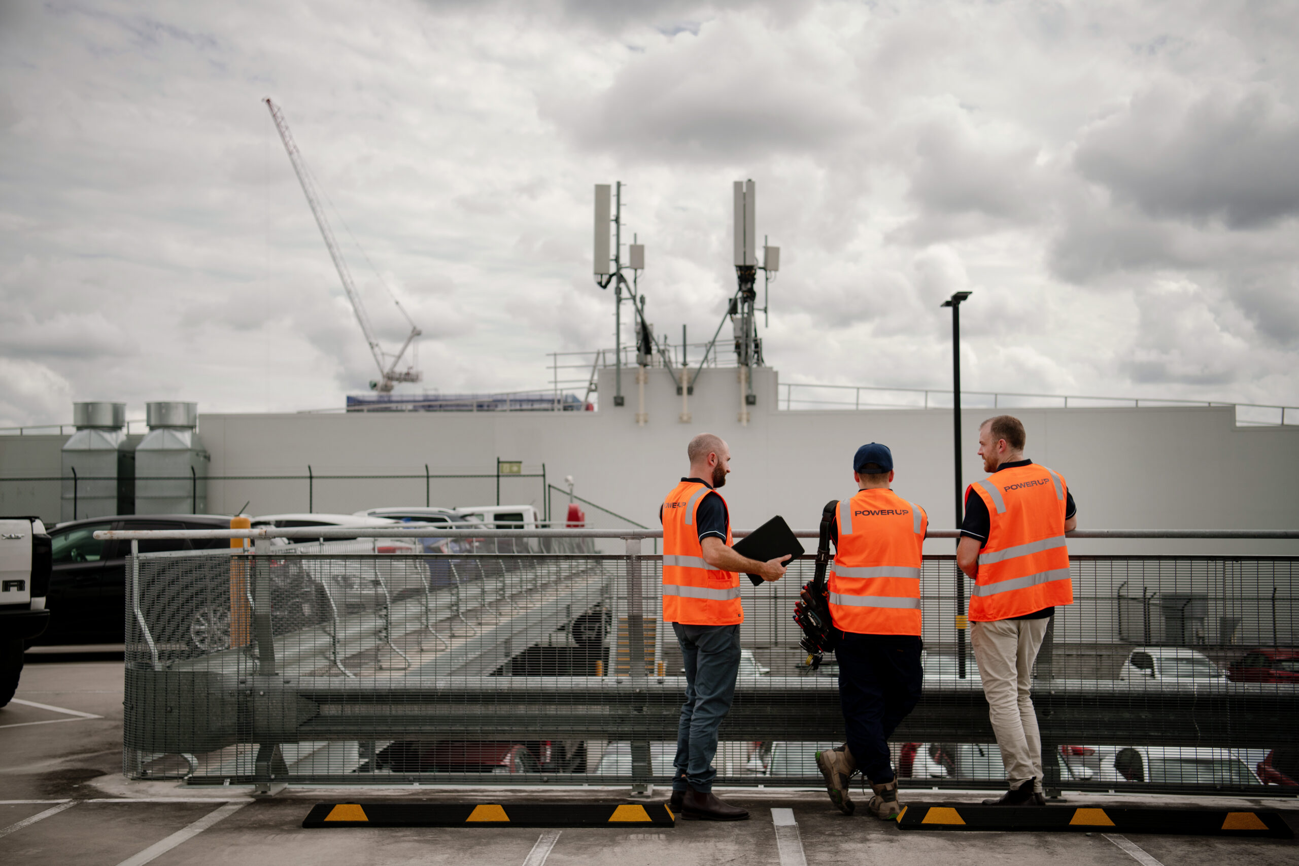
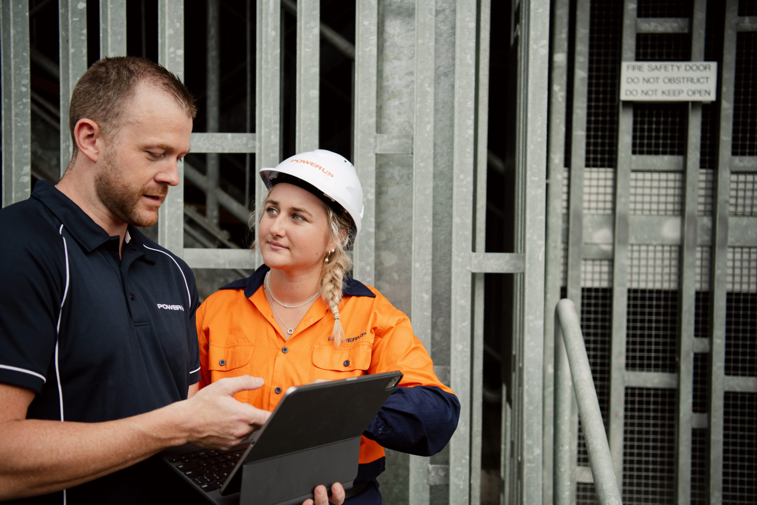
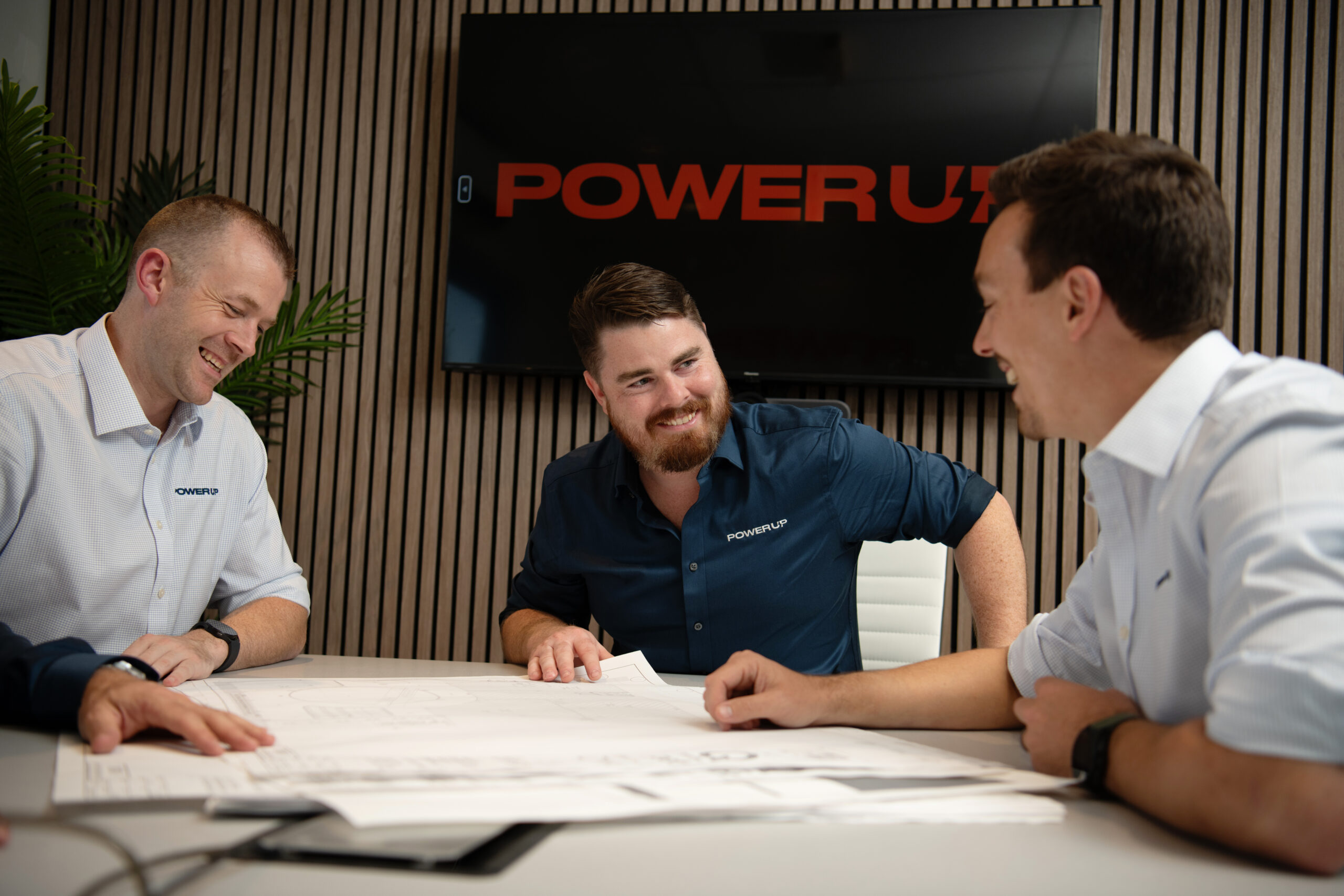
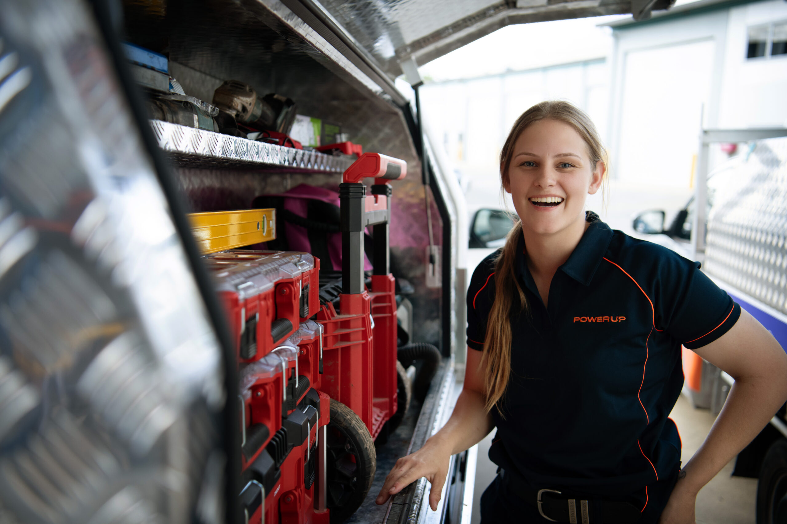
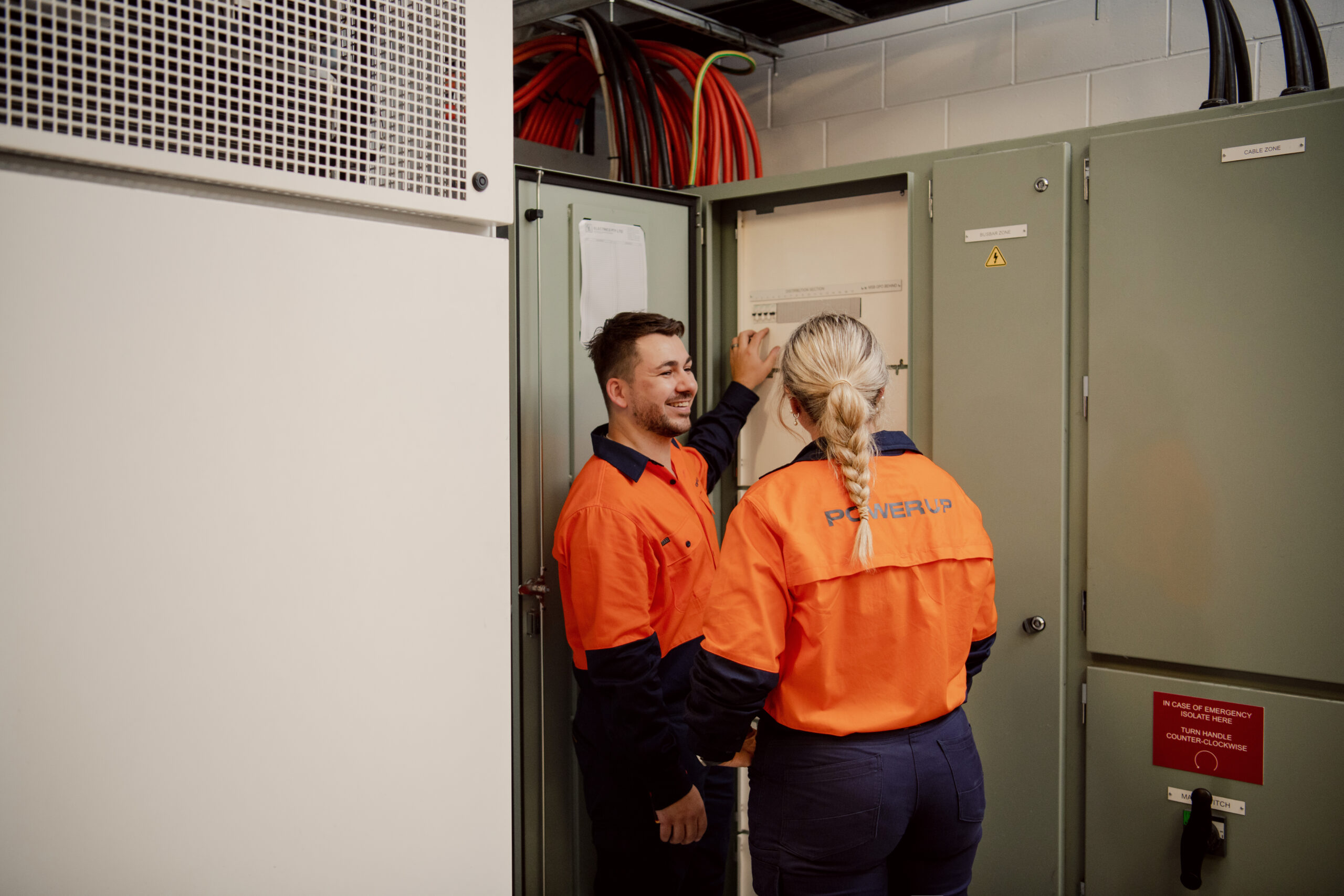
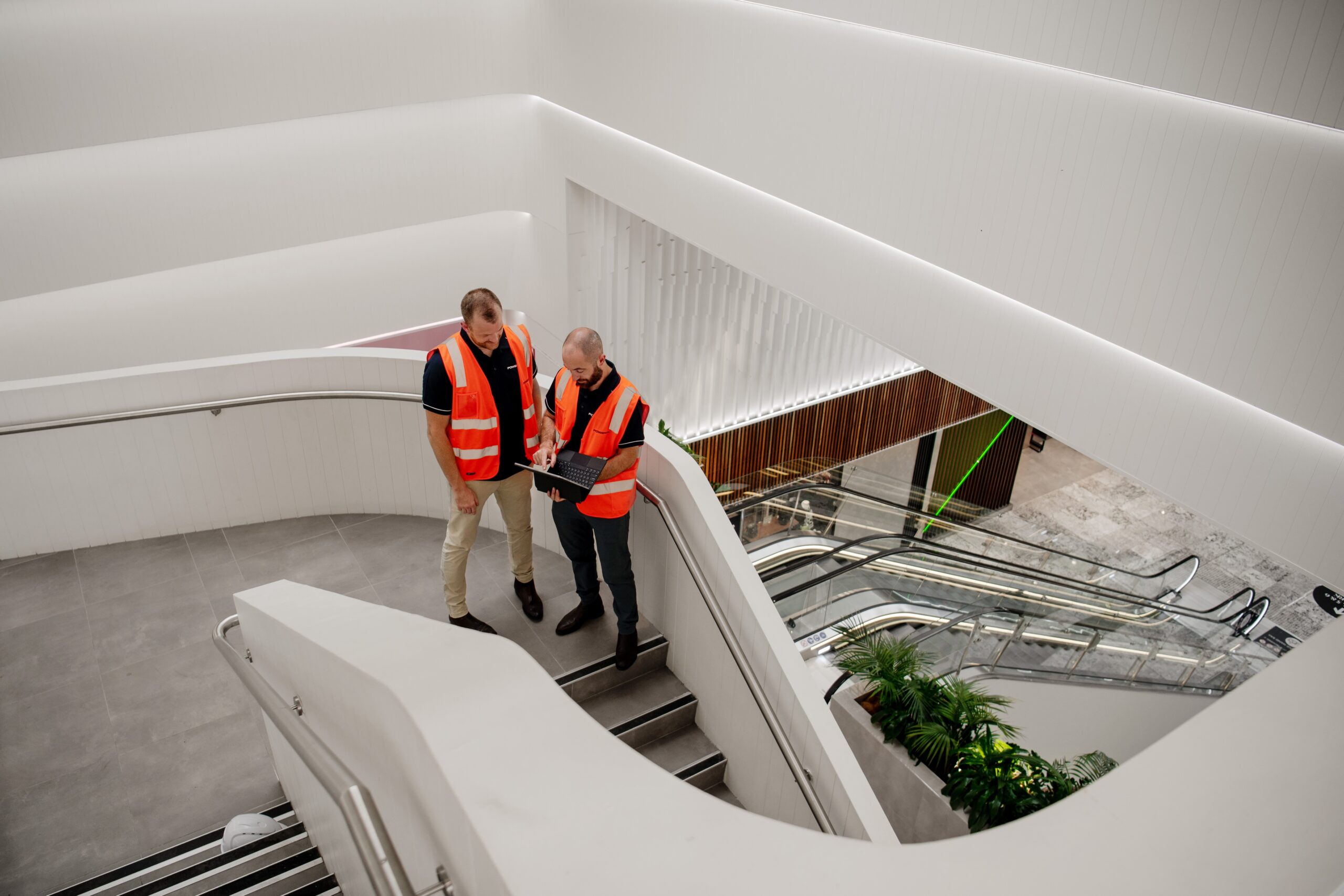
Photography.
Loveable. Bold. Sincere.
The PowerUp team are skilled technicians with a great attitude. So we captured them in their element, on-site and hard at work at a large QLD shopping centre. By shooting them in action, we were able to capture their focus, aptitude, and attitude all at once.
"I can't thank the team at Link enough for their help in our company re-brand. from the initial engagement through to go live and handover training they have been brilliant. Thank you team, and this isn't the end we'll be sure to keep in touch throughout our journey and I would highly recommend James and his team to anyone looking for assistance with branding, website design and copy."'
TOM BARRETT
POWER UP ELECTRICAL SOLUTIONS
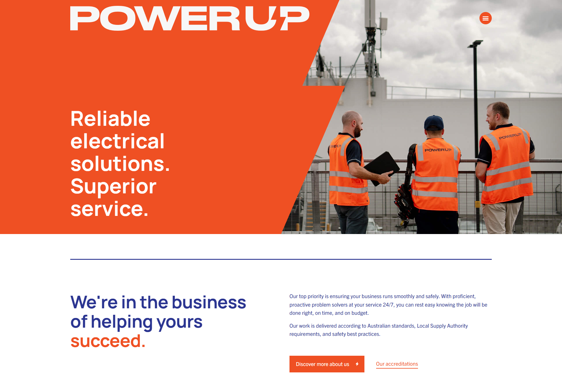
The new website
A fresh new feel for a new era of growth.
With a bold new design, engaging copy, and a seamless customer journey, PowerUp’s revamped website now reflects their top-tier status in the electrical industry, while keeping the spotlight on the hardworking team at the core of it all.
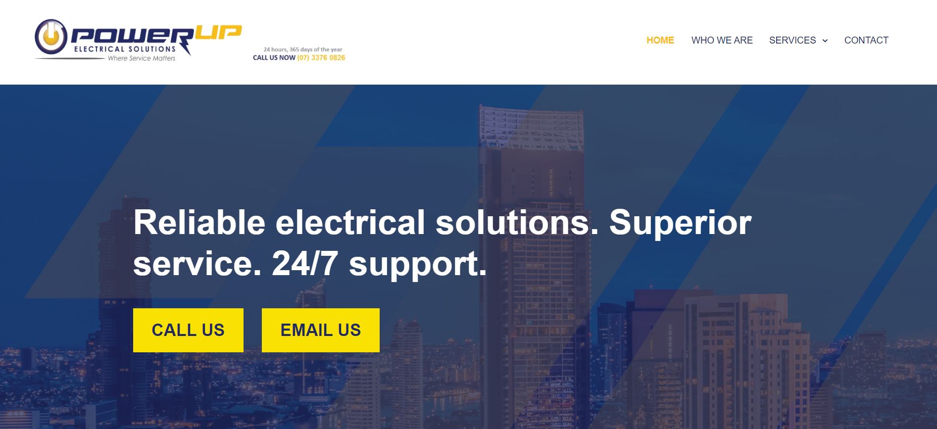
Before
After
Next up?
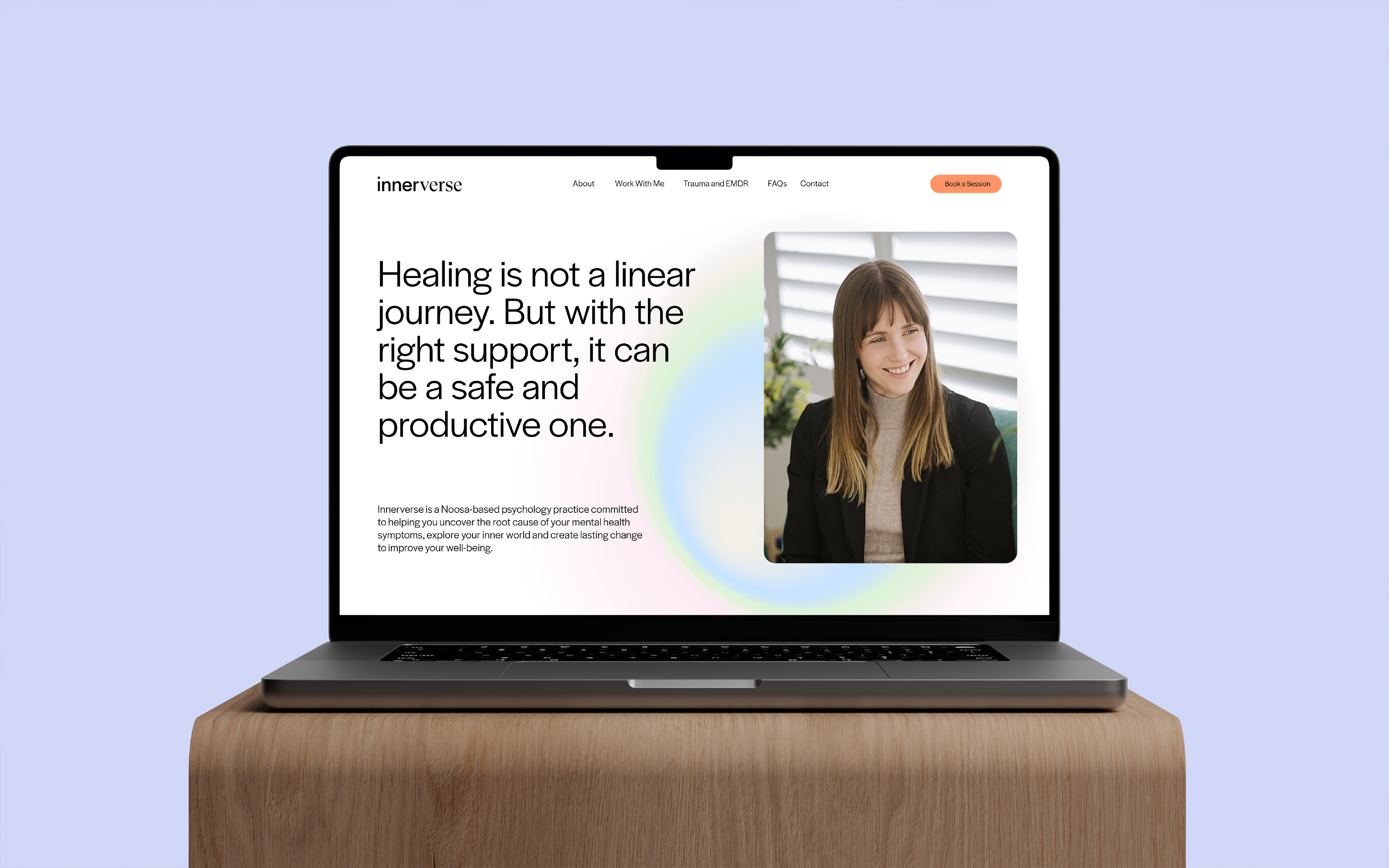
Innerverse: therapy at the intersection of science and empathy.


