As a quick-thinking and precise boutique firm, People Group offers a credible solution for Australian companies who are struggling to find great people that stick.
How we helped
Brand strategy Brand design Web design Copywriting
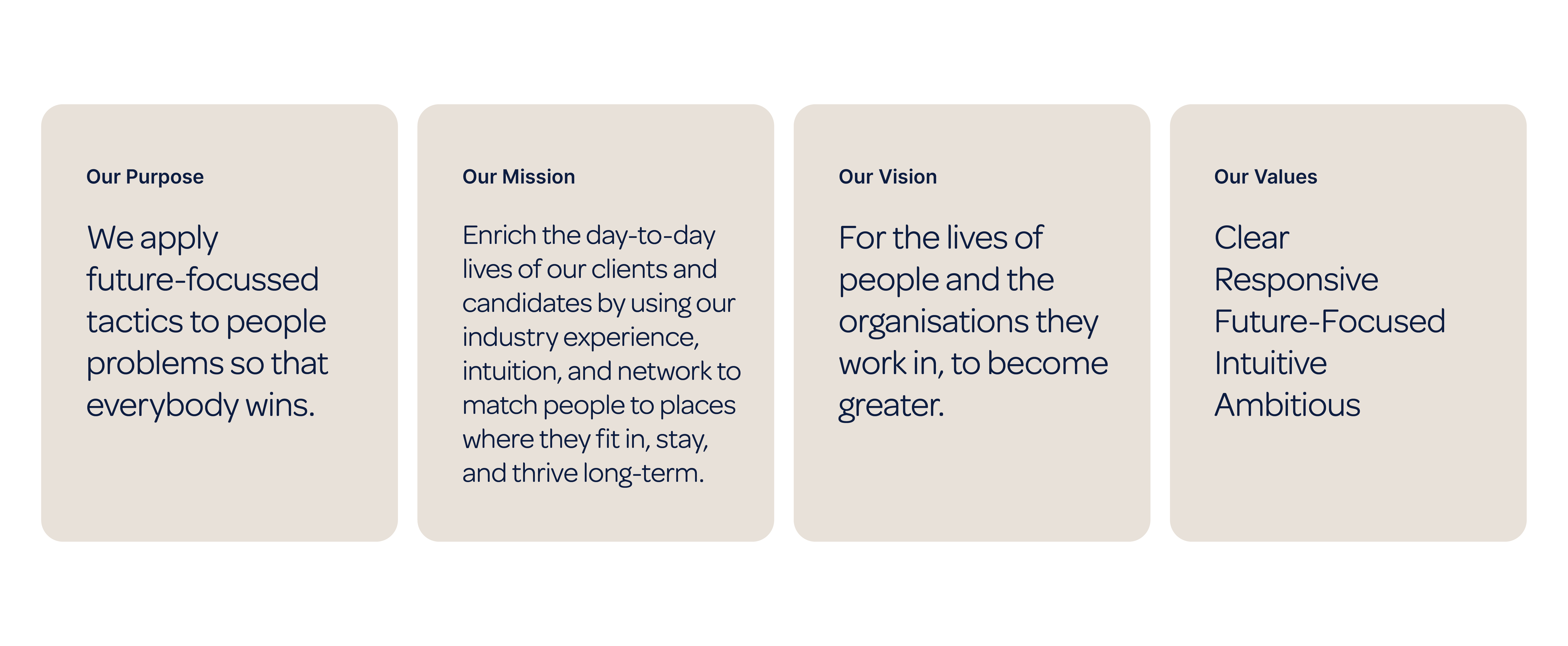
Our mission?
Present People Group as a new-age recruitment company that truly puts people first to find you the perfect match.
a word from our client
“When I set out on this journey, this is the final end product I had in mind, this feeling! LOVE IT!”
Hans Swartz
People Group
Brand strategy
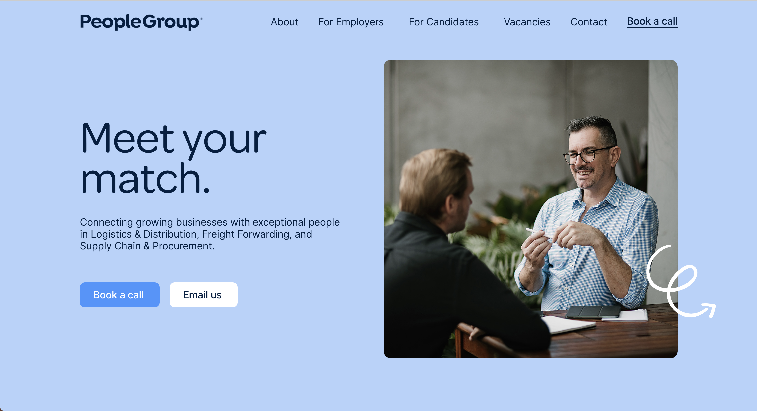
Relatable, reliable recruitment.
Curious, ambitious, and authentic, People Group is racing down a people-focused, purpose-driven path to find meaning in the day-to-day. Not only for themselves but also for the companies and candidates they work with. Their drive is not to fill a job. It’s to help others live an inspiring and fulfilling life.
the approach
Develop a fresh brand identity that feels authentic, approachable, and human, while simultaneously being impressive, premium, and trustworthy.
Messaging
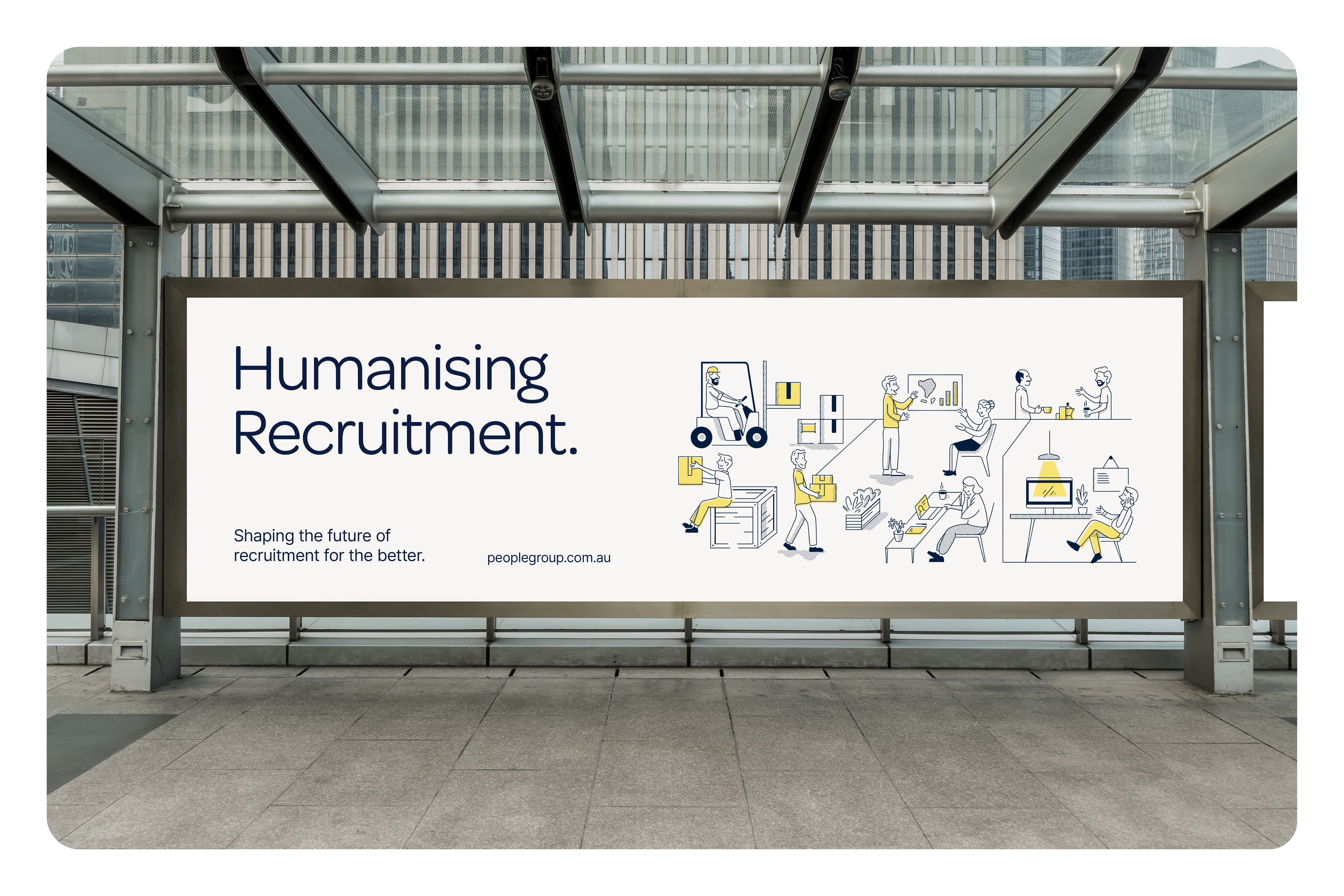
People of the people.
Fundamental to People Group’s success is their uncanny ability to understand what makes people tick and their dedication to humanising the recruitment process. So their communication style had to feel unquestionably human while reflecting their drive to make placements that go beyond the usual skill-fit approach.
a word from our client
“You have absolutely outdone yourself here. Every time I look at my Branding I am beaming from ear to ear! I can't say it enough but I absolutely LOVE this branding and colour and use of illustrations. It looks so smart and professional and classy and upmarket, yet super relaxed and readable. ”
Hans Swartz
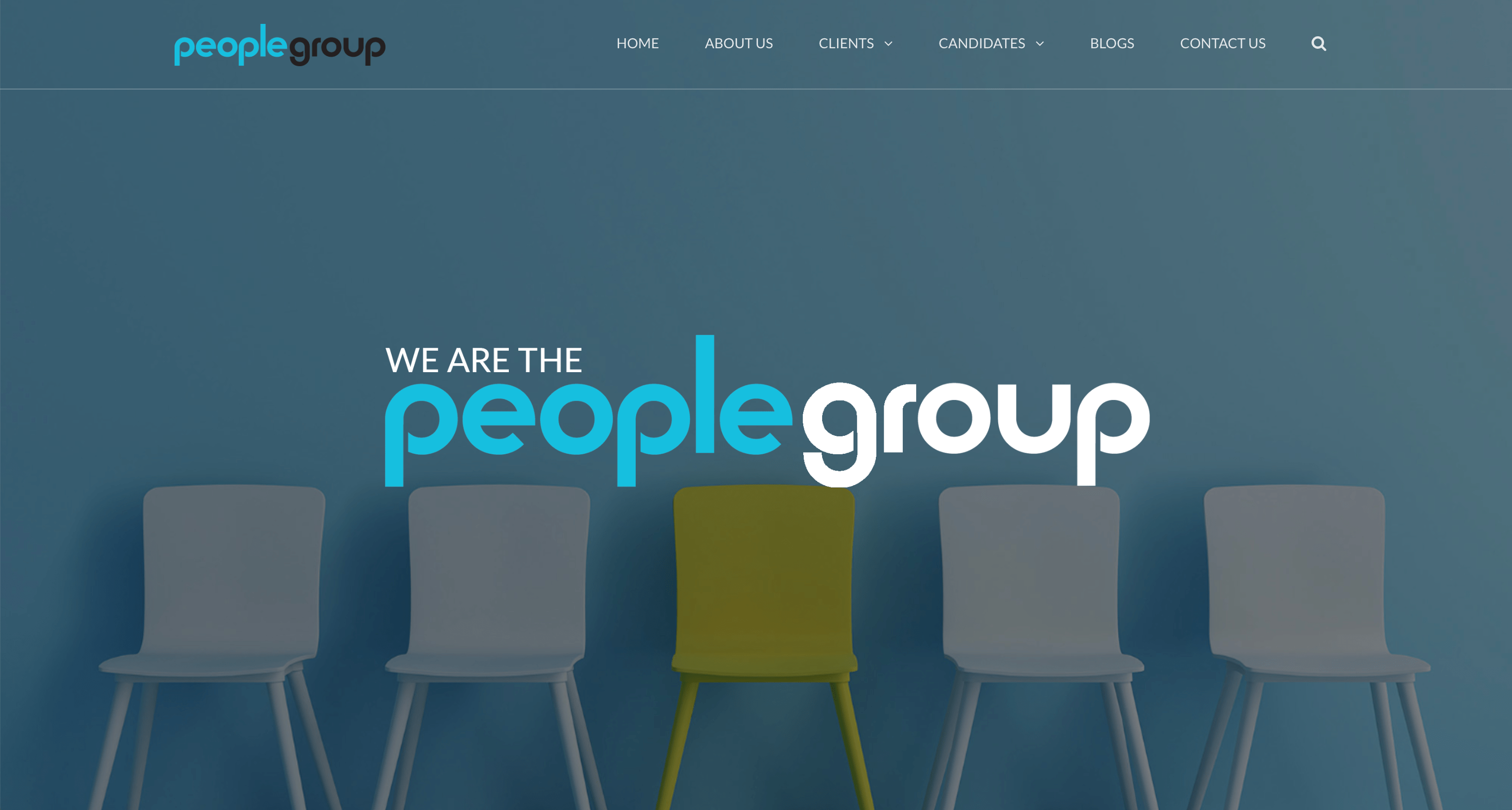
People group
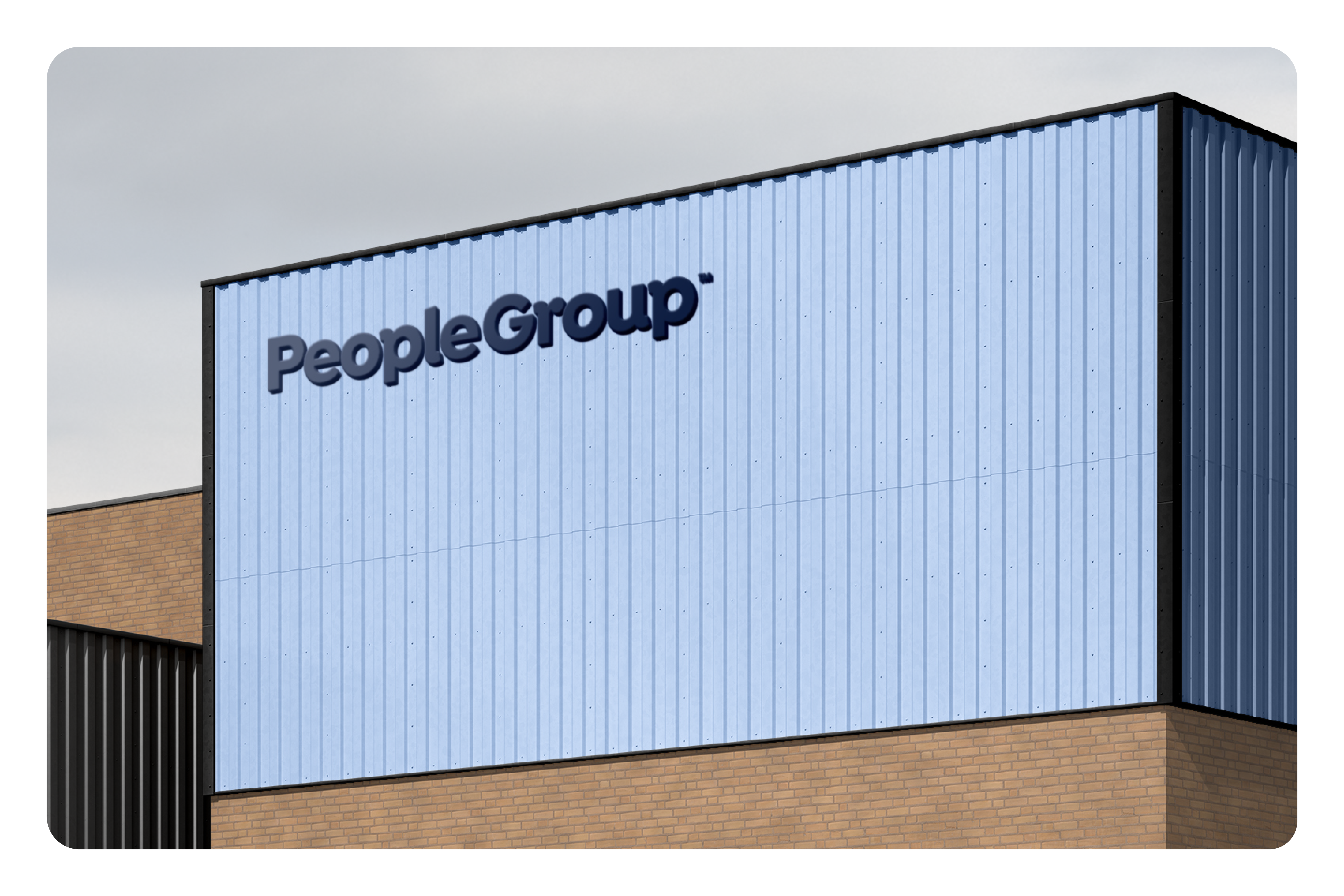
The new logo
New logo, same mission.
People Group's custom wordmark consists of a friendly slab sans serif typeface with rounded letterforms to create a welcoming feel.
Connecting through type.
The letters form together like an embrace. Each connected to the others to represent People Group’s belief in the power of connecting on a human level to uncover what makes people tick.
The result is a brand that breaks the norm for recruitment. Creating a strong human focus with a relatable, quirky feel to reflect the personality of their Founder.
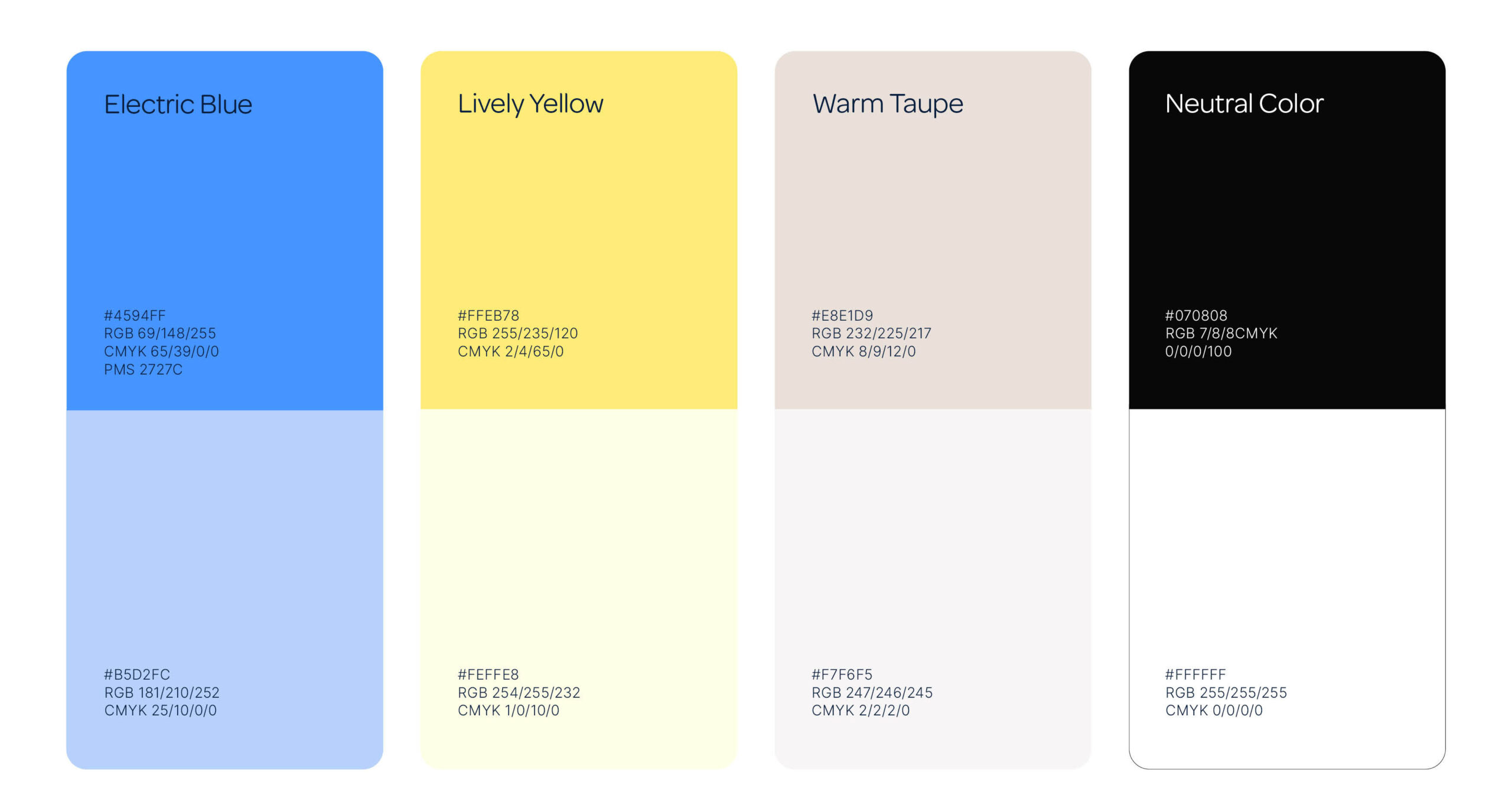
Colours.
Hans loved his original brand colours, so we presented an elevated, alternative blue for his new look. With the addition of a yellow accent to encourage a perception of optimism and positivity.
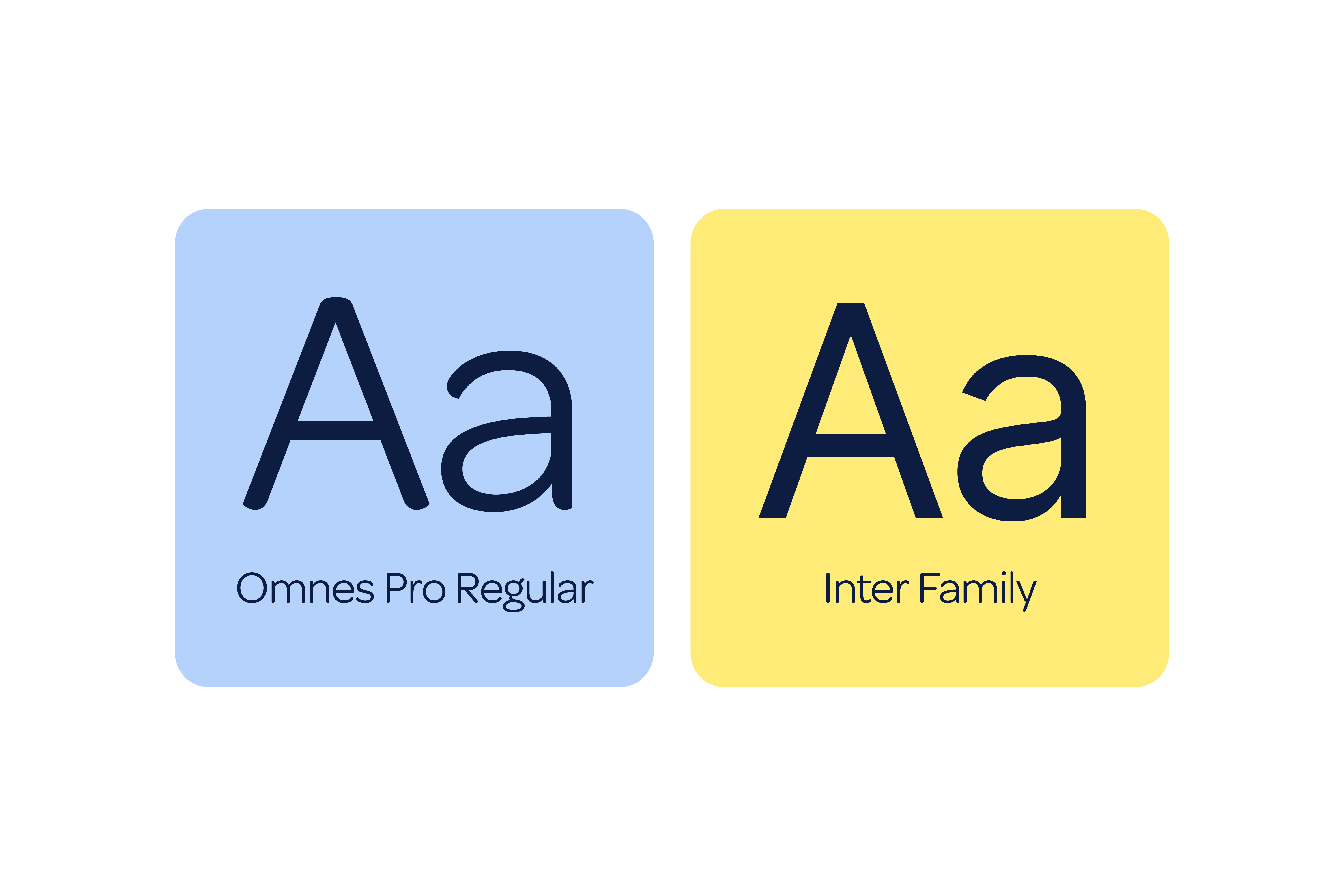
Typography.
Omnes’ crisp, rounded design is neither showy nor overly exact in feeling. Combined with Inter, an intelligent font designed for online legibility, this pairing is the perfect solution for busy people on the go to pick up what you’re putting down, fast.
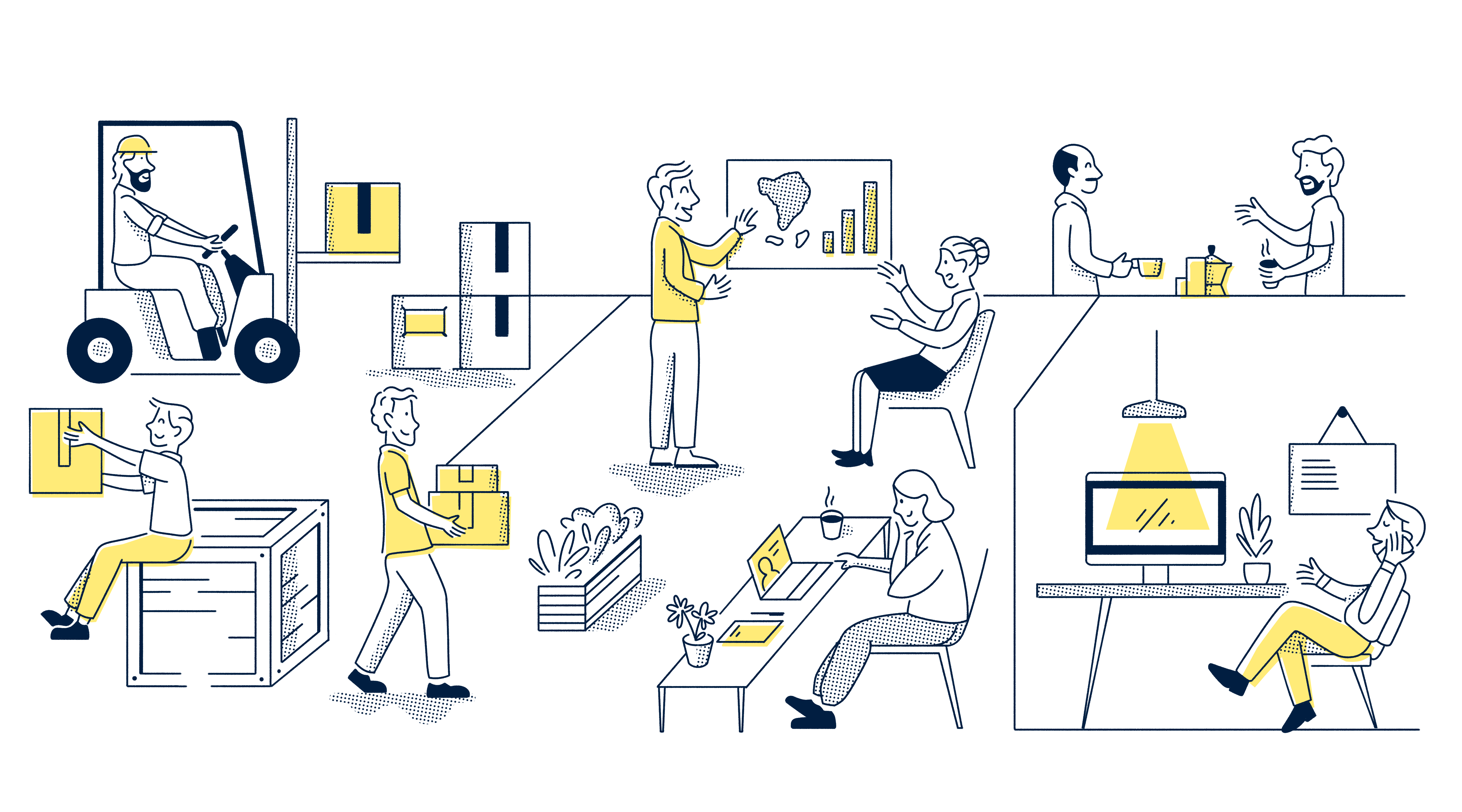
Graphic elements.
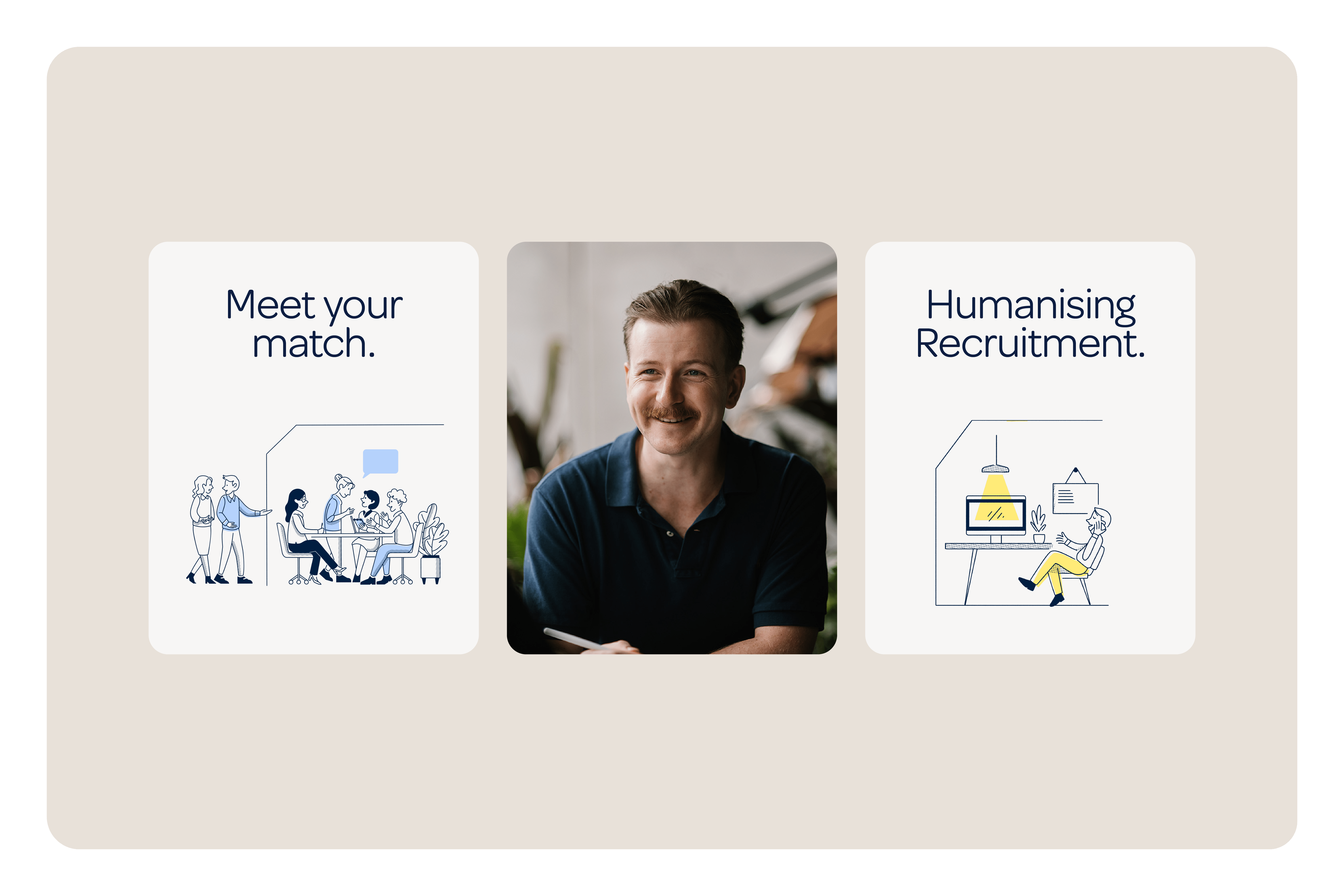
Inspired by the New Yorker’s style – which feels both relatable and elevated at the same time – we created playful and quirky illustrations to add a human touch that makes the brand feel smooth and approachable.
Photography.
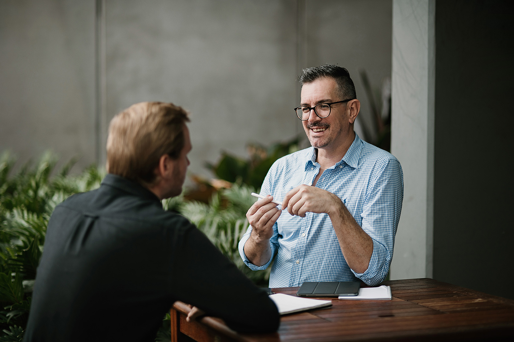
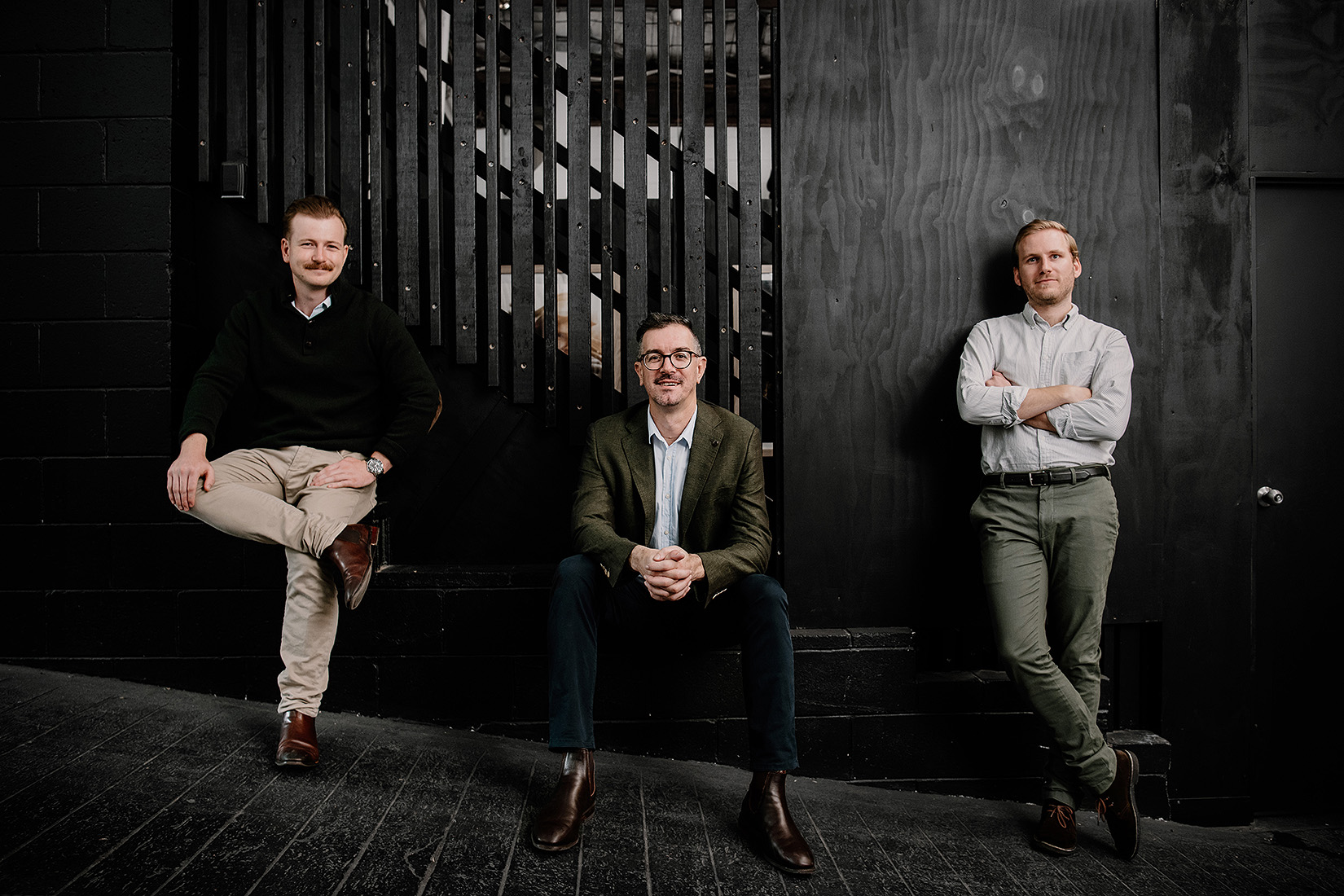
Our goal was to flip traditional recruitment photography on its head by demonstrating People Group’s deep understanding of human dynamics. Instead of portraying a superhero team, we presented them as supportive guides and evoked warmth through neutral, earthy colour tones, poses, locations, furniture, backgrounds, props, and outfits.
Across their new website, the illustrations add a quirky touch, conveying People Group’s human brand message and playfully interacting with the photography and text to captivate users for longer.
Before
After
Working on rebrands for purpose-driven business owners like Hans is an absolute dream for our creative team – especially when our work leaves them “beaming from ear to ear”. We had a blast with this one.
Closing statement.
Lorem ipsum dolor sit amet, consectetur adipiscing elit, sed do eiusmod tempor incididunt ut labore et dolore magna aliqua. Ut enim ad minim veniam, quis nostrud exercitation ullamco laboris nisi ut aliquip ex ea commodo consequat.
Next up?
Da Biuso and how to launch a unique, prestigious culinary experience with a bang.


