Folklore
Challenging the status quo.
Hot off the tail of their Emmy win, the team at Folklore had soared into the spotlight. But their brand wasn’t hitting the high notes of their mastery at storytelling through sound. It was time to cut through the noise and let the world know they’d arrived.
How we helped
Brand strategy
Brand design
Web design
Copywriting
Our mission?
Defy the ordinary to create a brand with an air of cool sophistication that showcases Folklore’s destined place in the big leagues, while staying true to their down-to-earth roots.
Brand strategy
Striking the right chord.
Our goal was to propel Folklore’s brand to the zenith of sound design, while anchoring it firmly in their authentic, human essence. We couldn’t just tell their story, we had to deliver an epic tale that not only celebrated their artistry and shone a light on their inventive spirit, but also resonated with every note of their unique personality.
the approach
Folklore’s work deserved to take centre stage but the real stars are the magicians behind the curtain. Their passion for storytelling and effortless collaboration is the reason people come back for more. So the spotlight had to shine on them too. We used each element to ensure their personal charm shone just as bright as their undeniably masterful work.


sound flexes
When sound speaks louder than words.
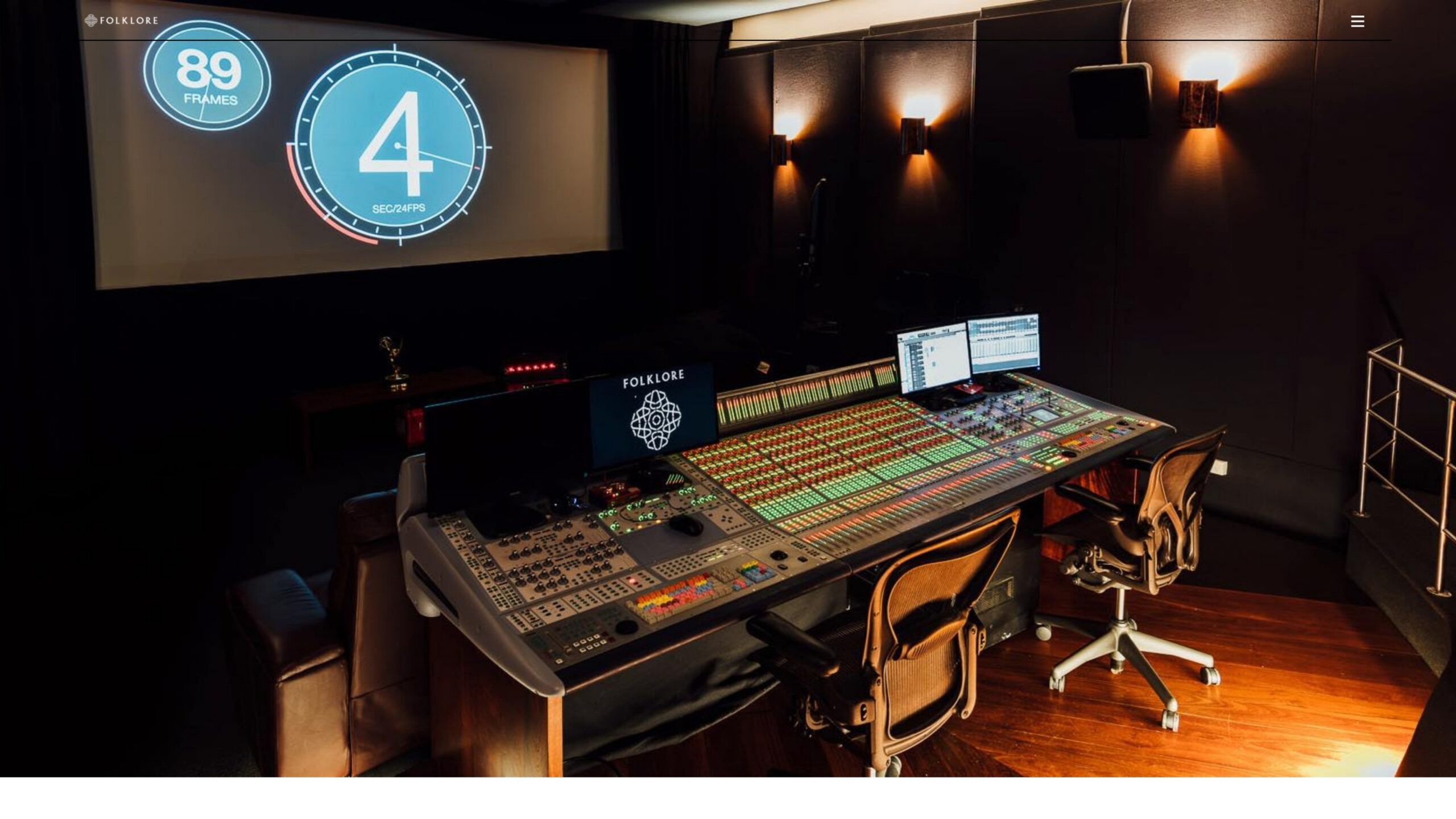
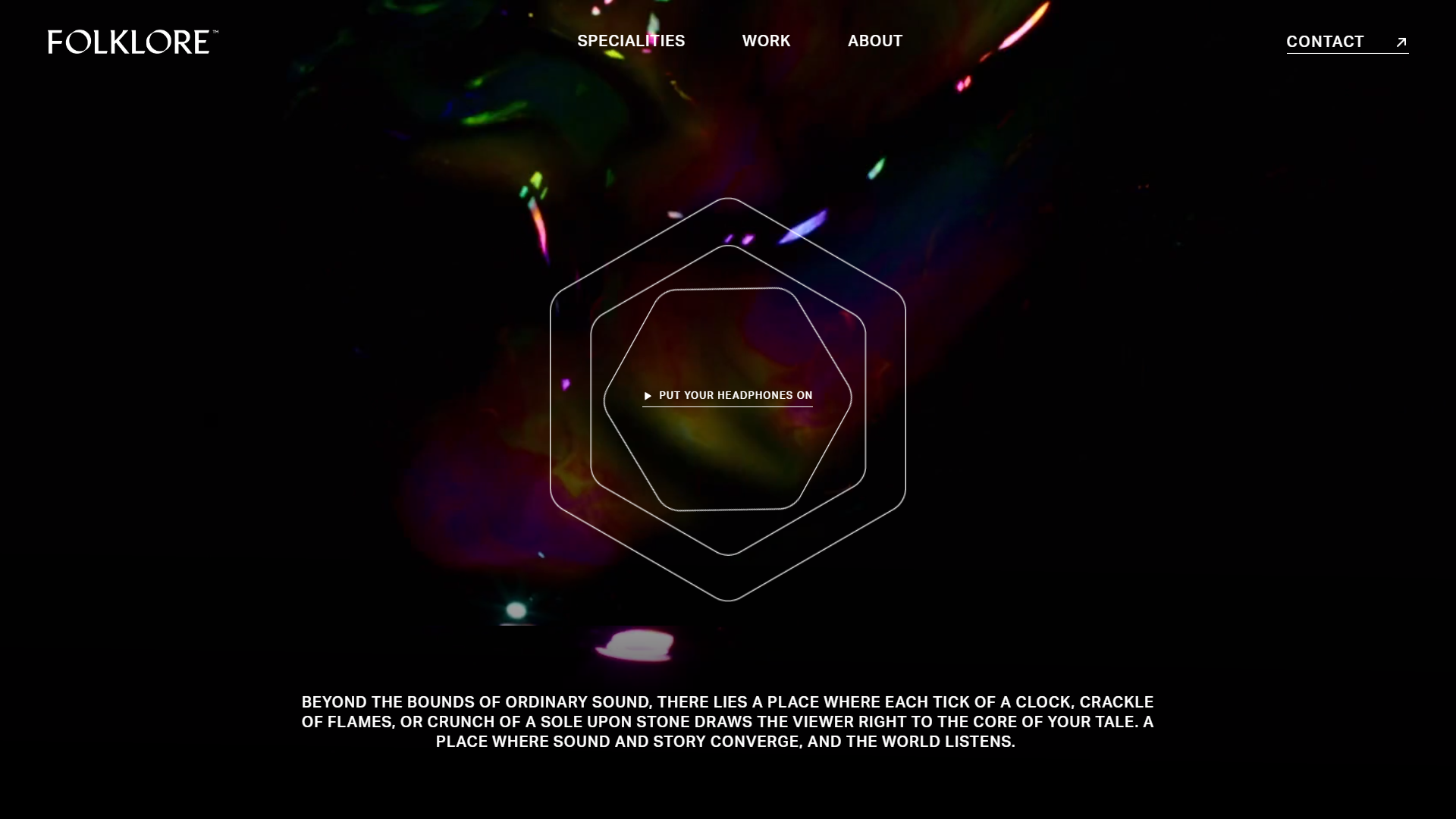
Your message isn’t just about what you say. It’s a collection of elements that come together to sell your story. We worked closely with the team to create “sound flexes” across their new website so users could experience the wonder for themselves. With cleverly crafted design elements, these mesmerising audio snippets did a lot of the heavy lifting in conjuring the magic of Folklore.
MOTION CREDIT: Compadre Picture Co
Messaging
Simplicity, with a spark.
To highlight the pioneering spirit of the Folklore team, the words on their website had to sing with personality, carrying their winning charm in every sentence. They’re proud of the work they do, and how they do it. This had to shine through every word, without sacrificing the grounded nature of the team. We achieved this through simple, direct copy that, while brimming with confidence, never sought to overcomplicate the role they play.

A MESSAGE FROM OUR CLIENT

The new logo
Simple, timeless, distinctive.
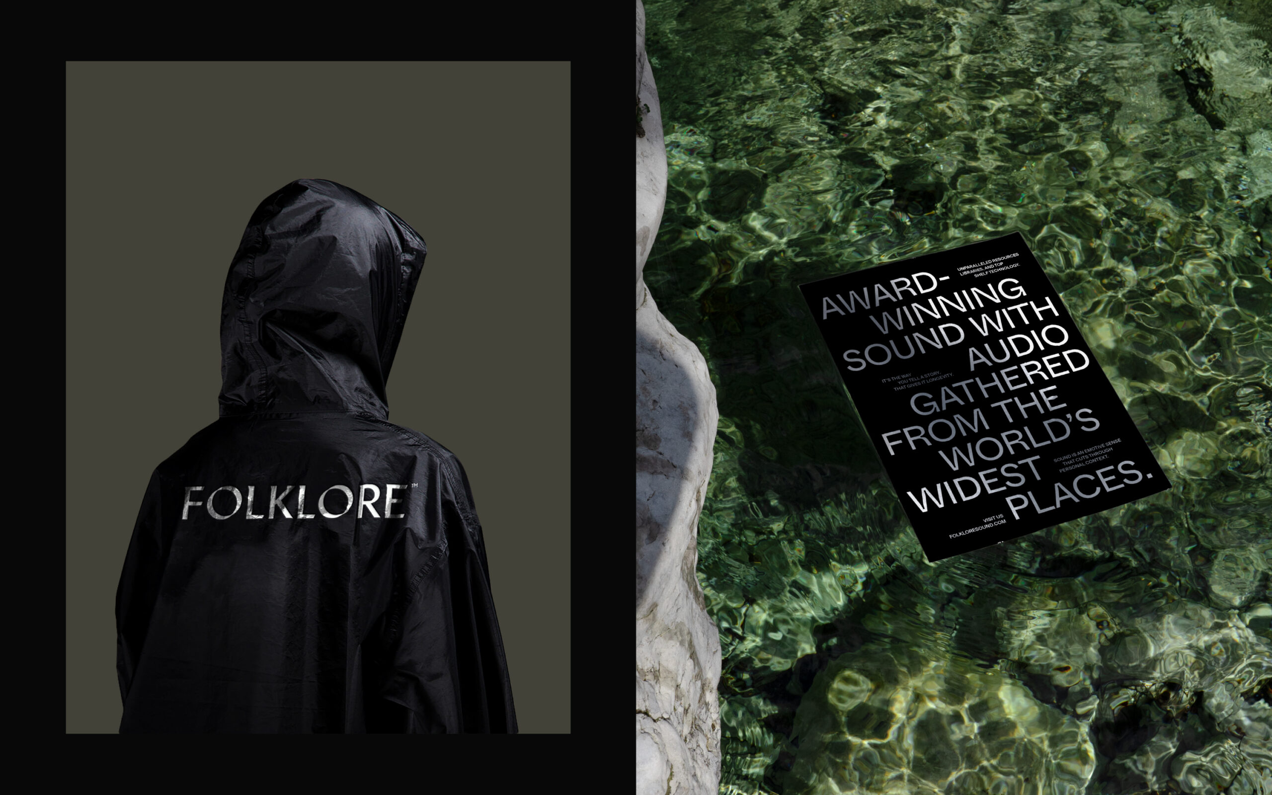
We created a contemporary serif logotype to achieve an expressive and distinctive look for the sound industry with versatile applications across digital and print. The modified 'O' with a slanted edge references the collaborative nature of their work. The intersection of the 'O' represents when a sound has been 'glued' to the screen.

Where timelessness meets tomorrow.
Folklore is more than just stories. It’s the stuff of myth, of legend, of magic. Yet the team’s paragonic tech is as modern as it gets. We artfully navigated this juxtaposition to craft a look that’s both timeless and fresh.
Colours.
Grounded in the concept of ‘audio gathered from Earth’s wildest places,’ the colour palette draws inspiration from natural elements like forests, the ocean, and sand. Paired with neutral black and white tones, the colour combinations create contrast and clarity while exuding a contemporary and moody brand look.
Typography.
To evoke a contemporary ambiance, we chose bold and expressive typography. But expression should never come at the cost of readability. When paired together, Whyte Inktrap and Suisse Int’ fit the bill. Clean, readable text, amplified by a bespoke, attention-grabbing headline typeface.
Graphic elements.
Inspired by sound notations, we incorporated line symbols that could move in motion with sound for a fluid, emotive feel that subtly pays homage to Folklore’s ability to evolve with their clients’ needs.
The new website
A show-stopping legend is born.
Weaving together symbolic motifs and powerful images from across the world, we crafted a brand that speaks the language of global excellence. Sprinkled with dazzling work samples, copy rich with personality, and “sound flexes” that showcase their audio mastery in full glory, this portfolio isn’t just impressive – it’s a world stage for their talent to shine.

Before
After


Let’s have a coffee.
Expert advice, a killer brew, and a plan for your world domination.


Let’s have a coffee.
Expert advice, a killer brew, and a plan for your world domination.