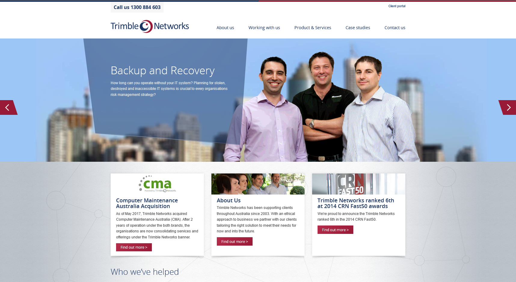
Gone are the days of hiding away in the basement. These IT gurus have moved up in the world, literally. They relocated to bright, modern offices and needed their brand to elevate with them so they could take the IT industry by storm.
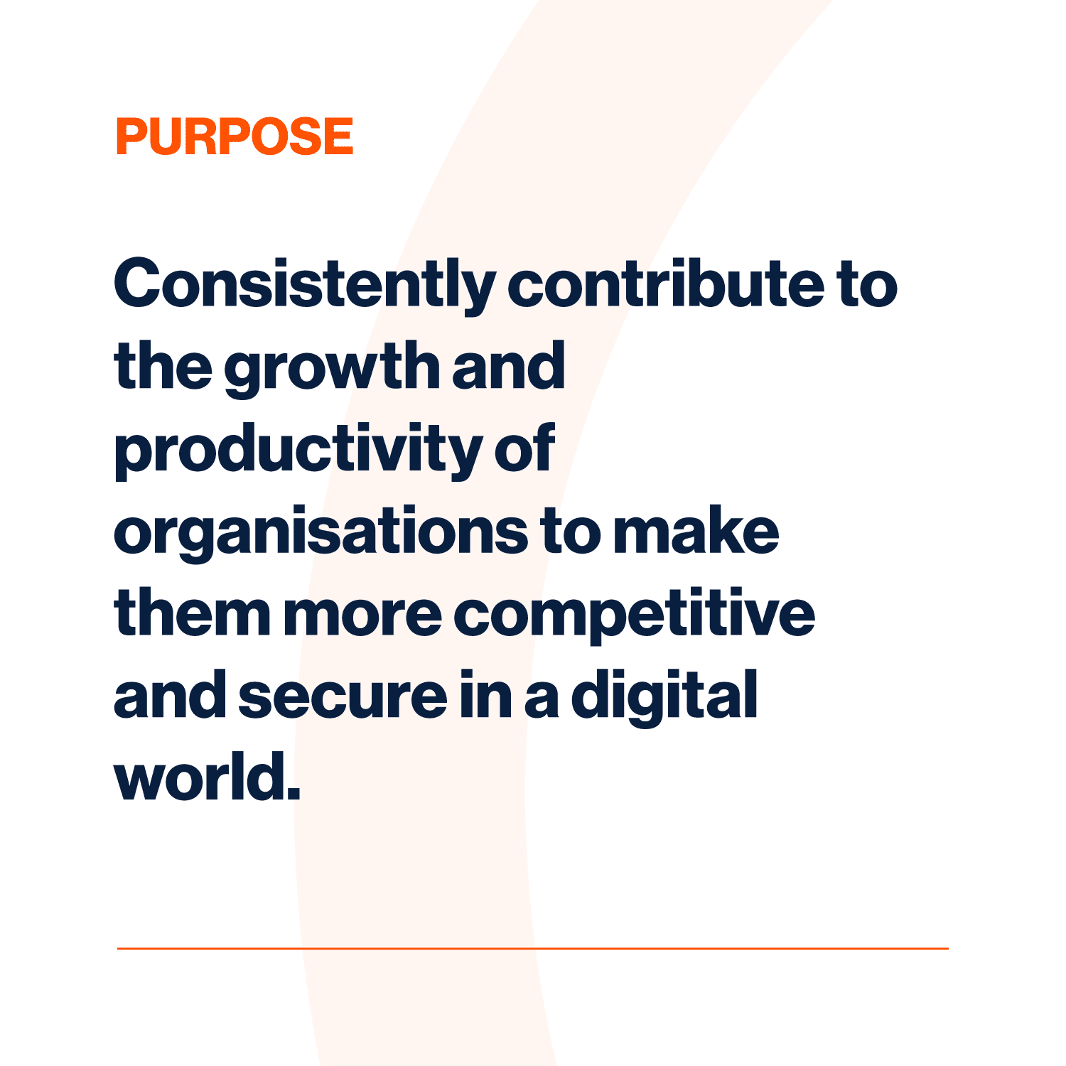
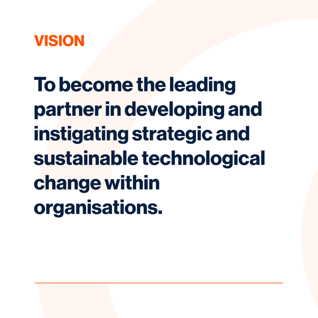
Create a memorable brand highlighting Trimble’s approach of being a trusted business partner and forming long-lasting, genuine relationships with their clients.
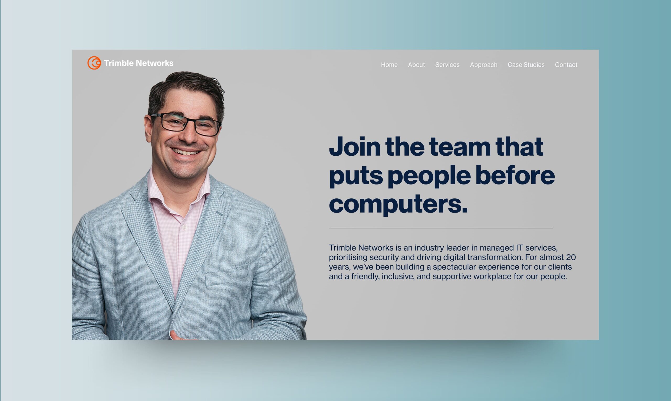
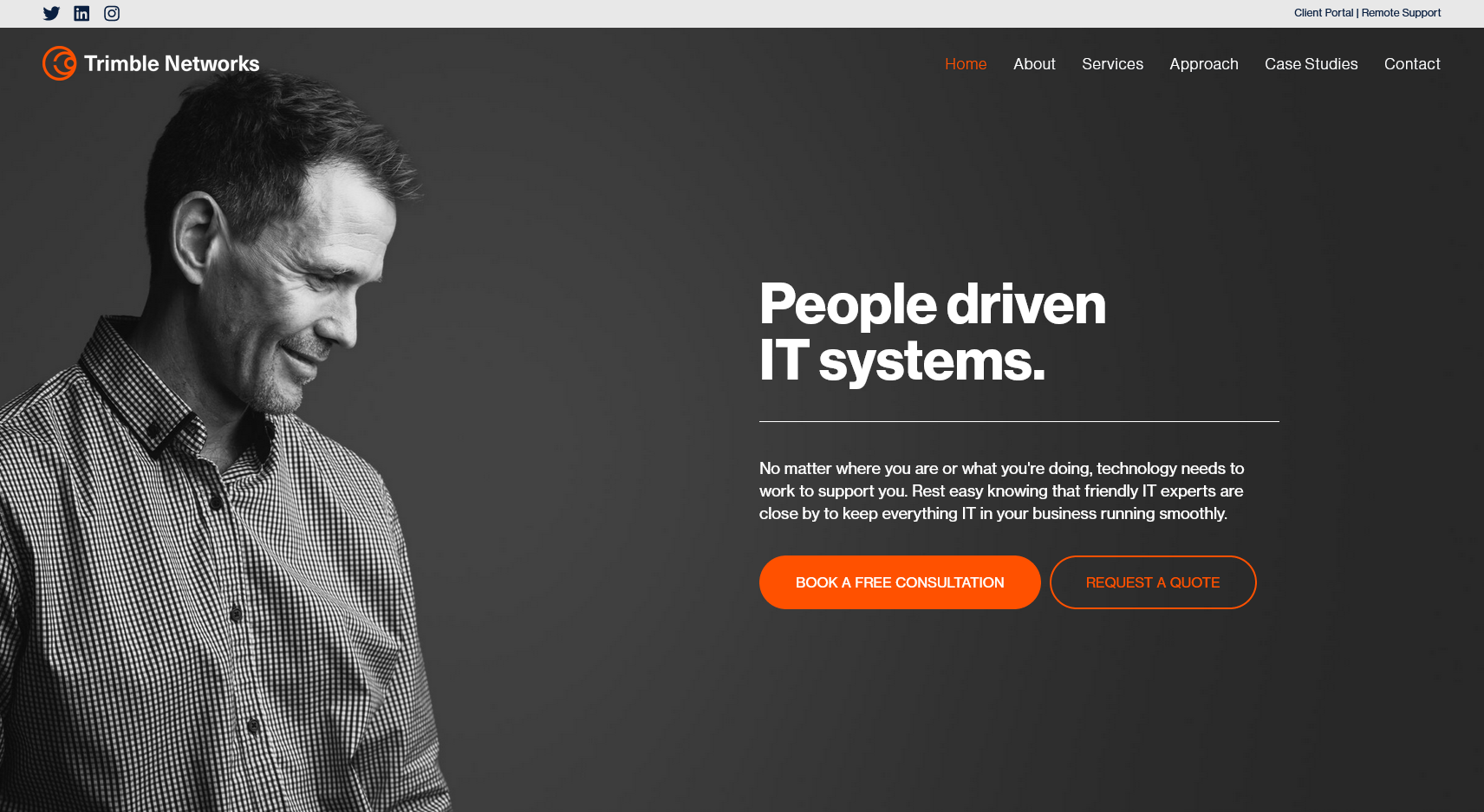
Trimble had to kick against the industry stereotype of IT gurus hiding away underground. Their people needed to come into focus because the friendly faces behind the screens make them special. They’re great with computers, but at their core, they’re all about people. And this had to sit firmly at the forefront of their brand.
For Trimble, people come first, but they also need to show off their skills. We struck this delicate balance by emphasising the person-centric application of their expertise. This took the form of statements like “creating strategic roadmaps for the future” and “optimising client operations”. It focused on how Trimble’s expertise transforms and stabilises businesses.
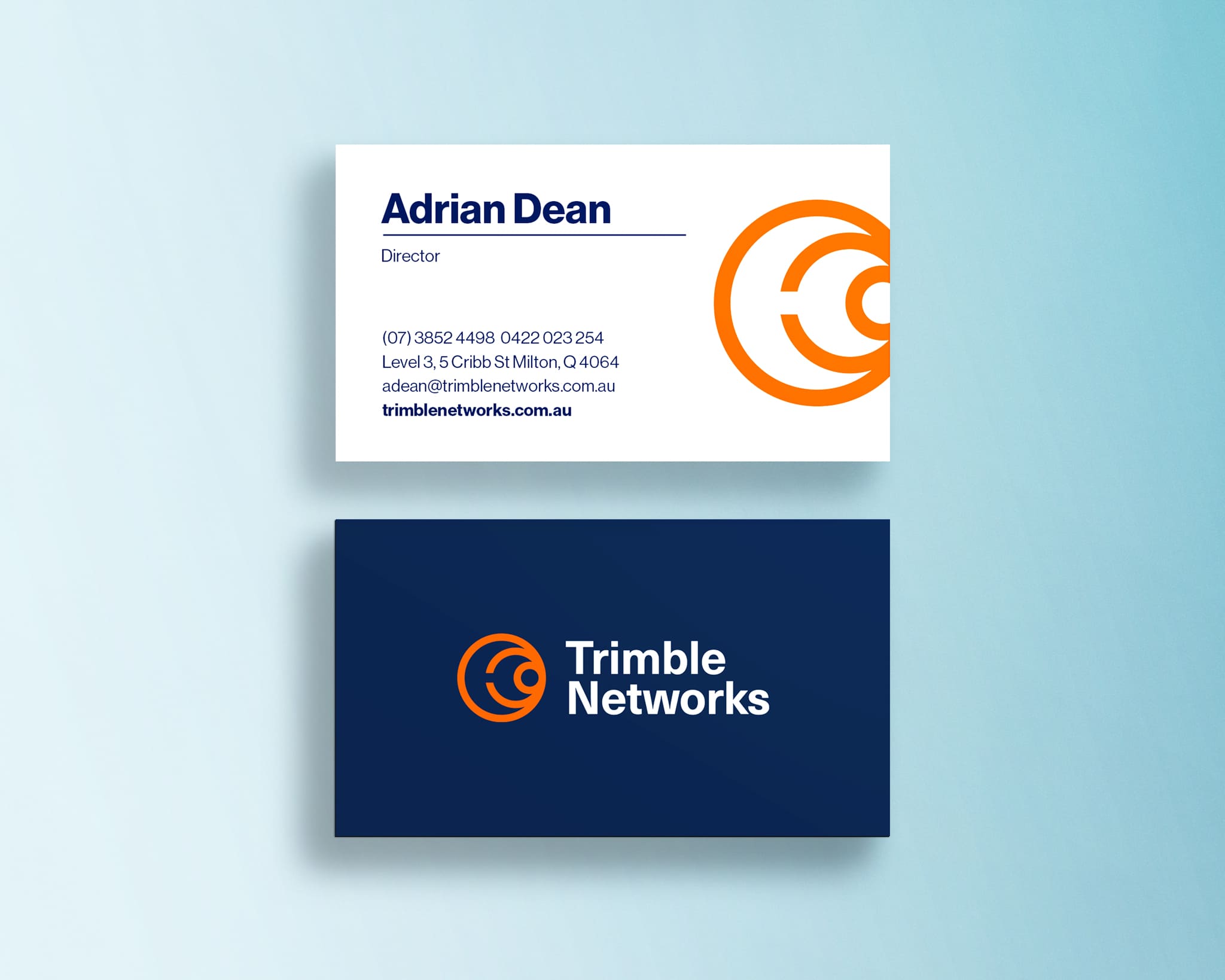
Our brief was to honour the legacy of Trimble Networks, but reignite and repurpose their symbol and colours to sit more confidently in the modern corporate landscape.
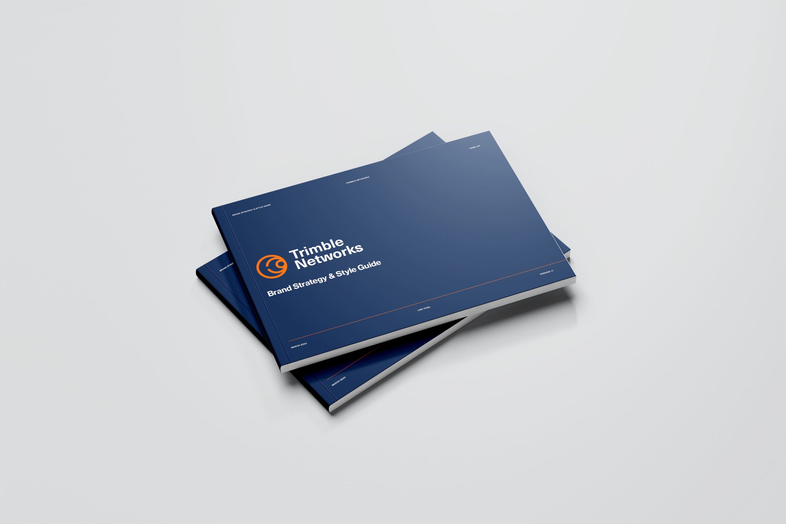
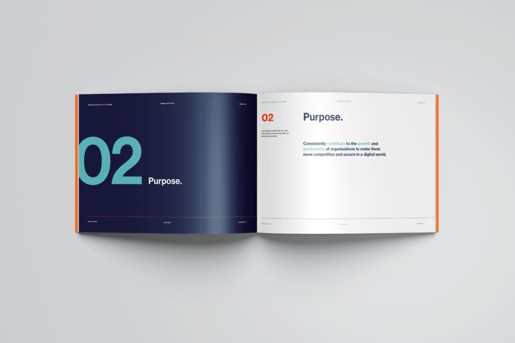
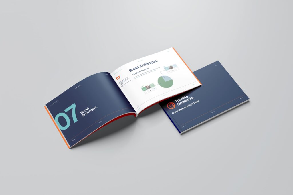
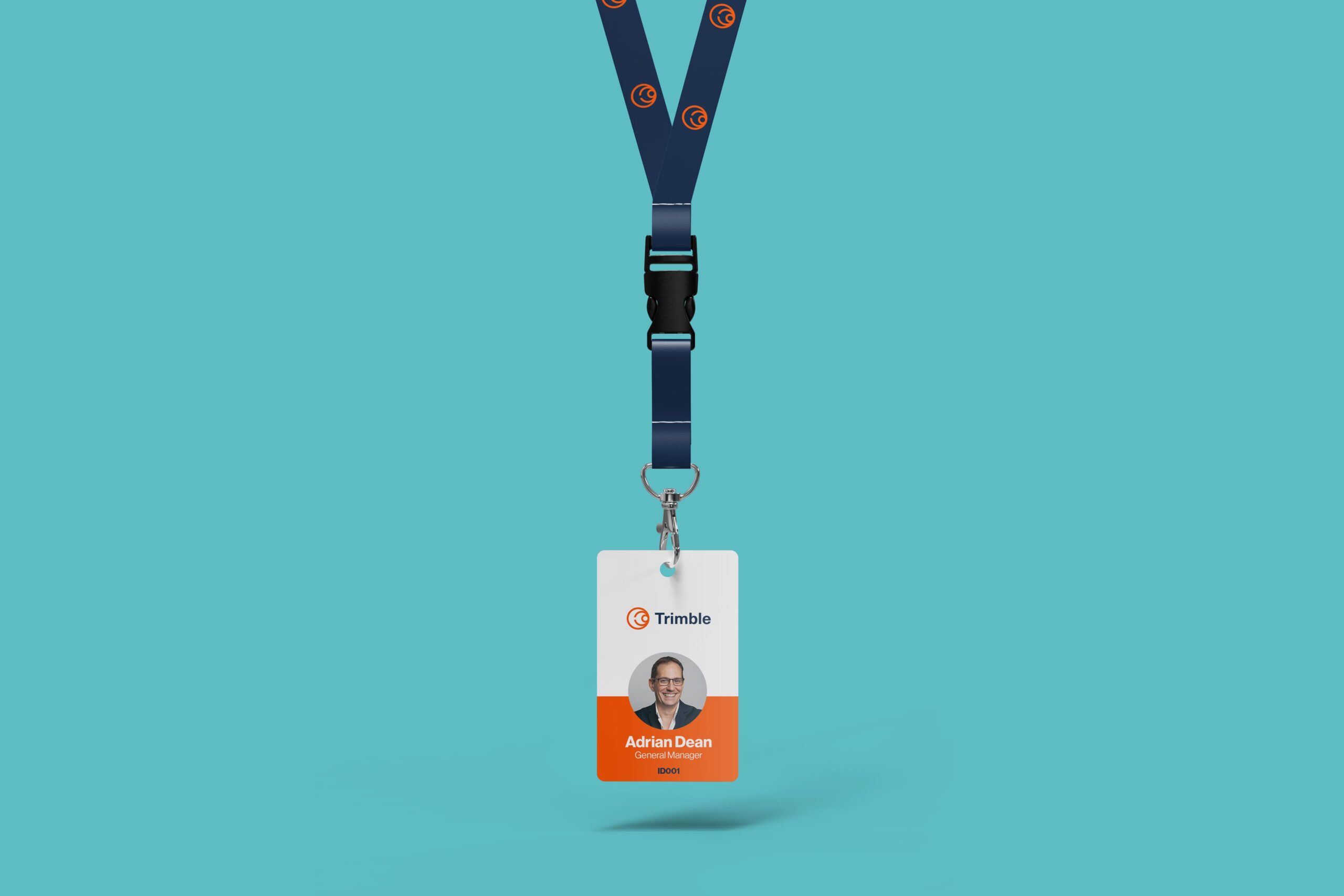
With clear a strategic direction for the brand and culture, the team at Trimble now have the tools they need to replicate their brand consistently – inside and out.
Lorem ipsum dolor sit amet, consectetur adipiscing elit, sed do eiusmod tempor incididunt ut labore et dolore magna aliqua. Ut enim ad minim veniam, quis nostrud exercitation ullamco laboris nisi ut aliquip ex ea commodo consequat.
Evolving from the maroon and navy of old, a bright and optimistic “Persimmon Orange” was added as a bold accent. The calming teal, used sparingly, creates a dynamic and unusual colour palette for the industry.
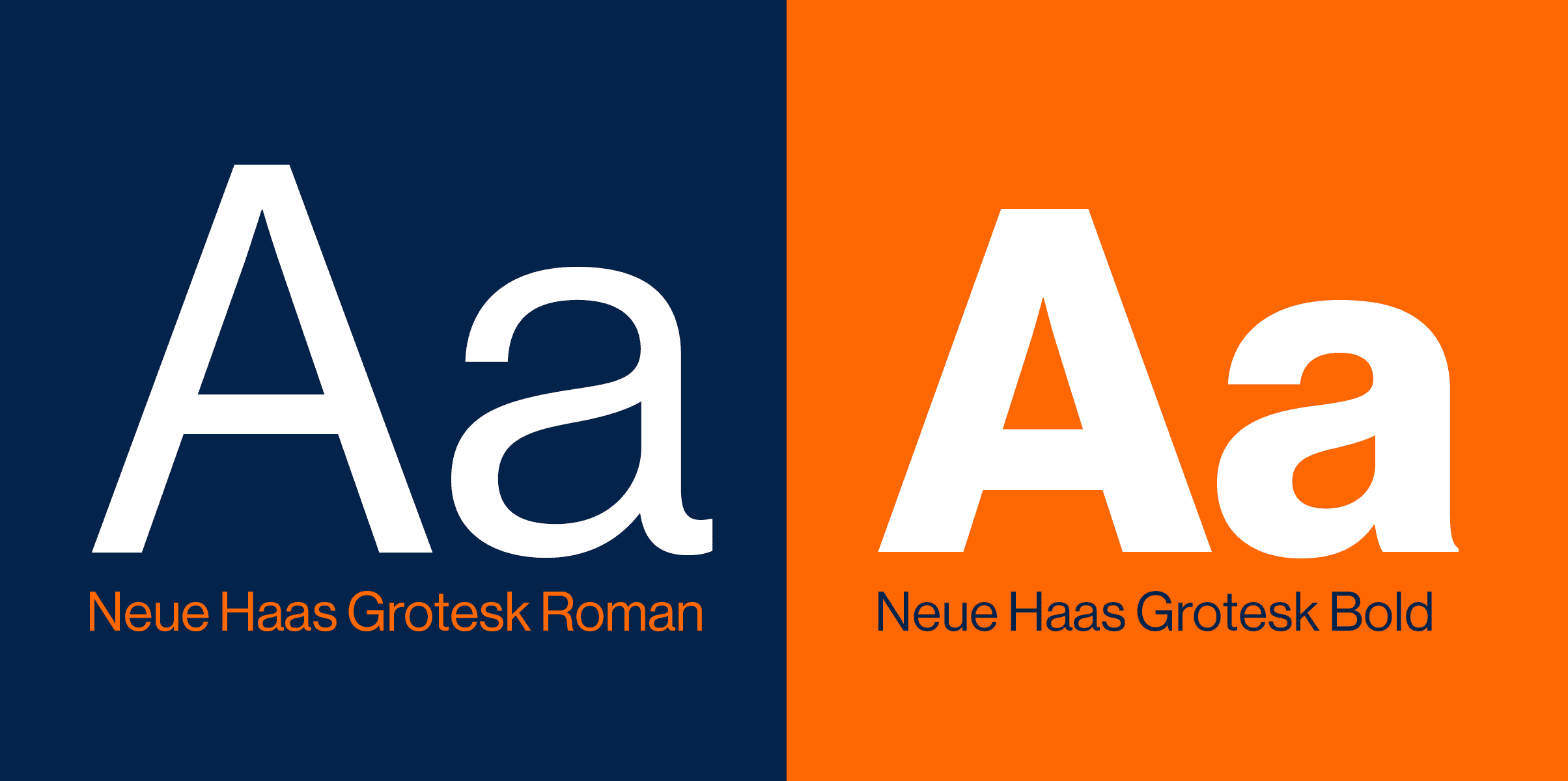
Neue Haas is a great alternative for fans of Helvetica. It has a high-end feel that’s easy to read and conveys intelligence.
The brand symbol is used boldly and bravely to create a truly memorable design.
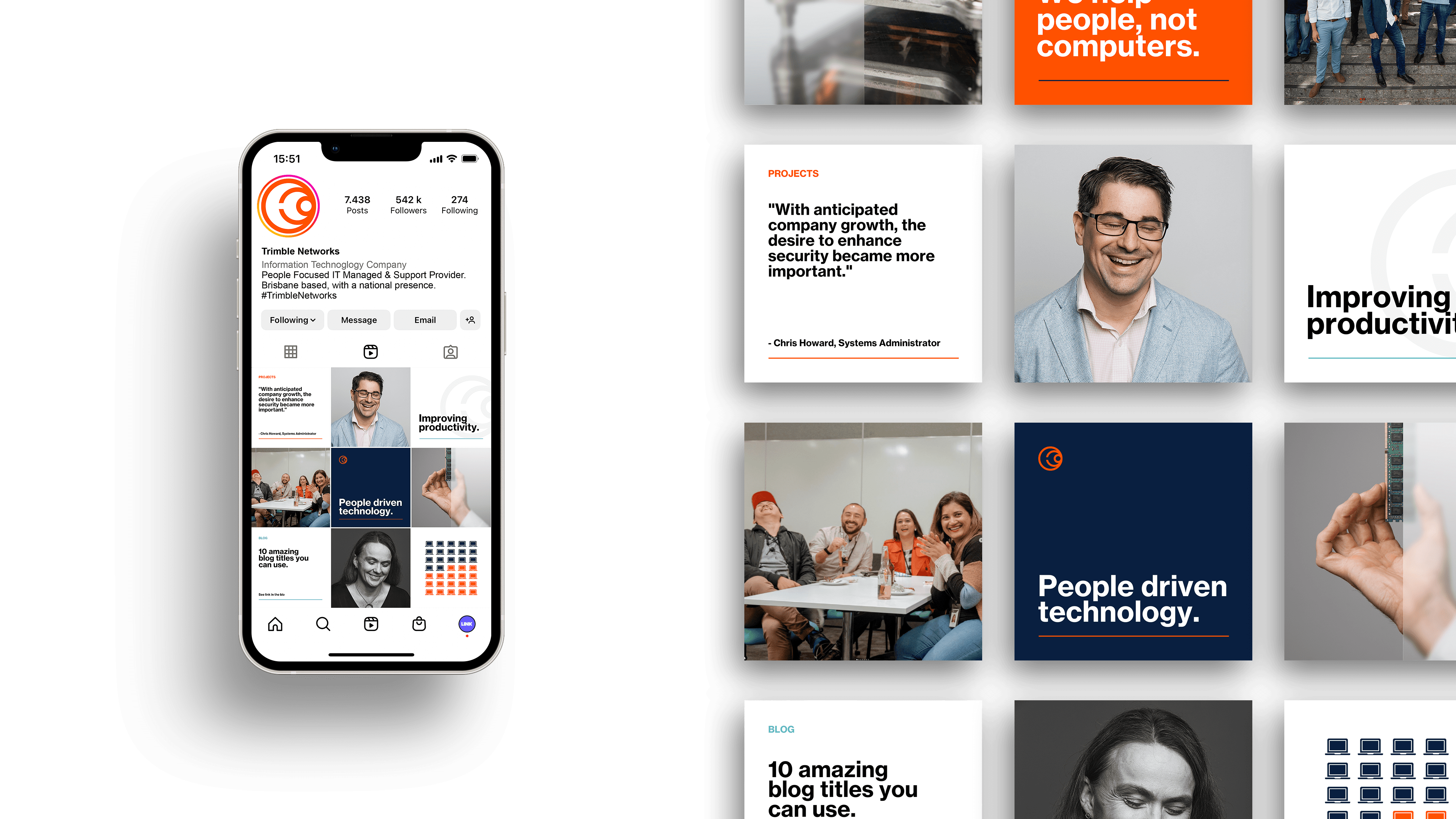
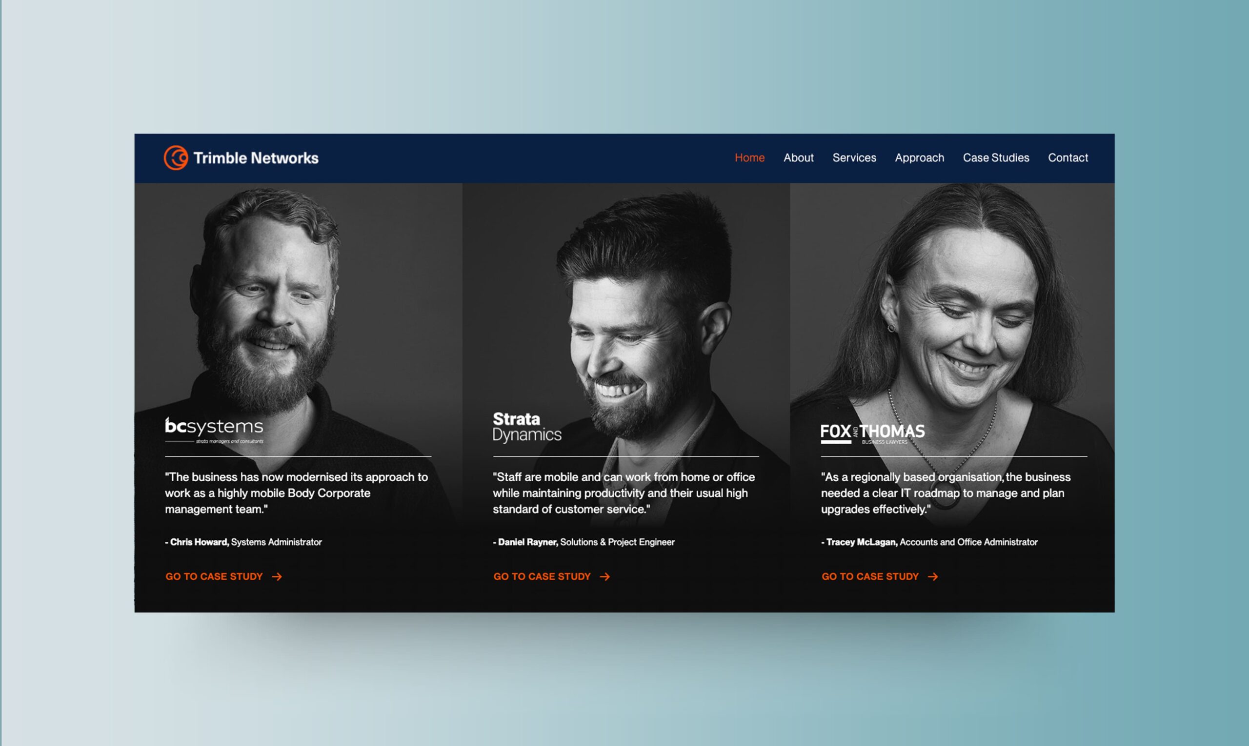
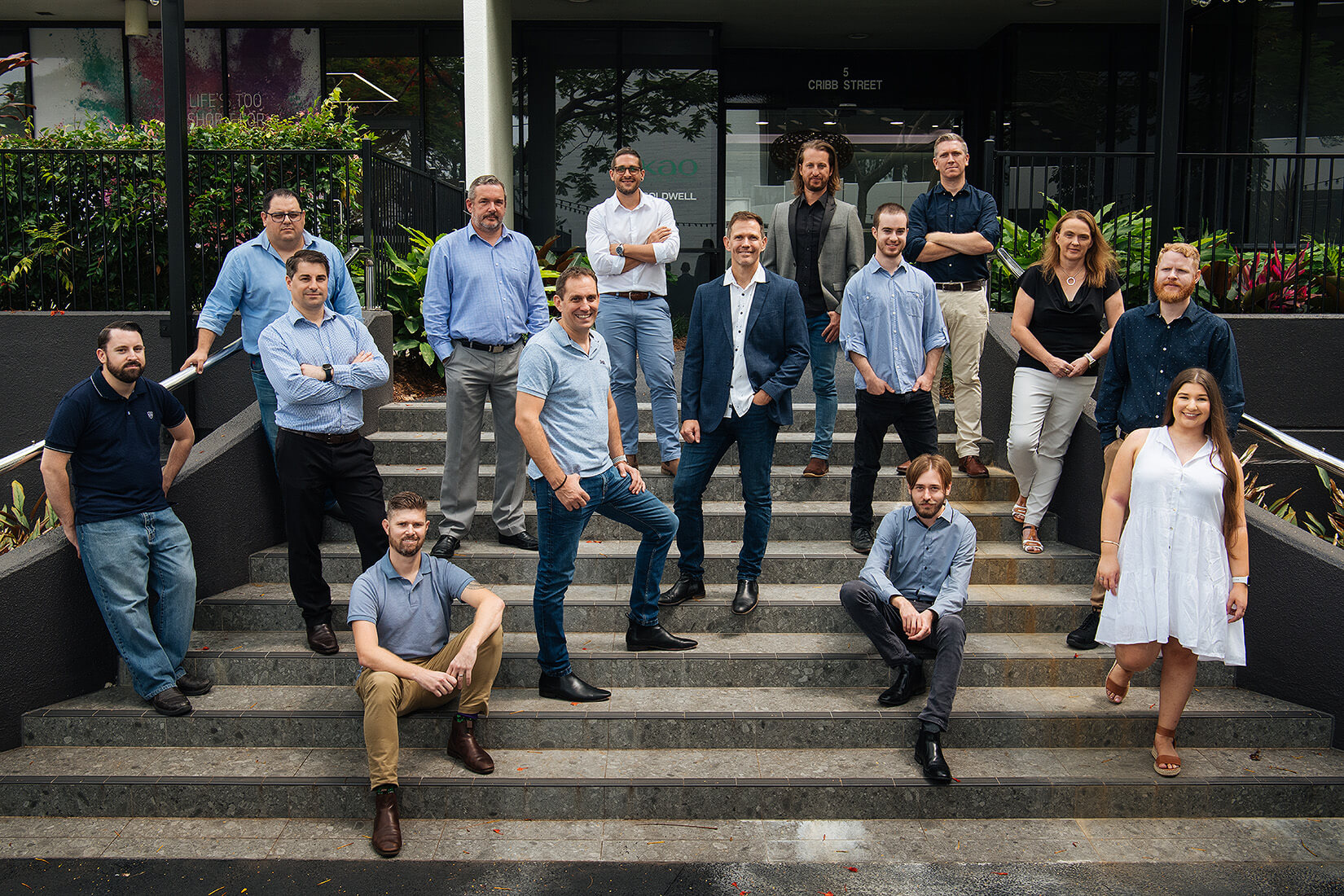
The creative team knew photography would be a key element in bringing computer systems to life. At first, the Trimble team were shy to be so front and centre in their brand. But their customers say the people at Trimble make them their IT provider of choice. So it was time for the real heroes to come to the front.
(Photo credits : Don’t Say Cheese)
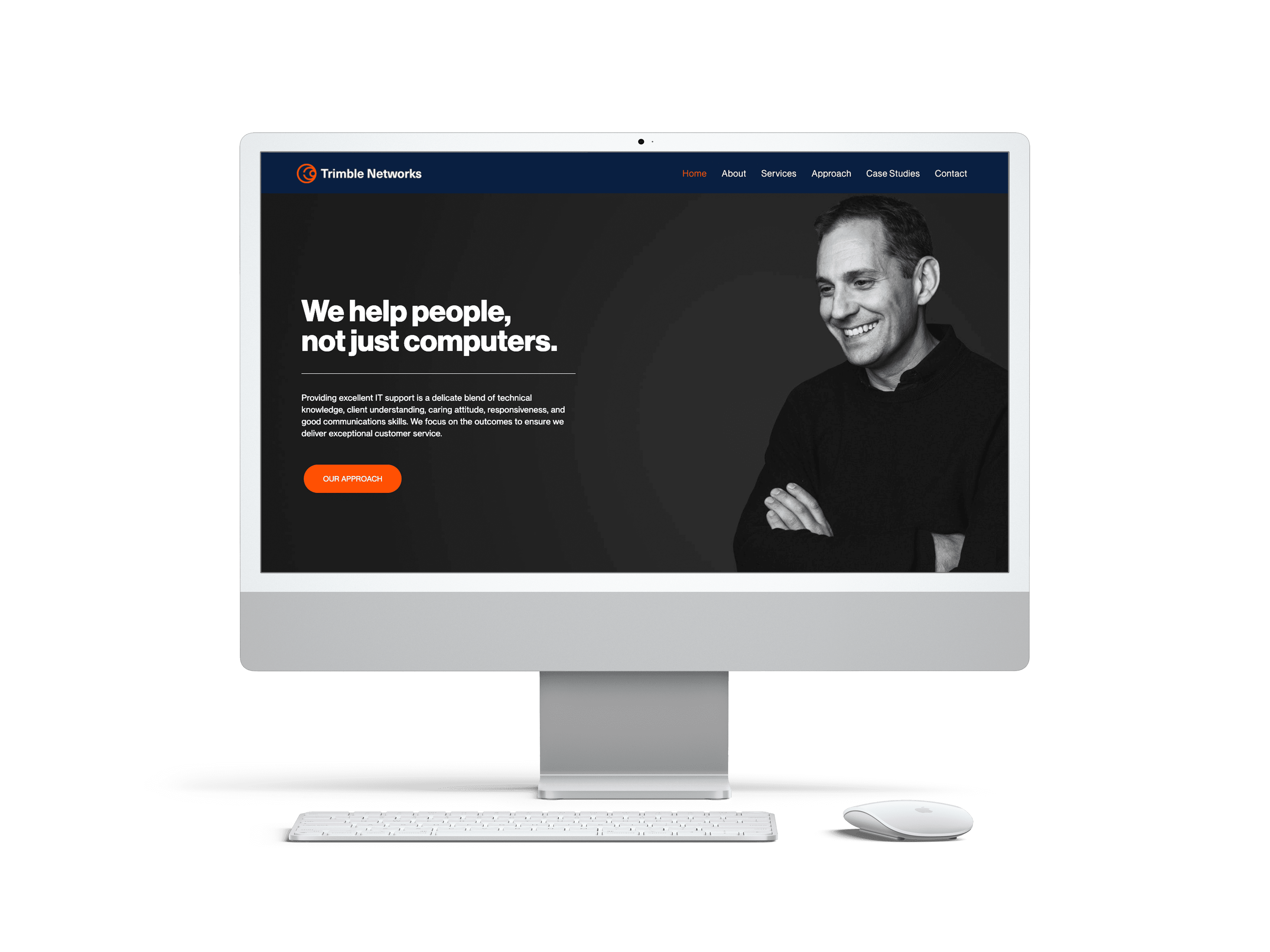
A digital interface that lives and breathes Trimble’s progressive, determined, and human centred approach to IT support.
With a clear strategy, executed with precision, Trimble now have more eyes on their site for longer with an 153% increase in average session duration since launch.
With a clear brand strategy and guidelines on how to execute efficiently, Trimble got more eyes on their site, kept customers interested enough to act, and boosted their SEO with more time spent on the page.
Want the same for your business?
Expert advice, a killer brew, and a plan for your world domination.
5 articles. 2 min reads. All wrapped up in one fortnightly newsletter.