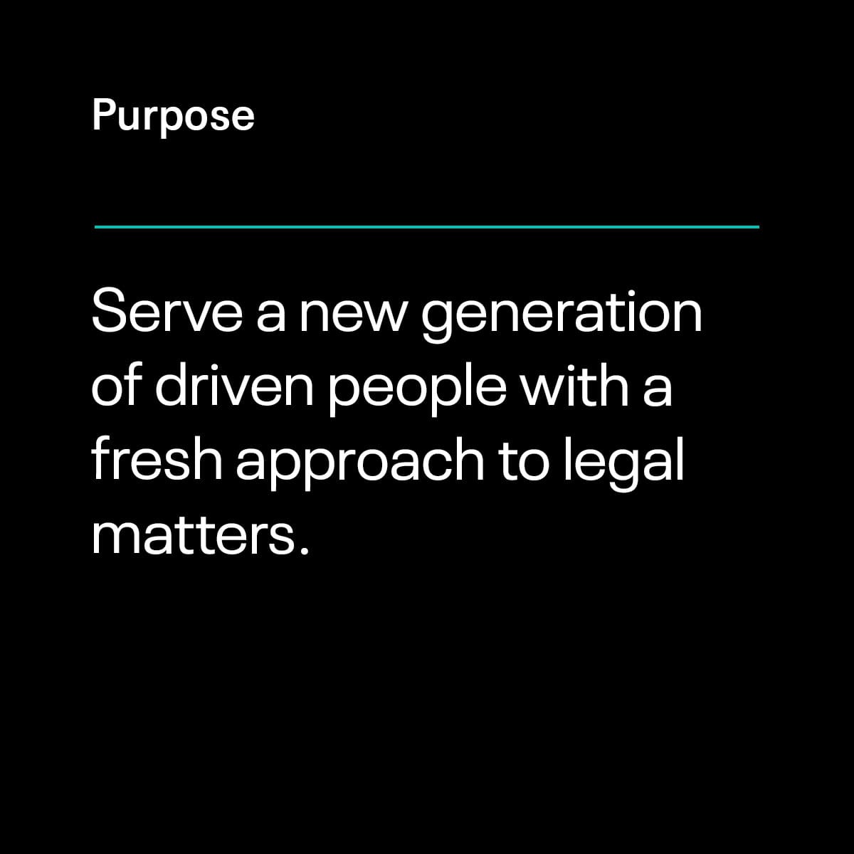
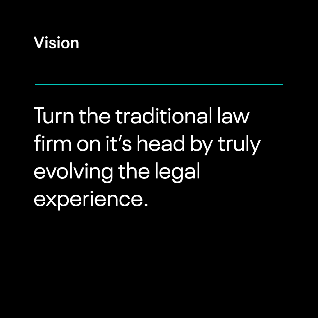
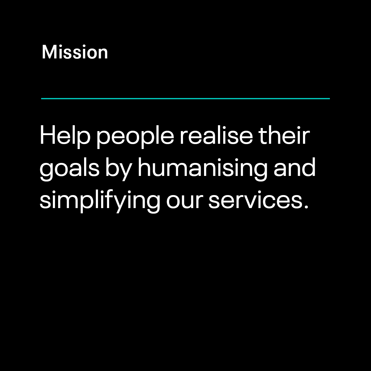
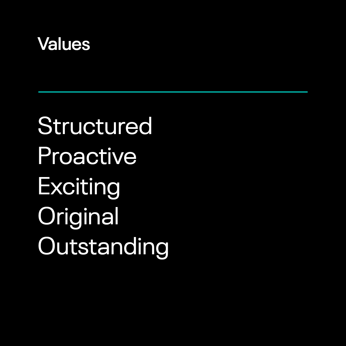
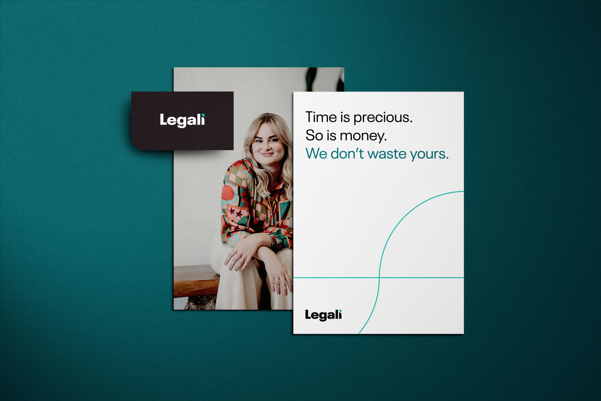
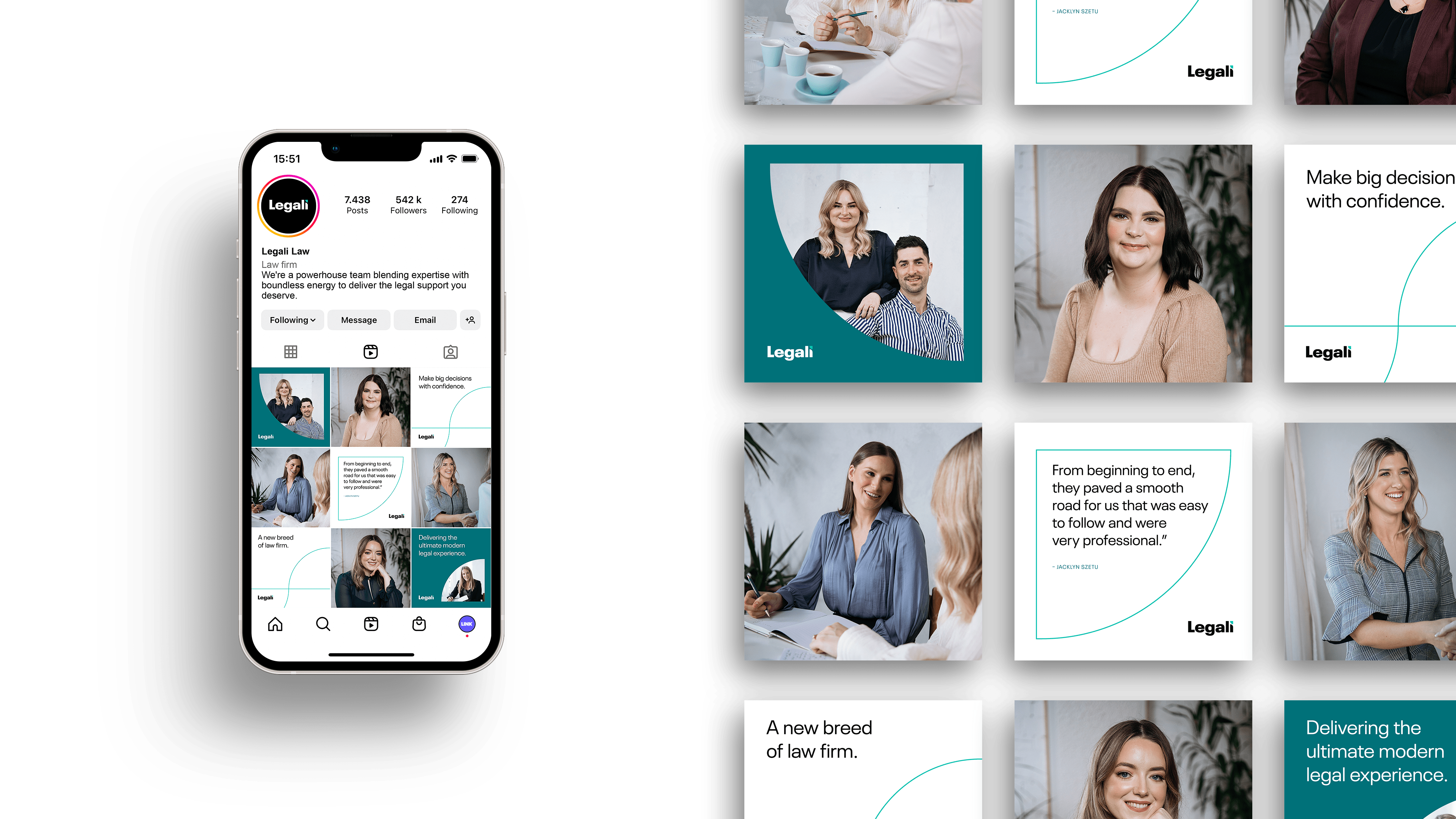
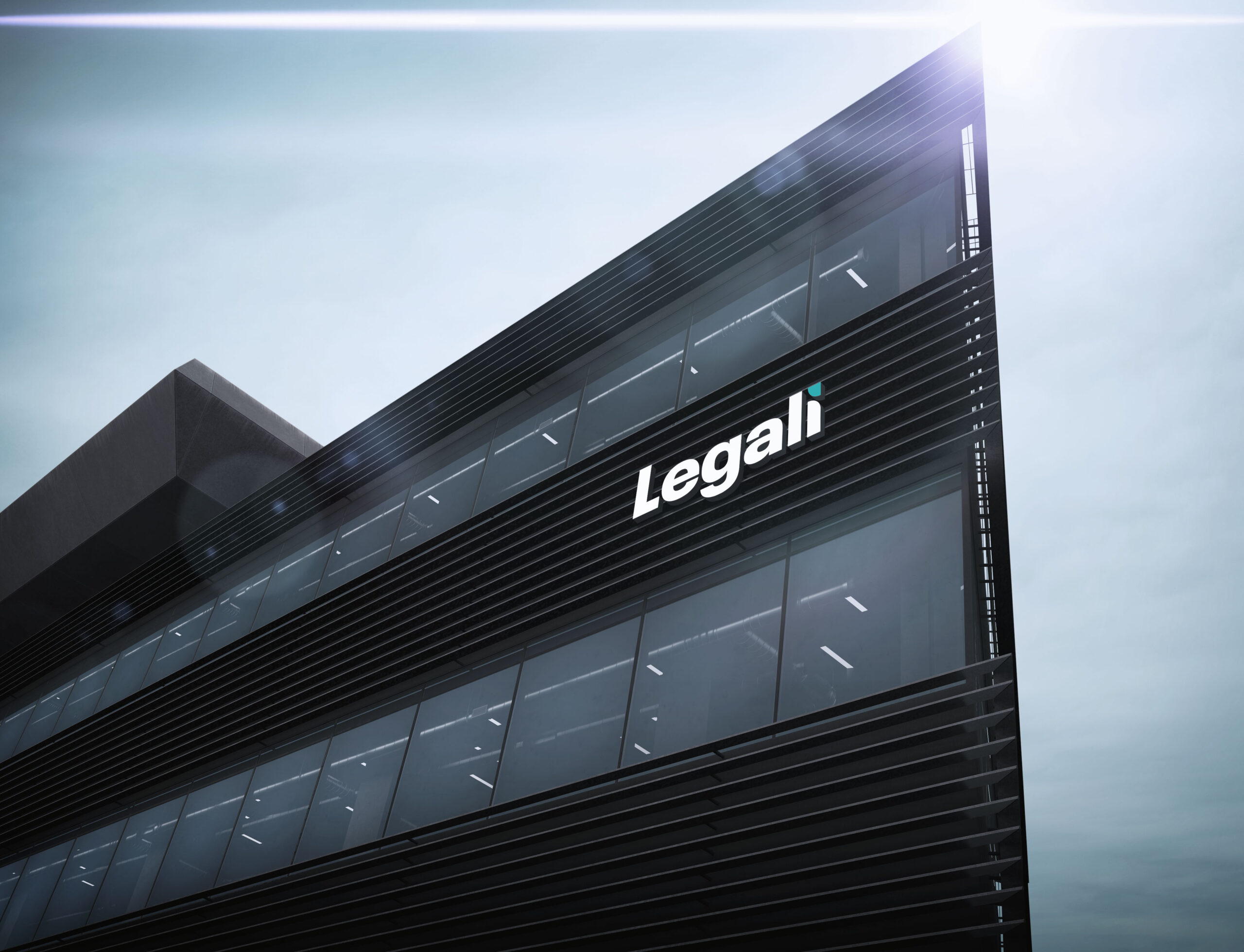
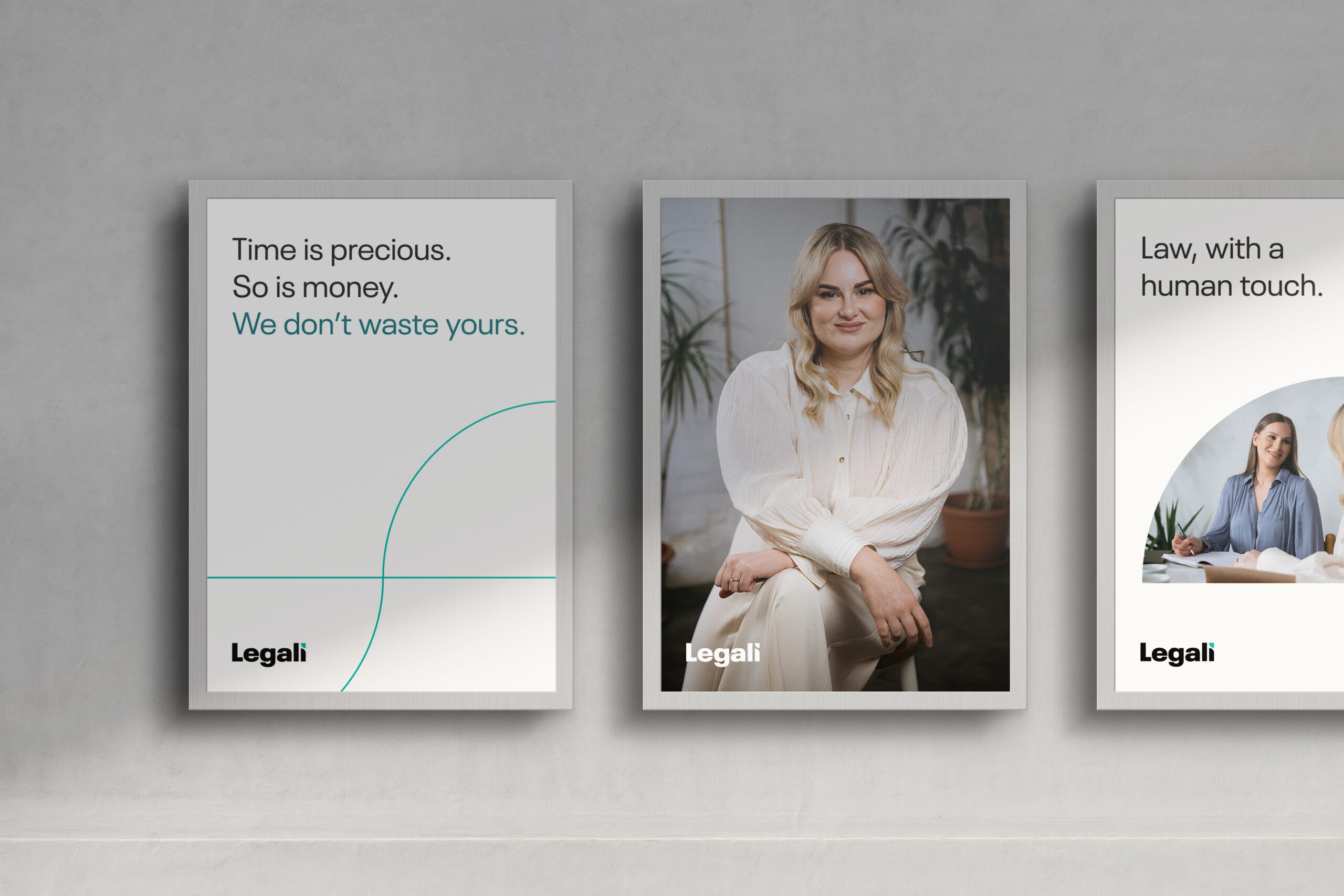
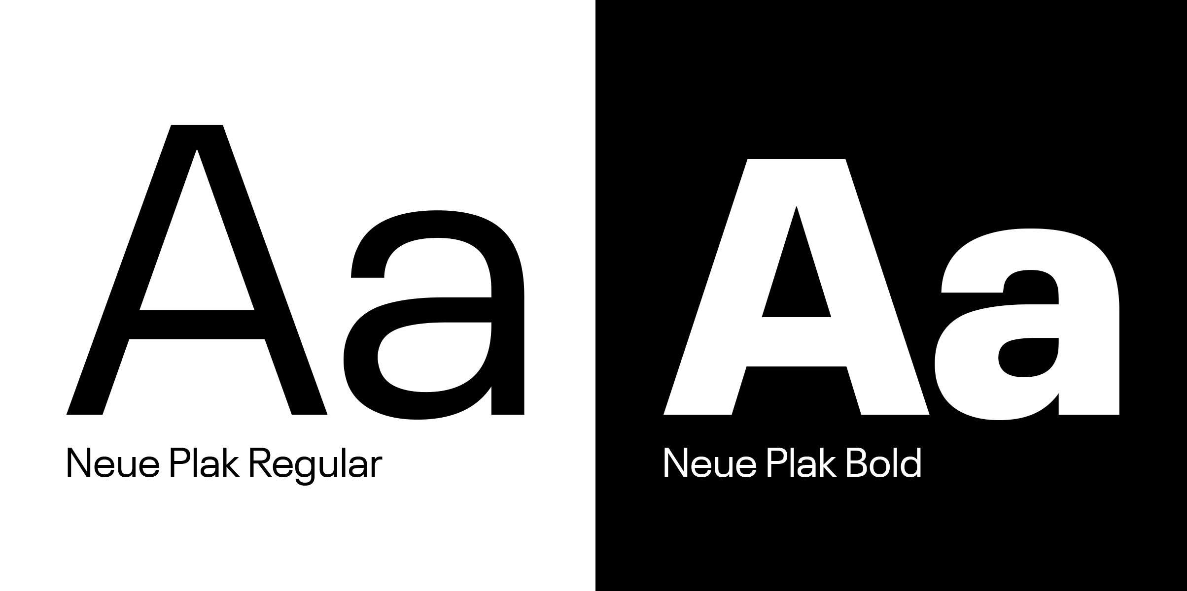
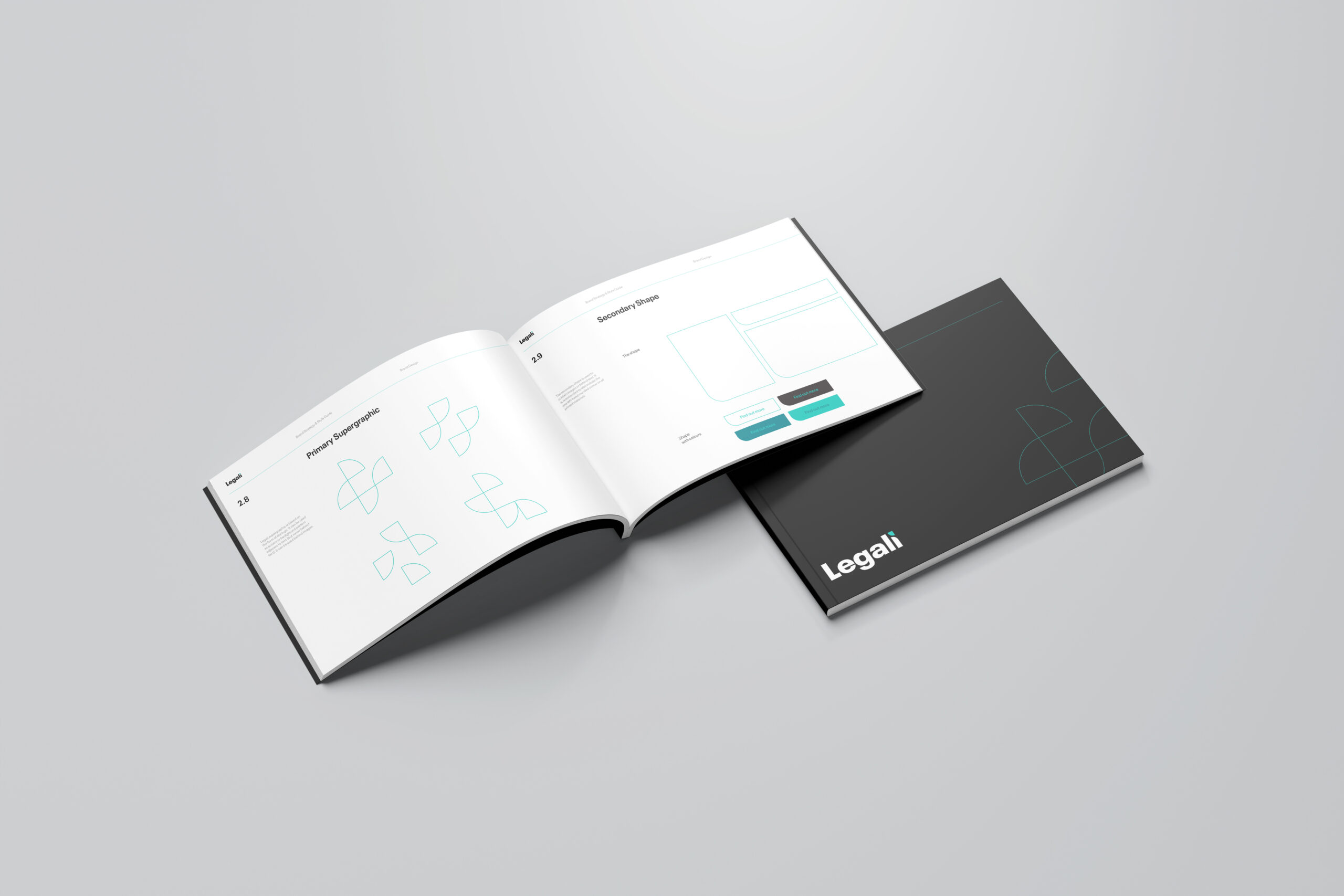
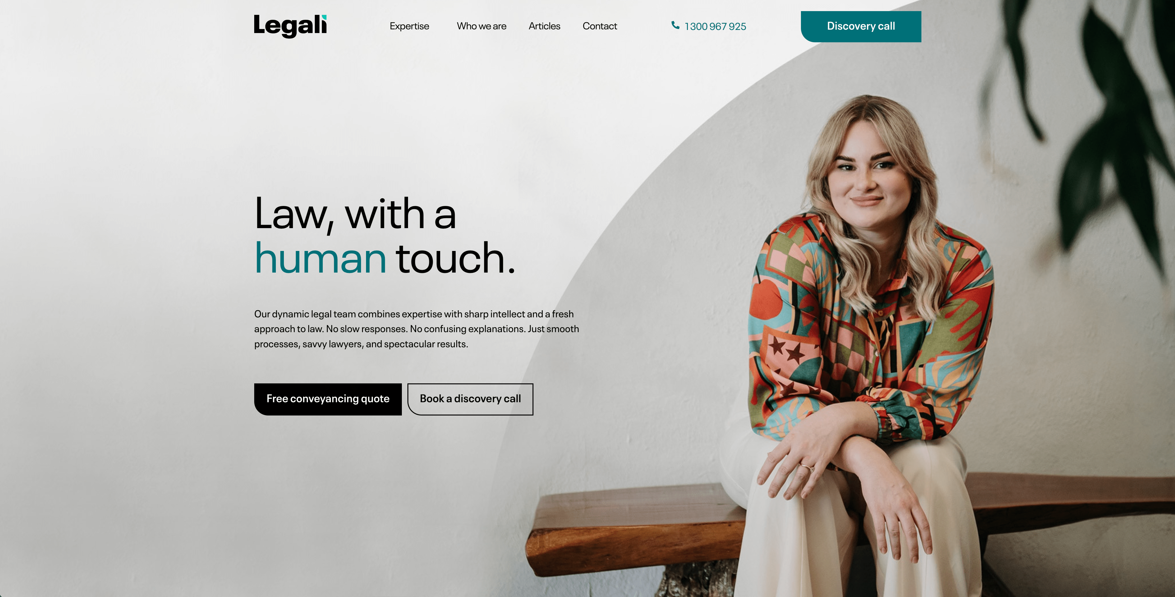
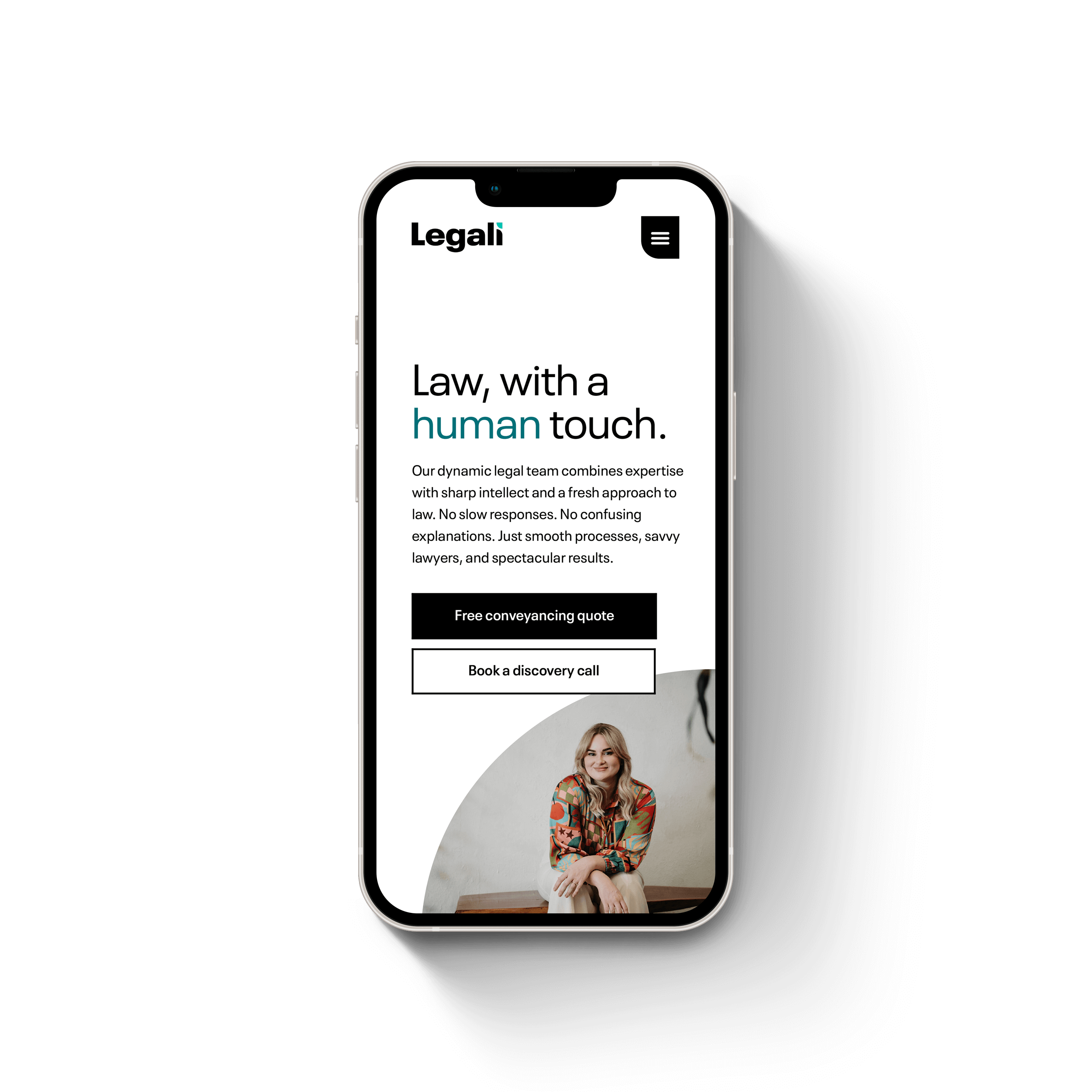
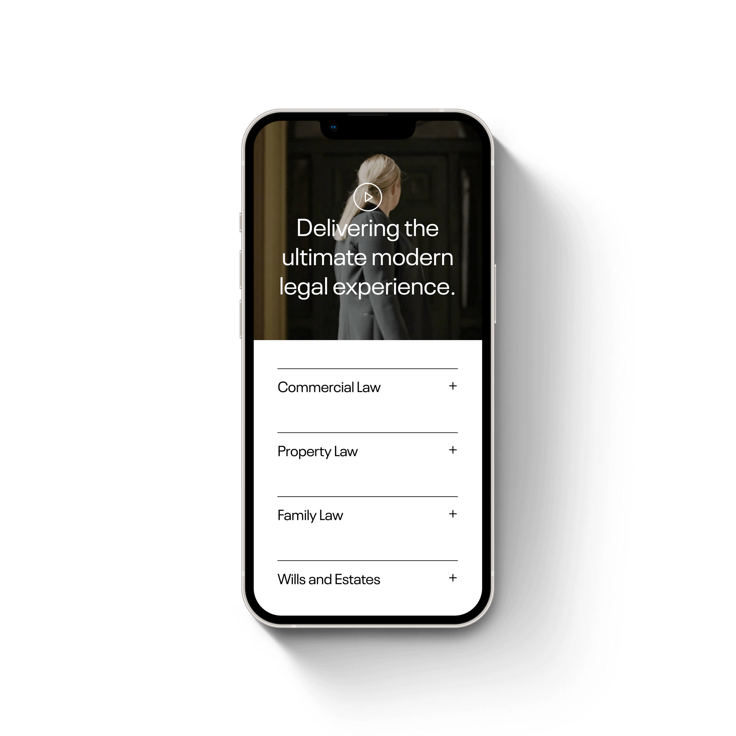
To solidify Legali as a game-changer in the field of law, with a brand that reflects their drive to create the ultimate modern legal experience, delivered by lawyers you’ll actually like.
An energetic and direct style of communication fit the simplicity and confidence at the heart of Legali. But we needed a twist. Unlike more traditional companies, their big-picture vision aligns with what their customers value. They share a common enemy. So, tongue-in-cheek statements were introduced to foster comradery with their target market.
Colour drives attention to the differentiating letter, so it’s immediately clear Legali does things differently. While the curved shape represents smooth facilitation between people.
The result leans into the simple brand name to create a modern, bold, and solid logo that steps away from tradition.
Using the influence of Silicone Valley innovators, a mono (black or white) brand was created with a pop of lively colour to breathe a fresh life into law.
Legali’s typeface reflects its warmth and bold spirit.
The dynamic quarter shape used in the logo is the bedrock of Legali’s visual identity. The shapes feel warm and approachable and form secondary brand elements that make them instantly recognisable.
Airy. Bright. Professional. Human.
These elements were used to capture the warmth and vibrance of the Legali team on camera.
(Photo credits : Don’t Say Cheese)
The new modern digital interface for Legali was designed to calm the mind of their customers. An elegant use of white space, and modern layout elements create a world class user interface that is designed to convert.
With the assistance of our epic digital marketing team, the new Legali site has resulted in 2746% increase in average conversion rate since launch.
Expert advice, a killer brew, and a plan for your world domination.
5 articles. 2 min reads. All wrapped up in one fortnightly newsletter.